ČERNOŠICE Villa
This project was never about finishing a completed house with furniture and decoration afterward. We joined the project during the architectural design phase, allowing us to develop the interior together with the massing of the house, natural light, and the proportions of each room. That is why the entire space feels calm and coherent. Nothing tries to become decoration for its own sake. Materials, built-in furniture, and lighting are integrated into the architecture from the first sketch.
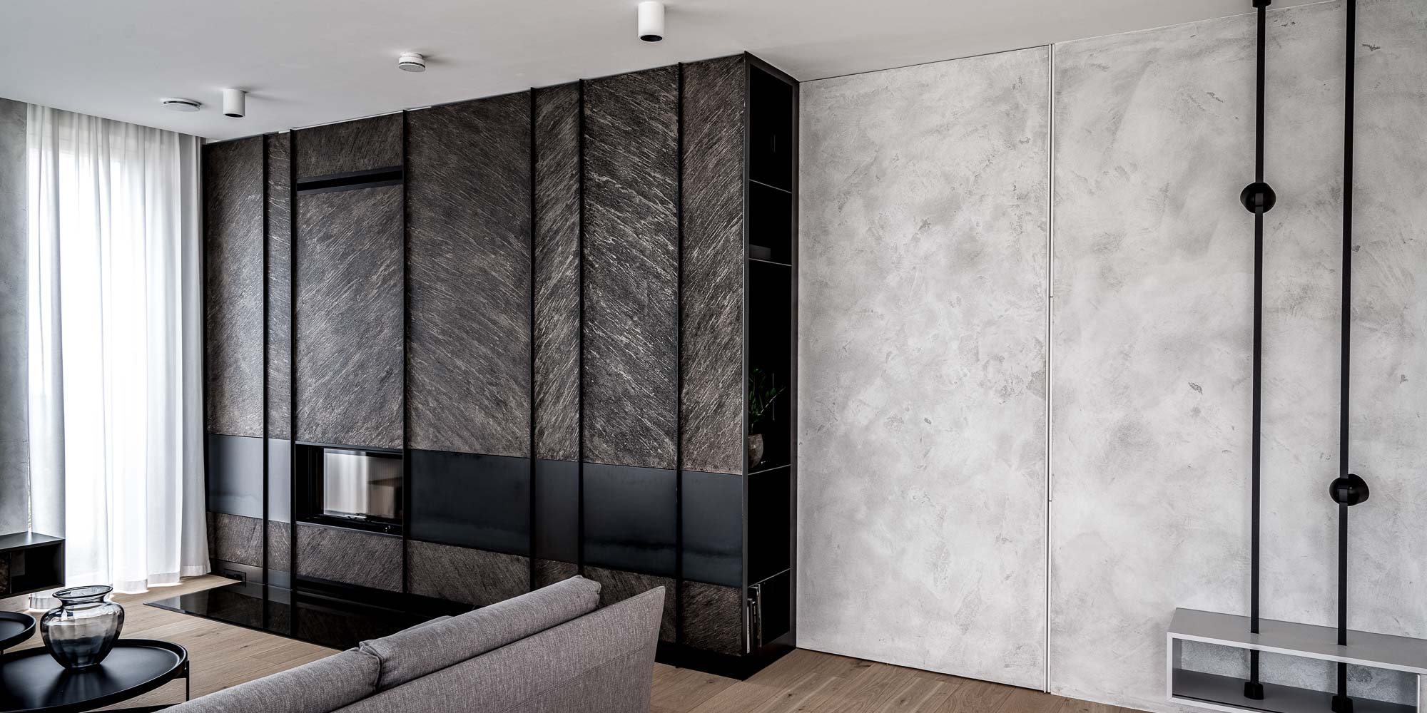
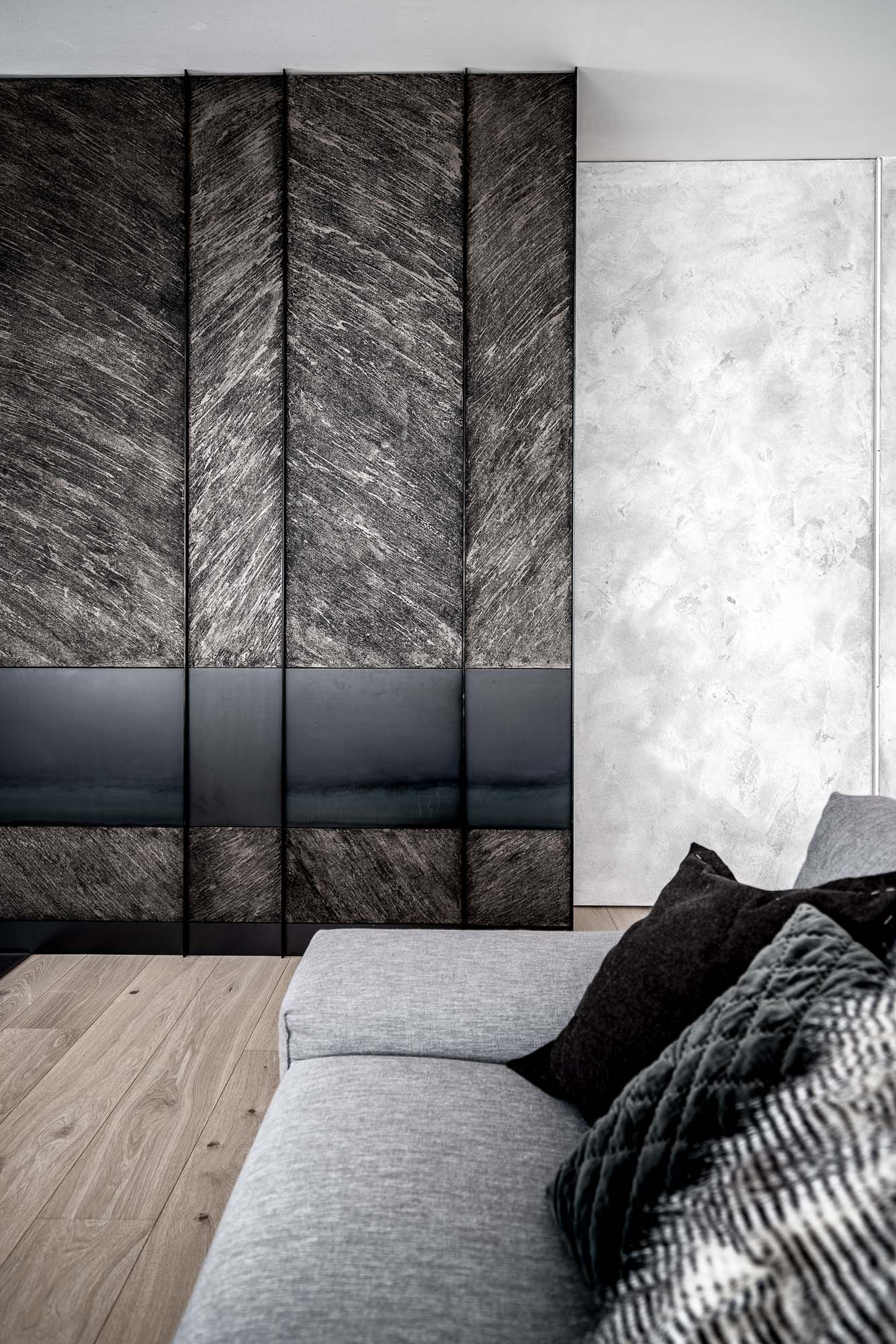
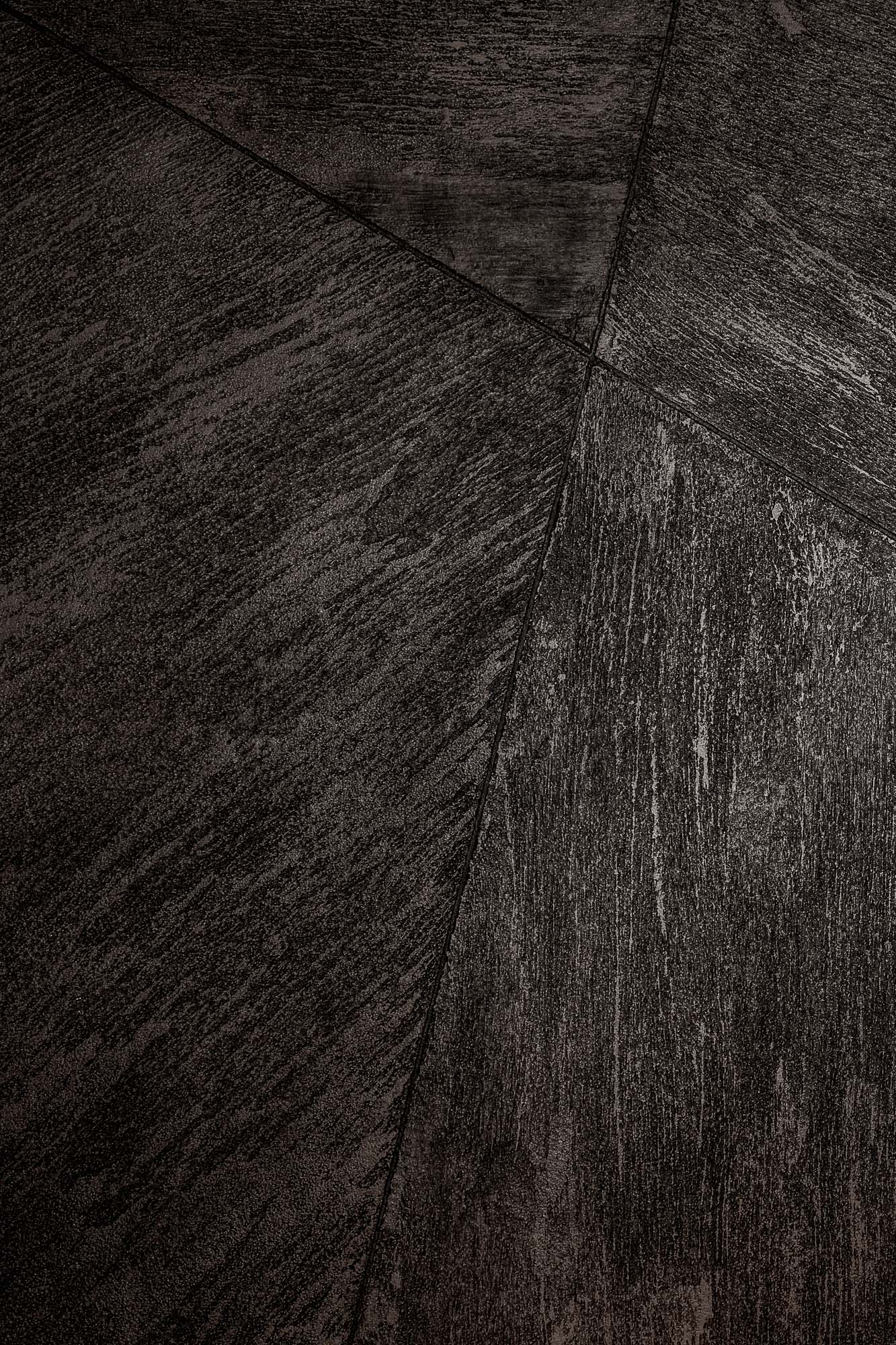
The minimalist interior is built on the contrast between bright surfaces, dark volumes, and expressive textured plaster finishes that appear throughout the entire house.
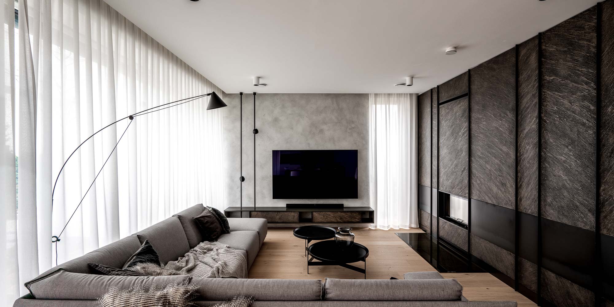
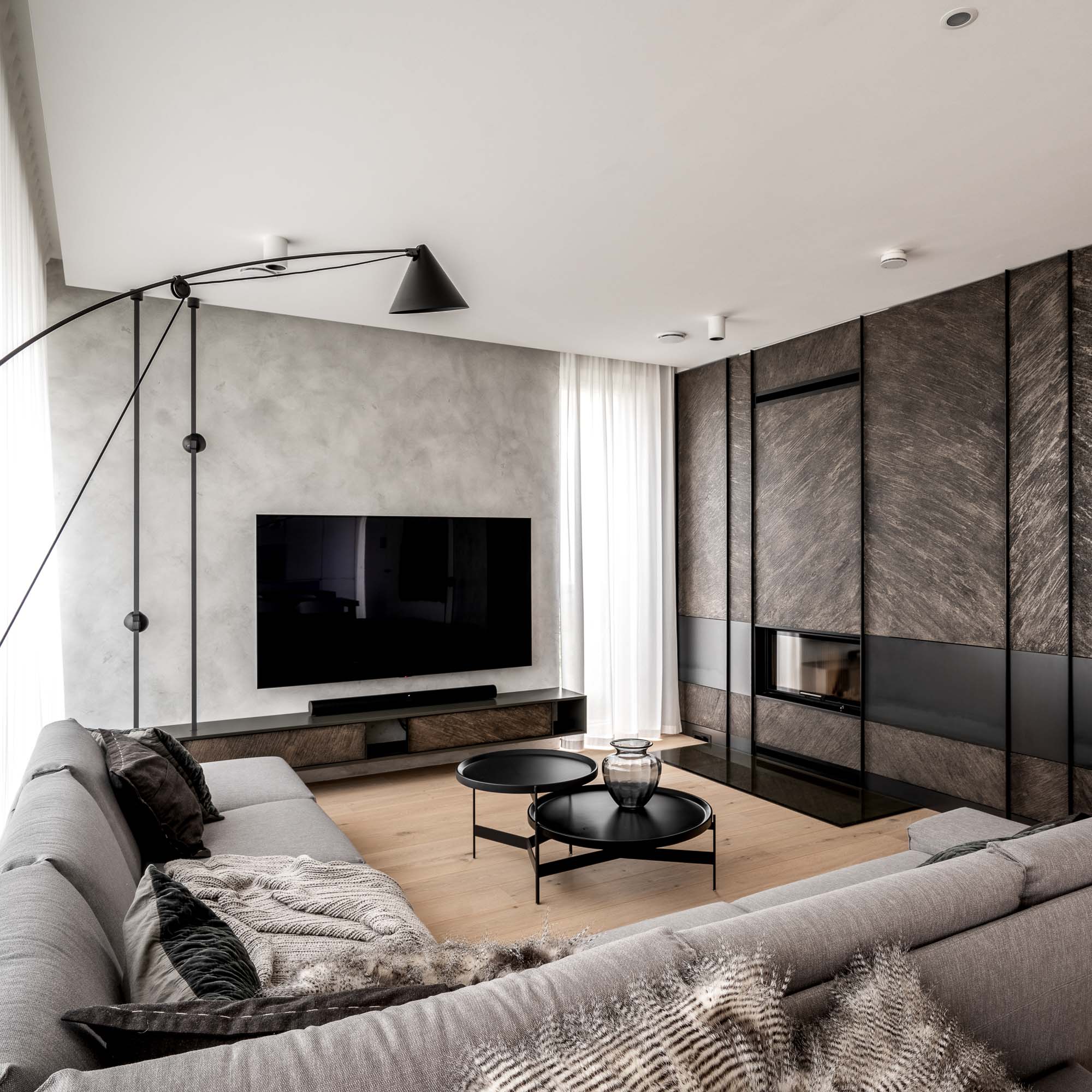
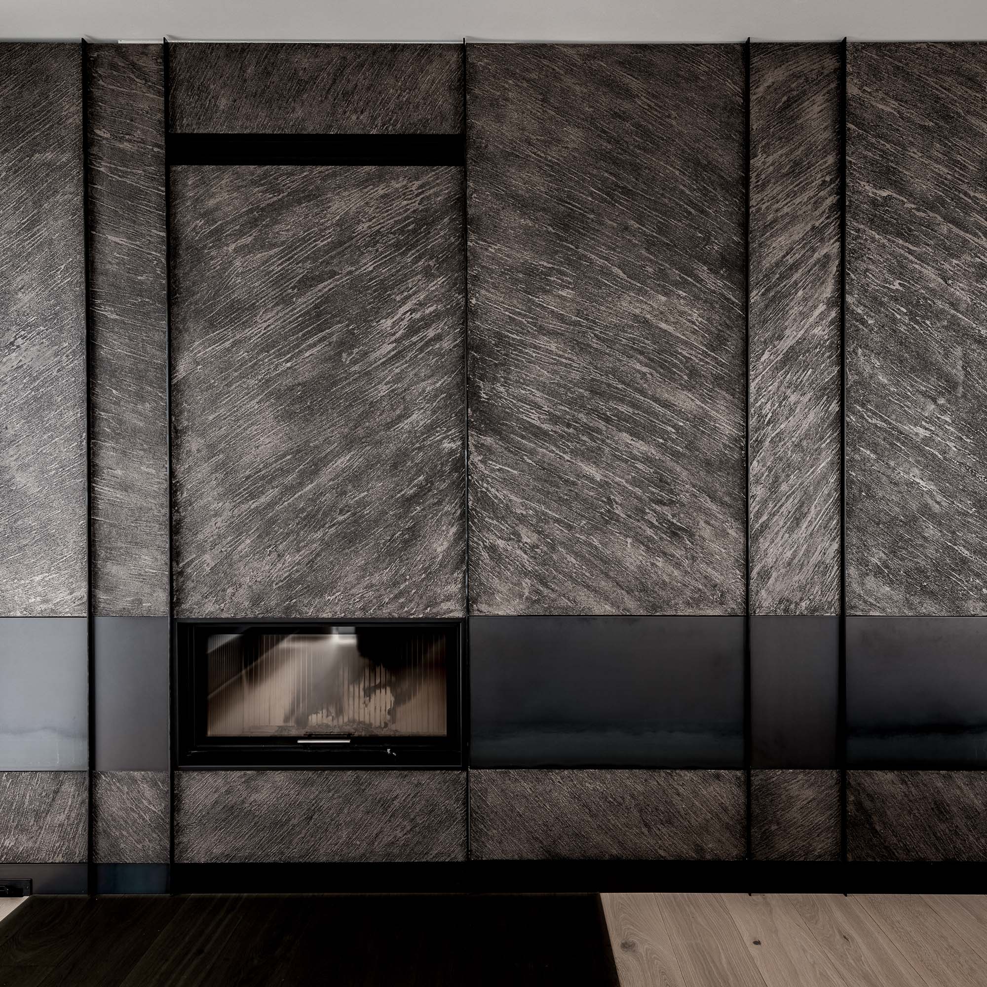
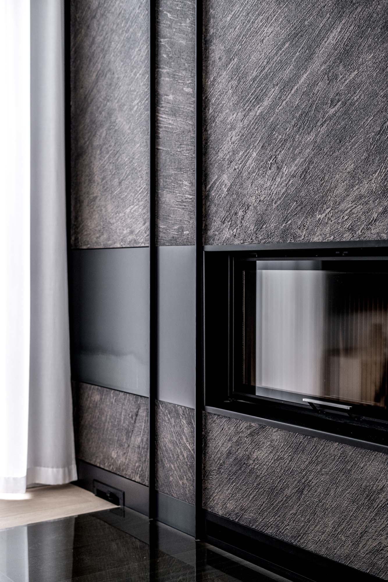
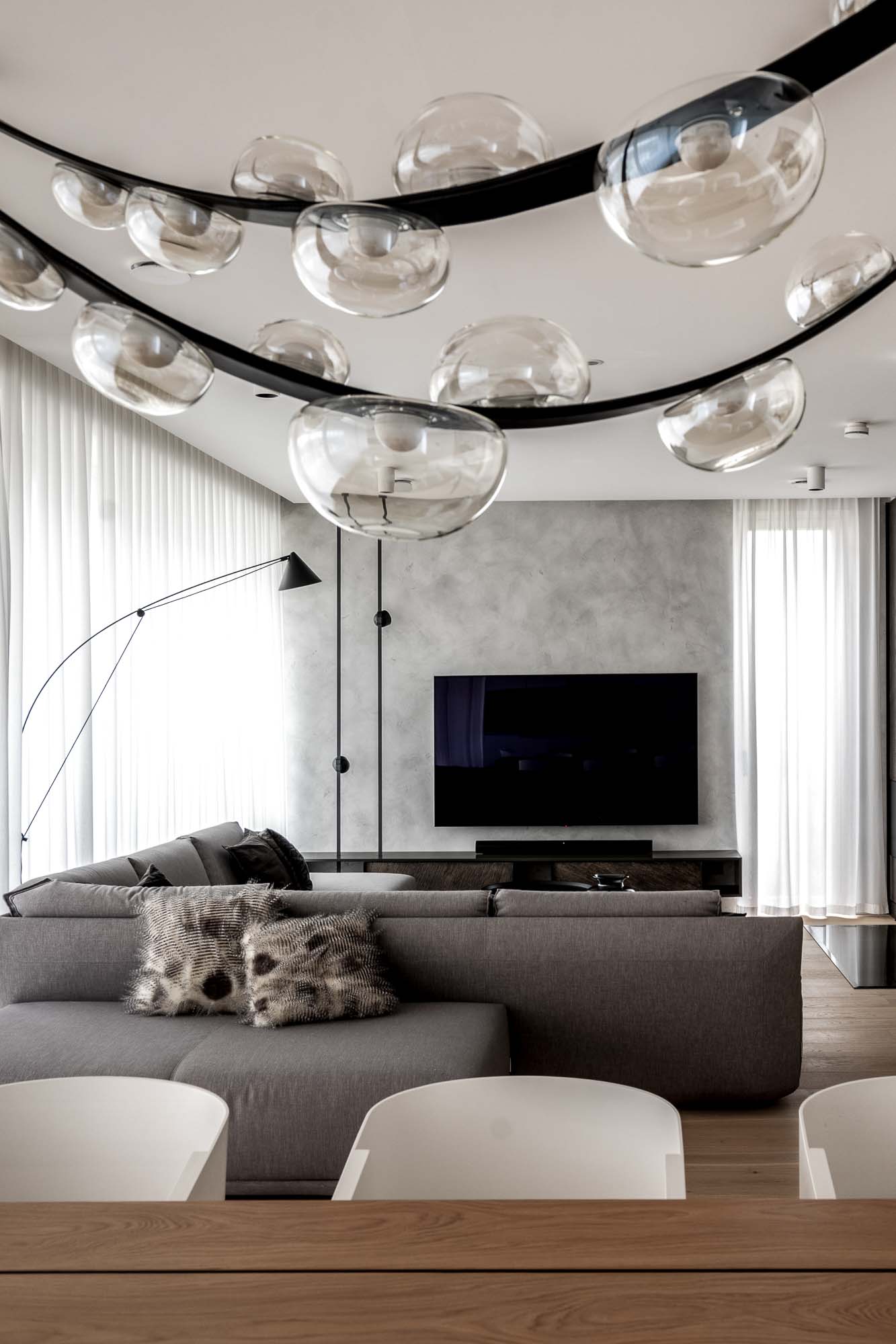
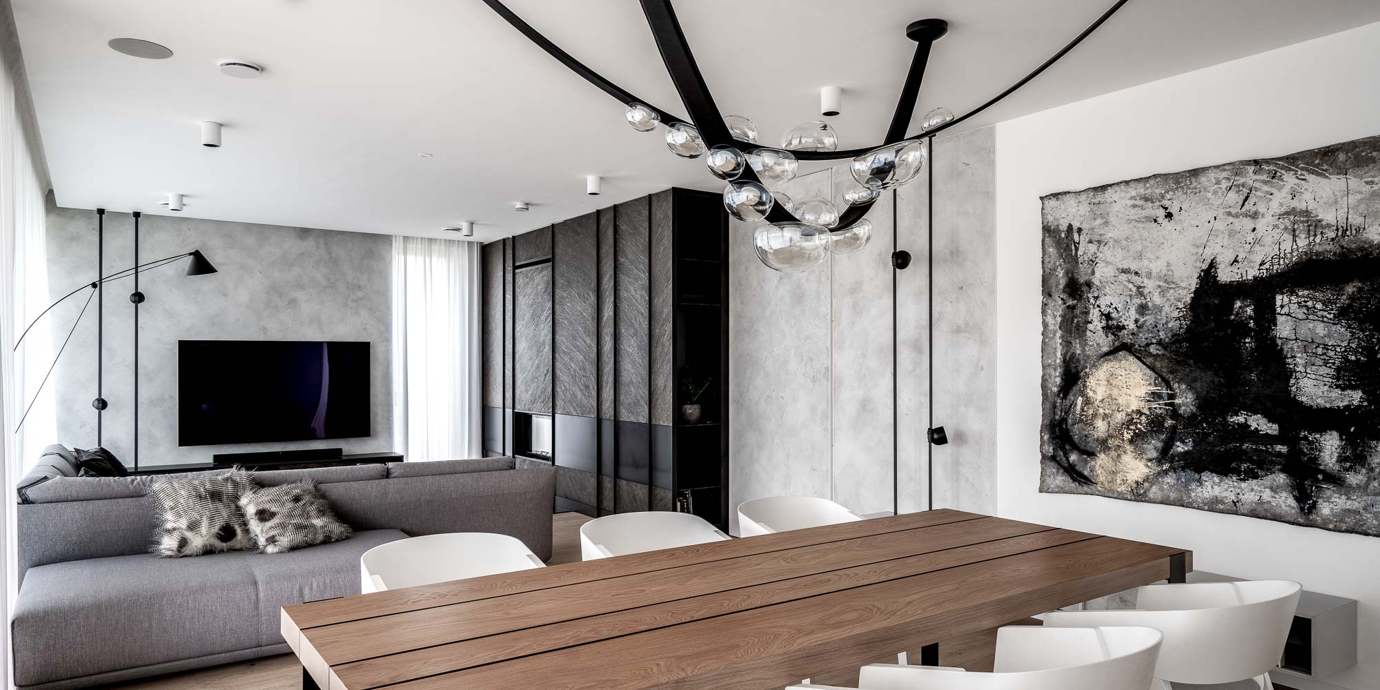
Fireplace as the main composition
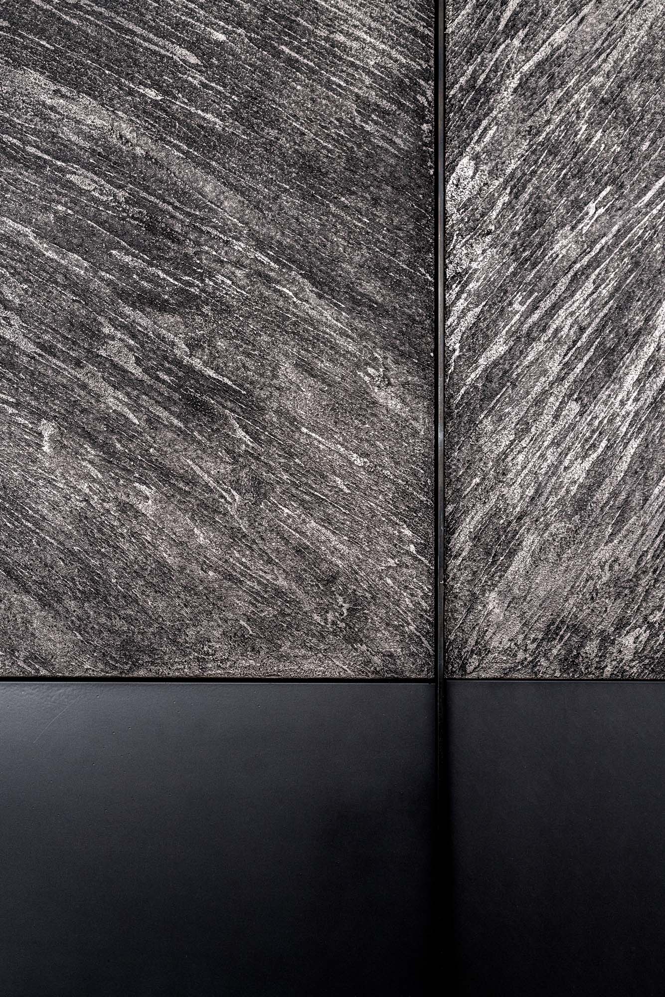
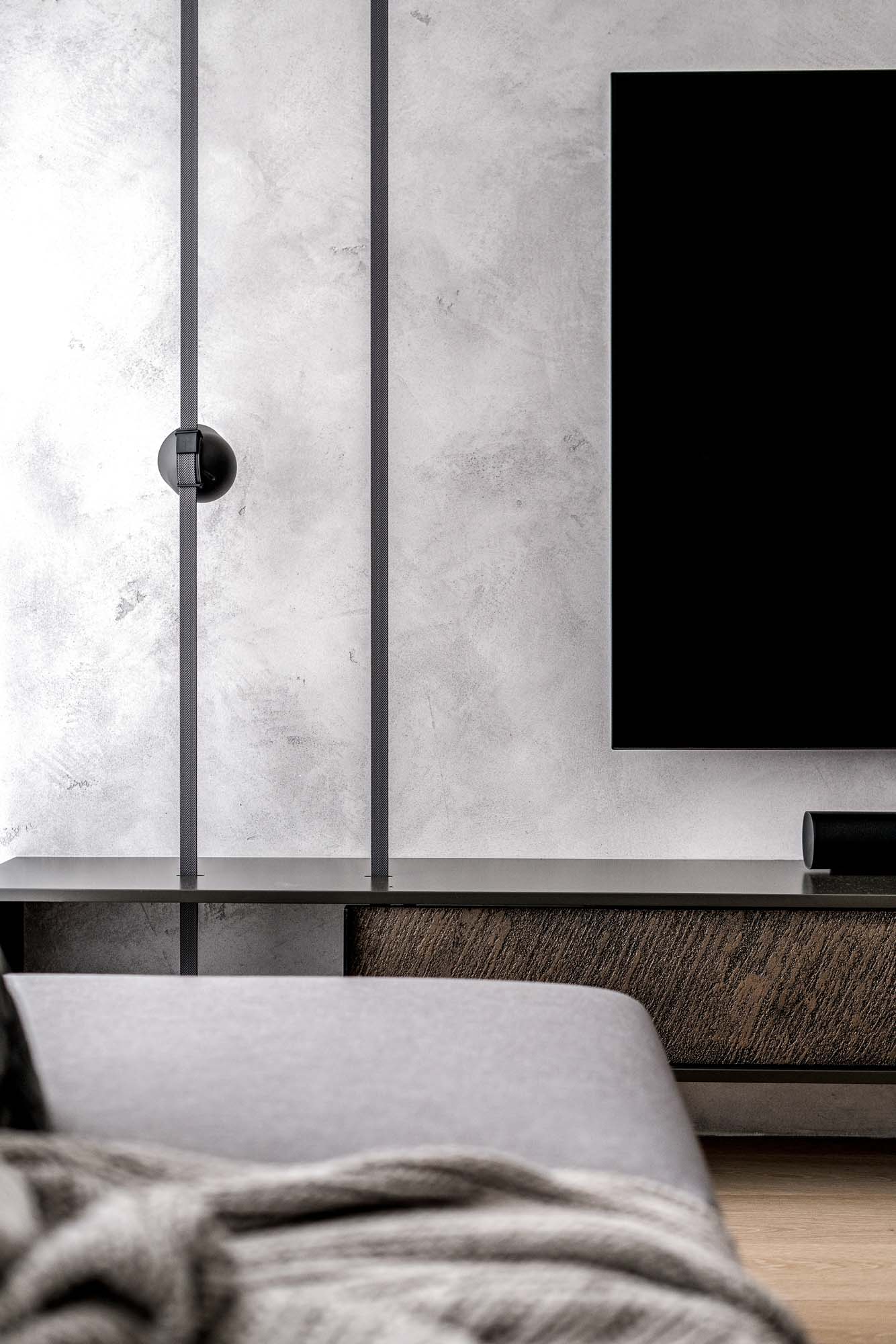
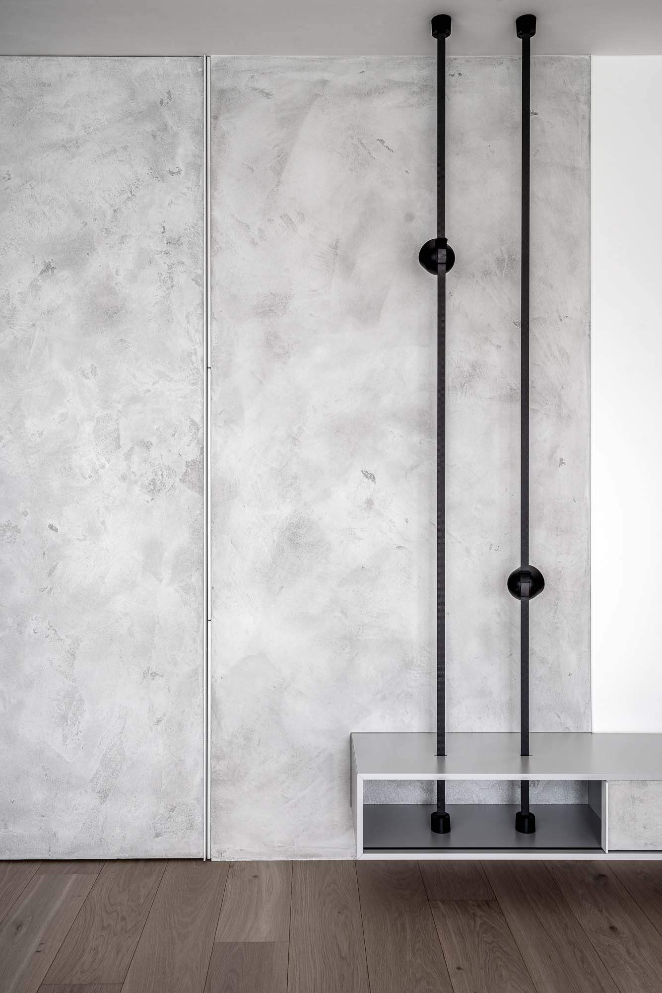
The living room is not centered around furniture or a television. The dominant feature of the space is the fireplace wall designed as one large architectural element. The fireplace is not simply inserted into a wall — it becomes part of a custom-designed textured plaster composition created specifically for this project.
The dark vertical divisions create rhythm and give scale to the large open living area. In the evening, side lighting transforms the textured surface almost into a relief. Exactly the type of detail that works completely differently in reality than in photographs.
It's not the first time a fireplace has defined the entire living room for us — in another project we approached it through steel plate cladding instead.
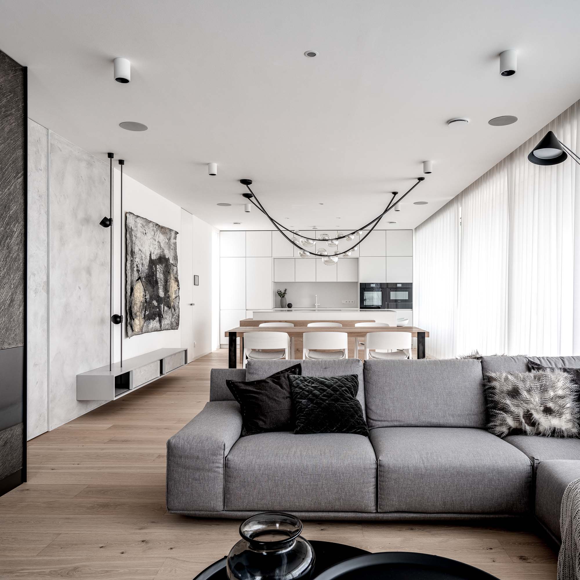
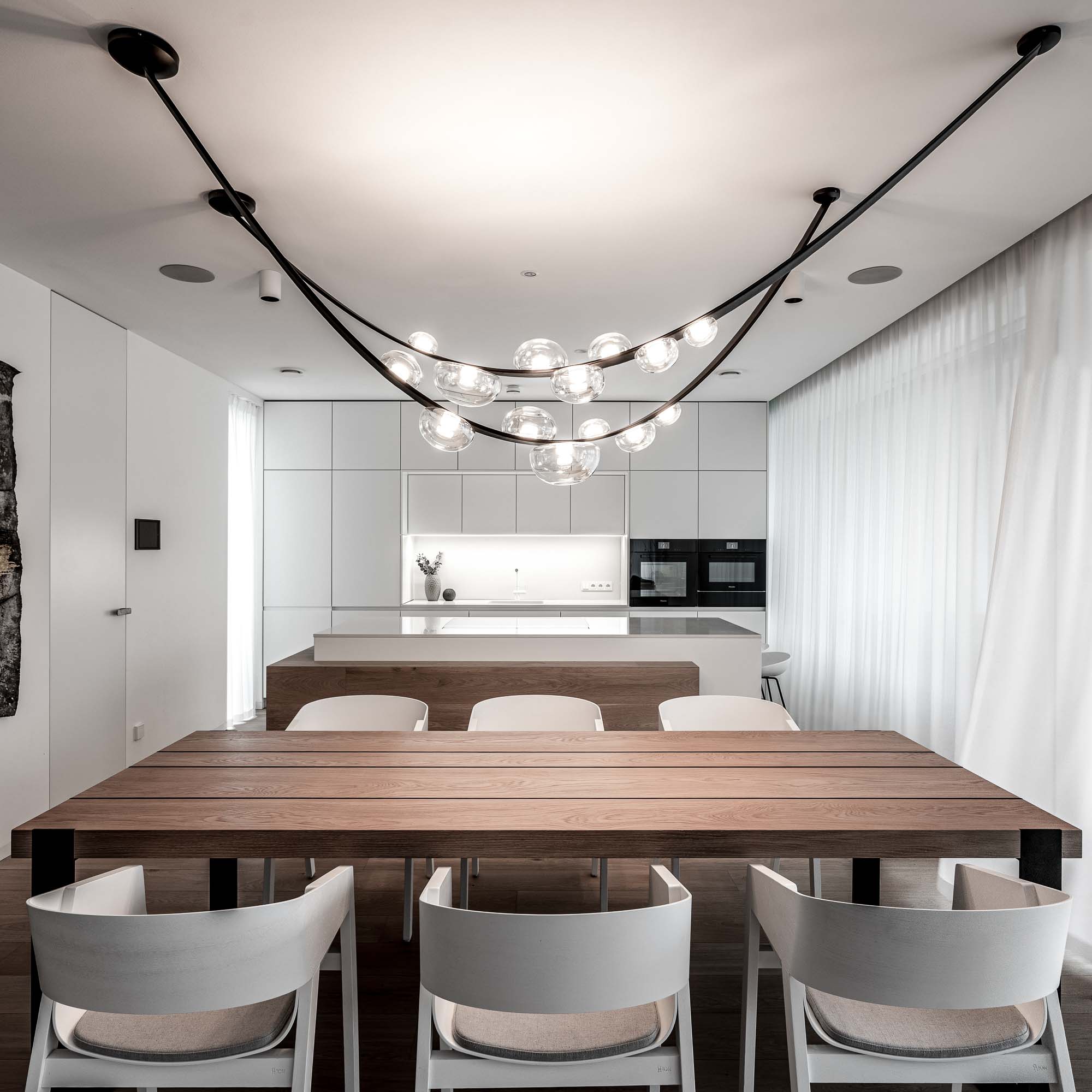
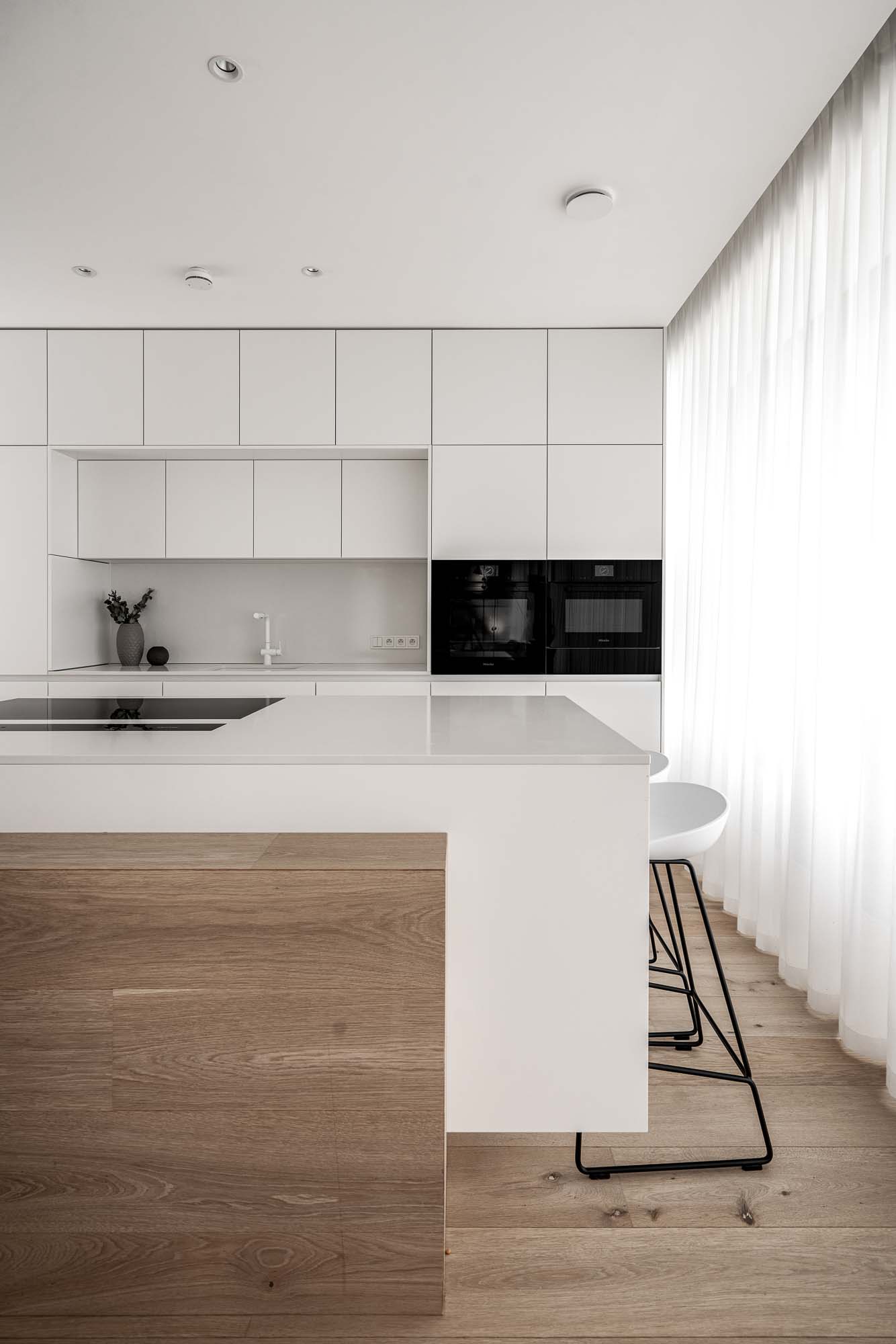
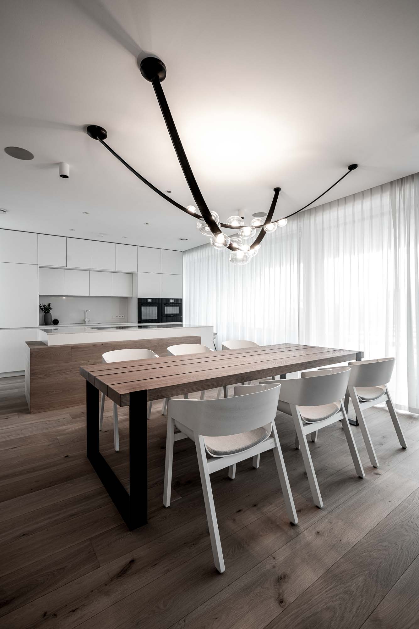
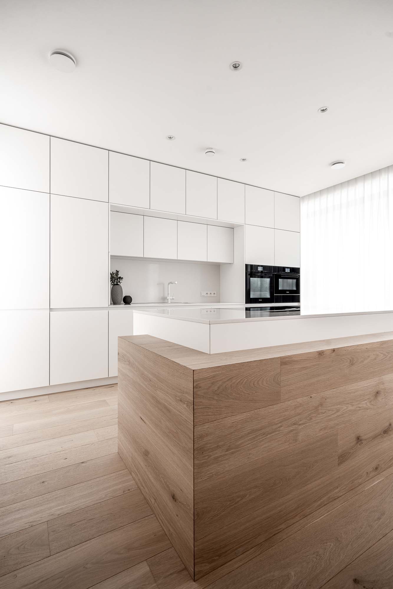
The kitchen in the background
The kitchen was intentionally designed to remain visually quiet. We did not want tall cabinets or expressive materials to dominate the open living area. The white surfaces almost disappear into the walls, allowing the proportions of the space, the long dining table, and the suspended light fixture above it to stand out instead.
One interesting detail is the kitchen island clad in the same material as the floor. The island therefore feels less like a separate object and more like the floor itself rising into the space.
The large suspended light above the table acts as an optical boundary between the kitchen and living room — not through partitions, but through light and proportion.
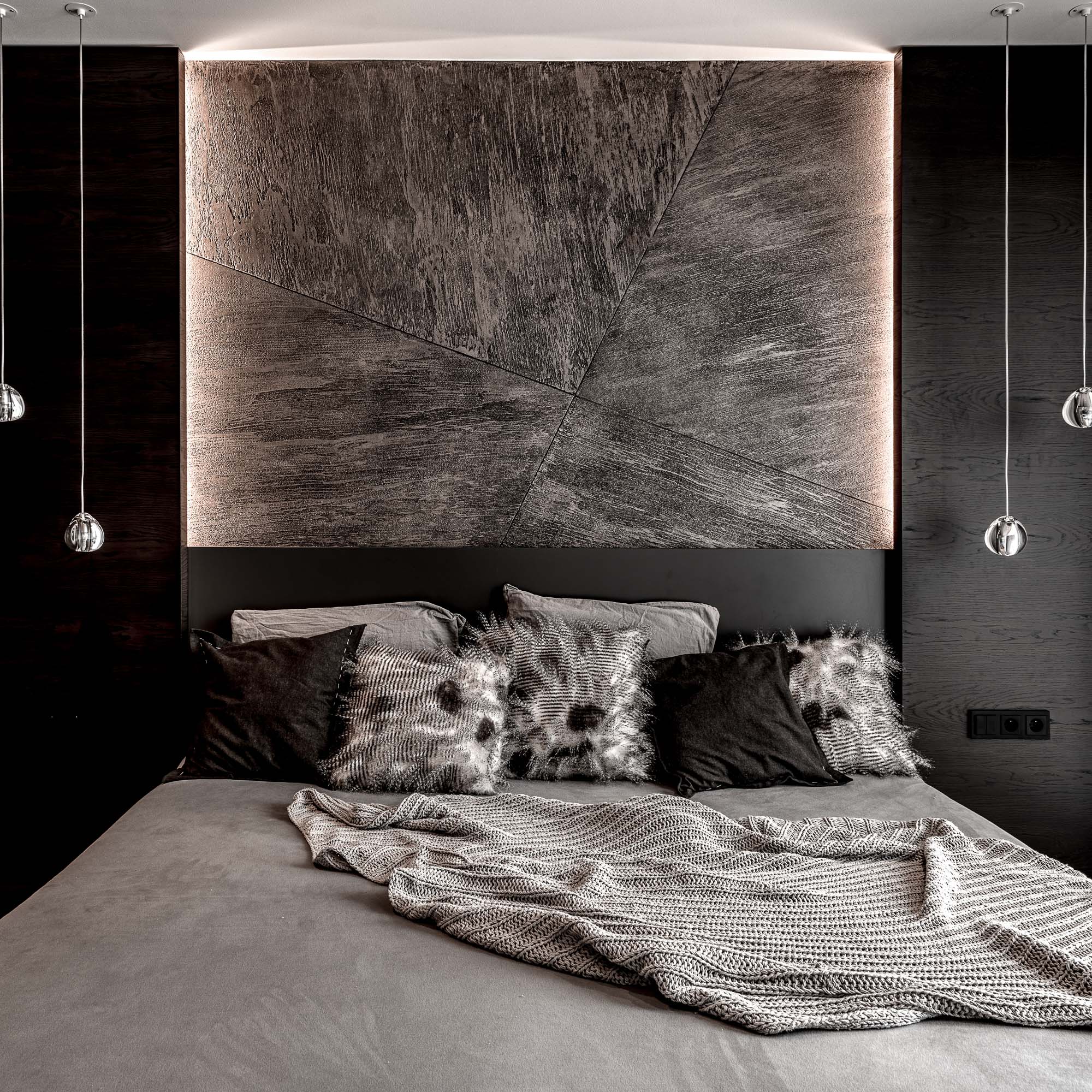
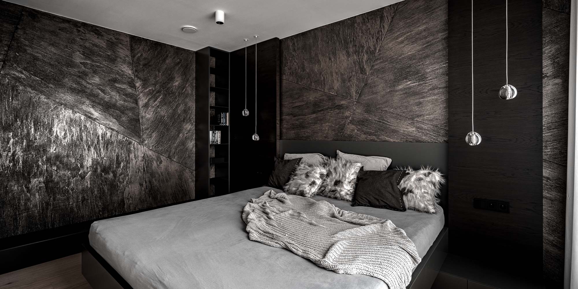
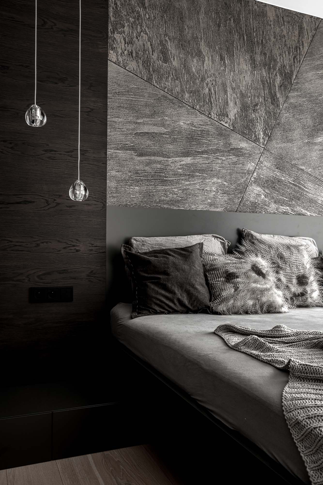
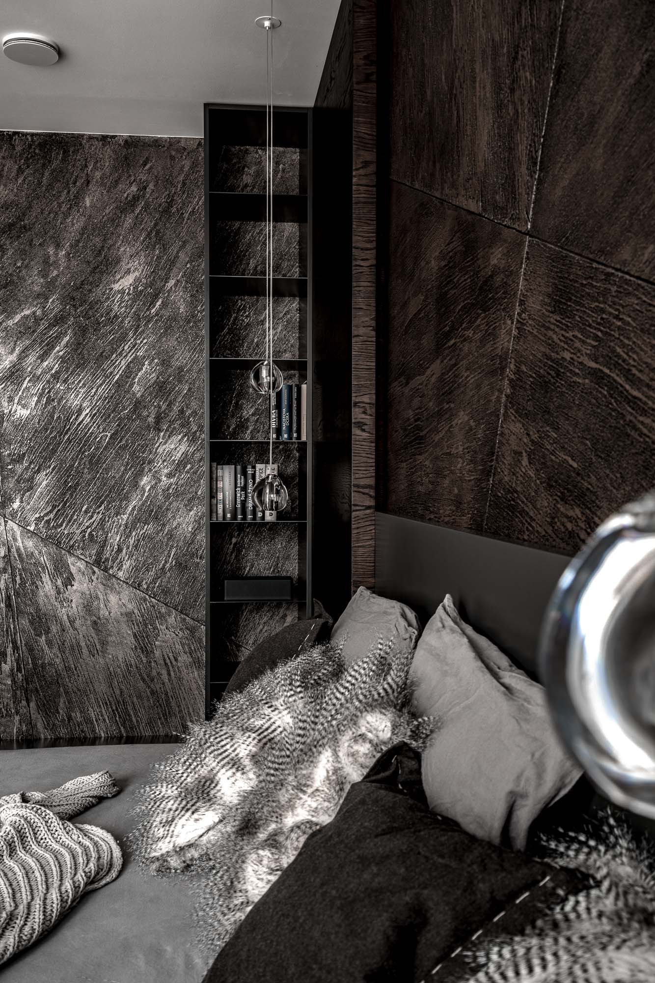
A darker bedroom atmosphere
The bedroom is intentionally darker than the rest of the house. We wanted to create a calm and intimate atmosphere instead of a catalogue-like composition of a bed and decorative artwork.
The textured plaster finish appears here again, this time in large-scale surfaces with a strong structure and subtle backlighting. The material itself creates atmosphere without the need for additional decoration. Dark wood, black details, and soft textiles keep the room quiet and restrained.
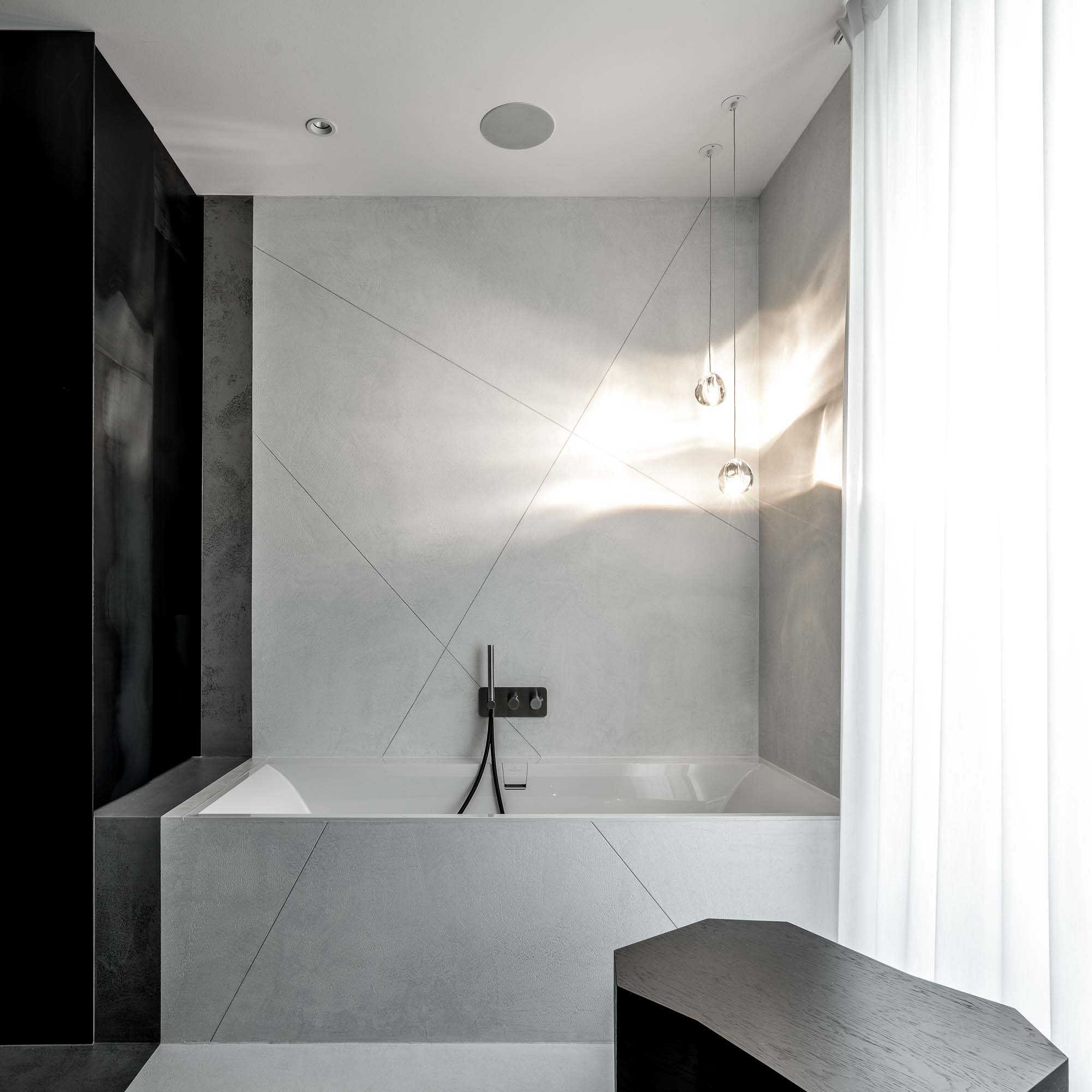
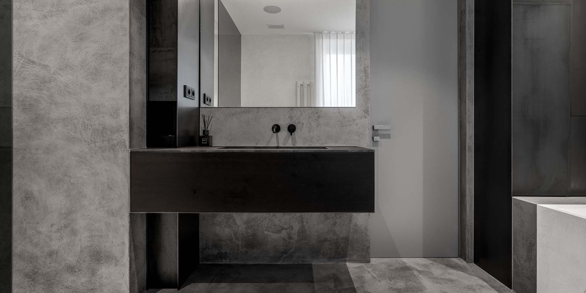
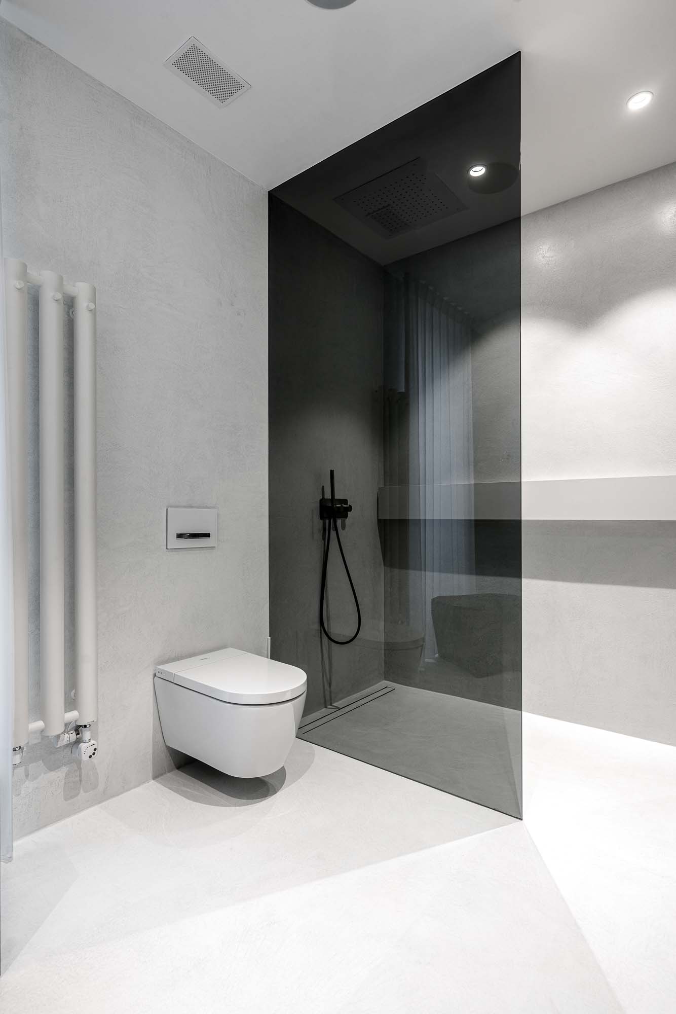
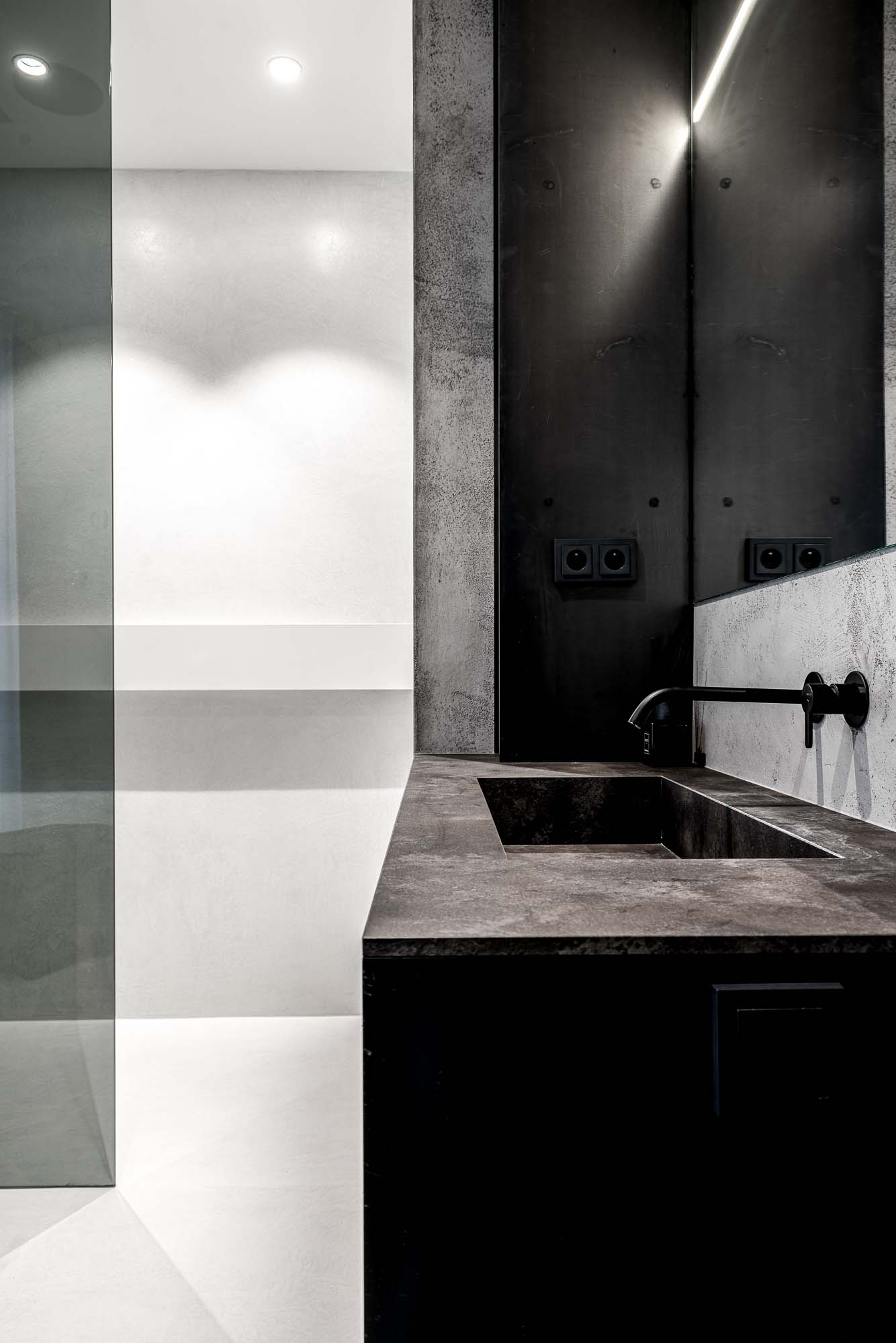
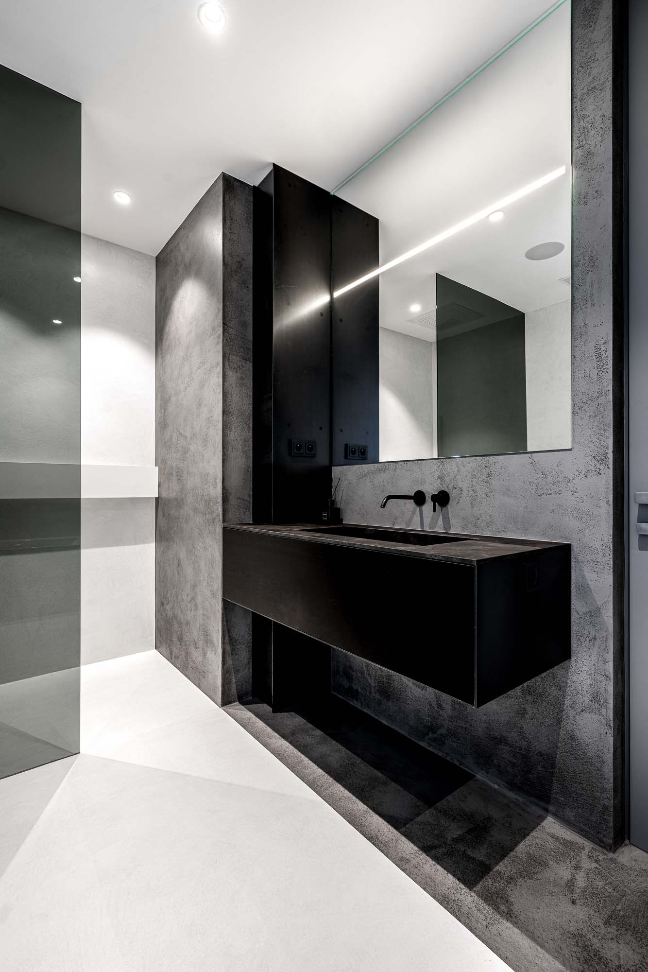
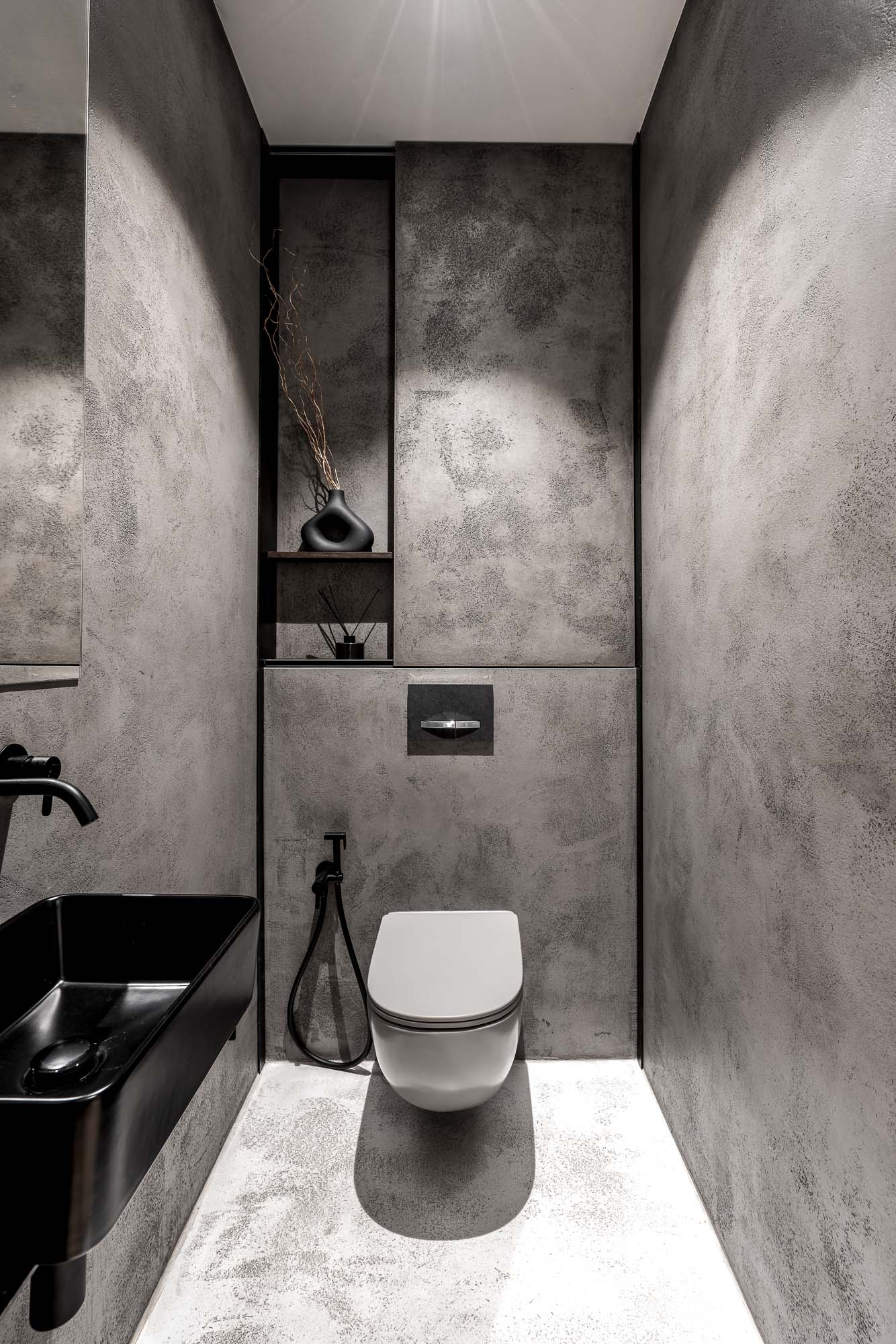
Plaster instead of tiles
The bathroom also relies primarily on plaster finishes and large monolithic surfaces. Sharp negative grooves cut into the plaster create subtle geometry without the use of traditional tiles.
The light-colored plaster is combined with dark glass, black fixtures, and minimalist furniture. A large frameless mirror visually expands the space even further and highlights the purity of the details. The result is not a sterile bathroom, but a space that feels like a natural continuation of the entire interior.
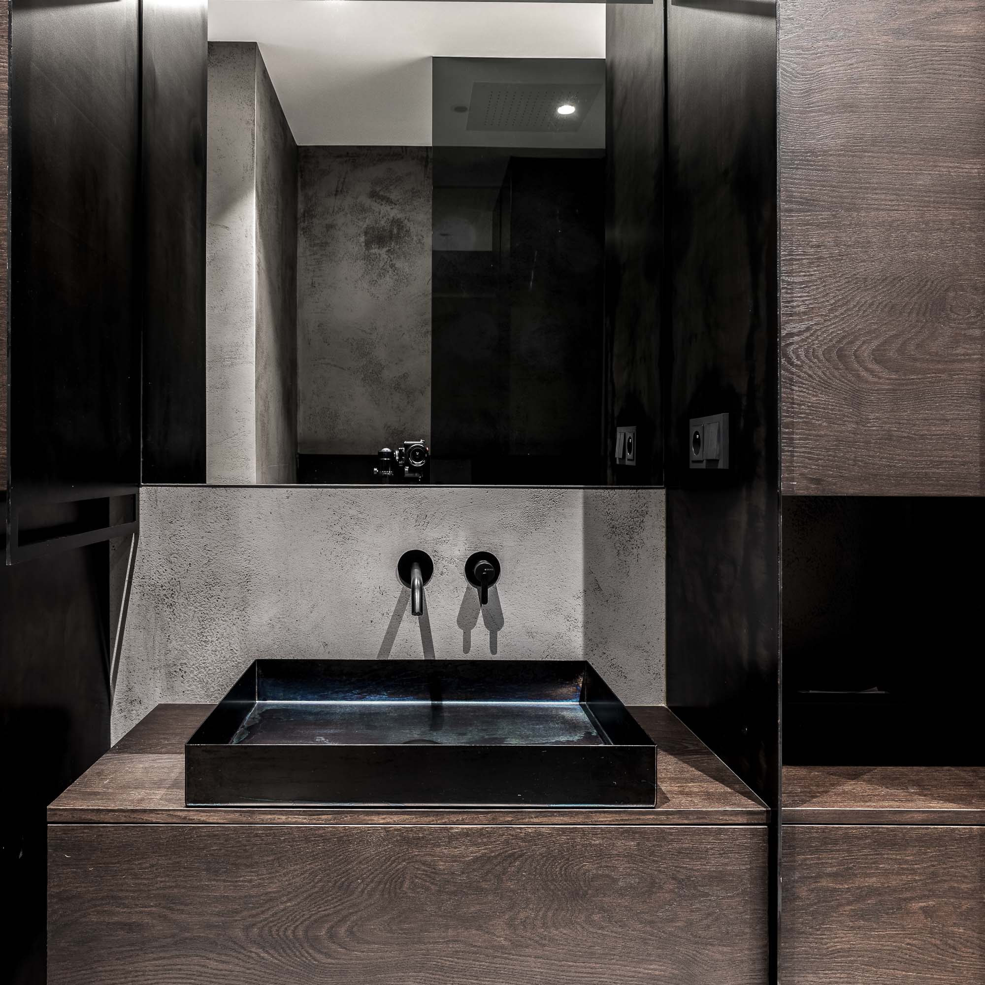
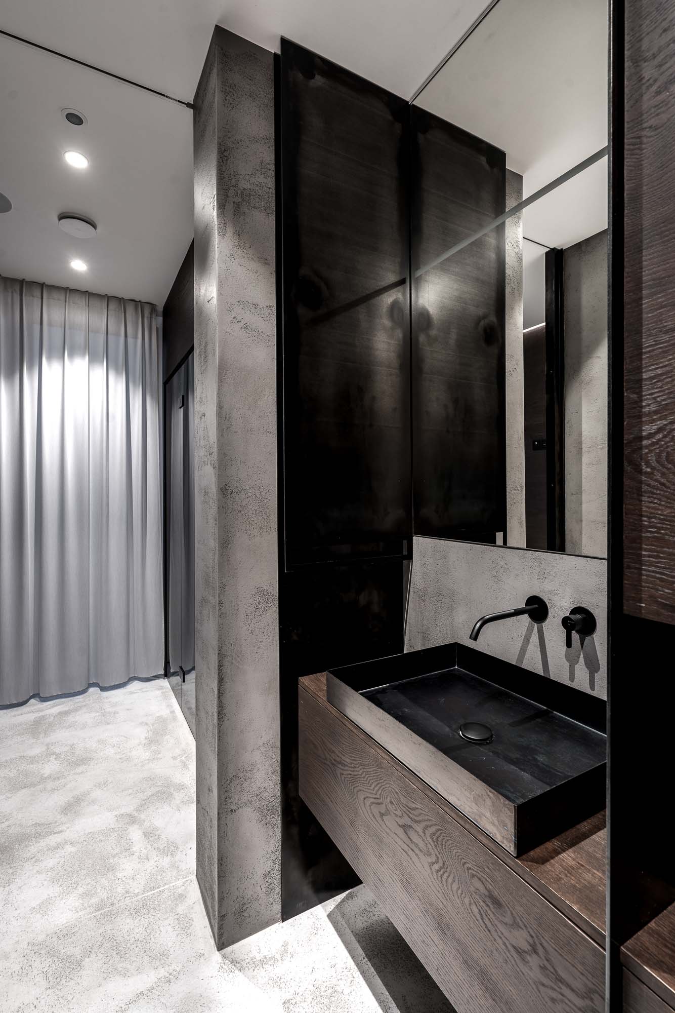
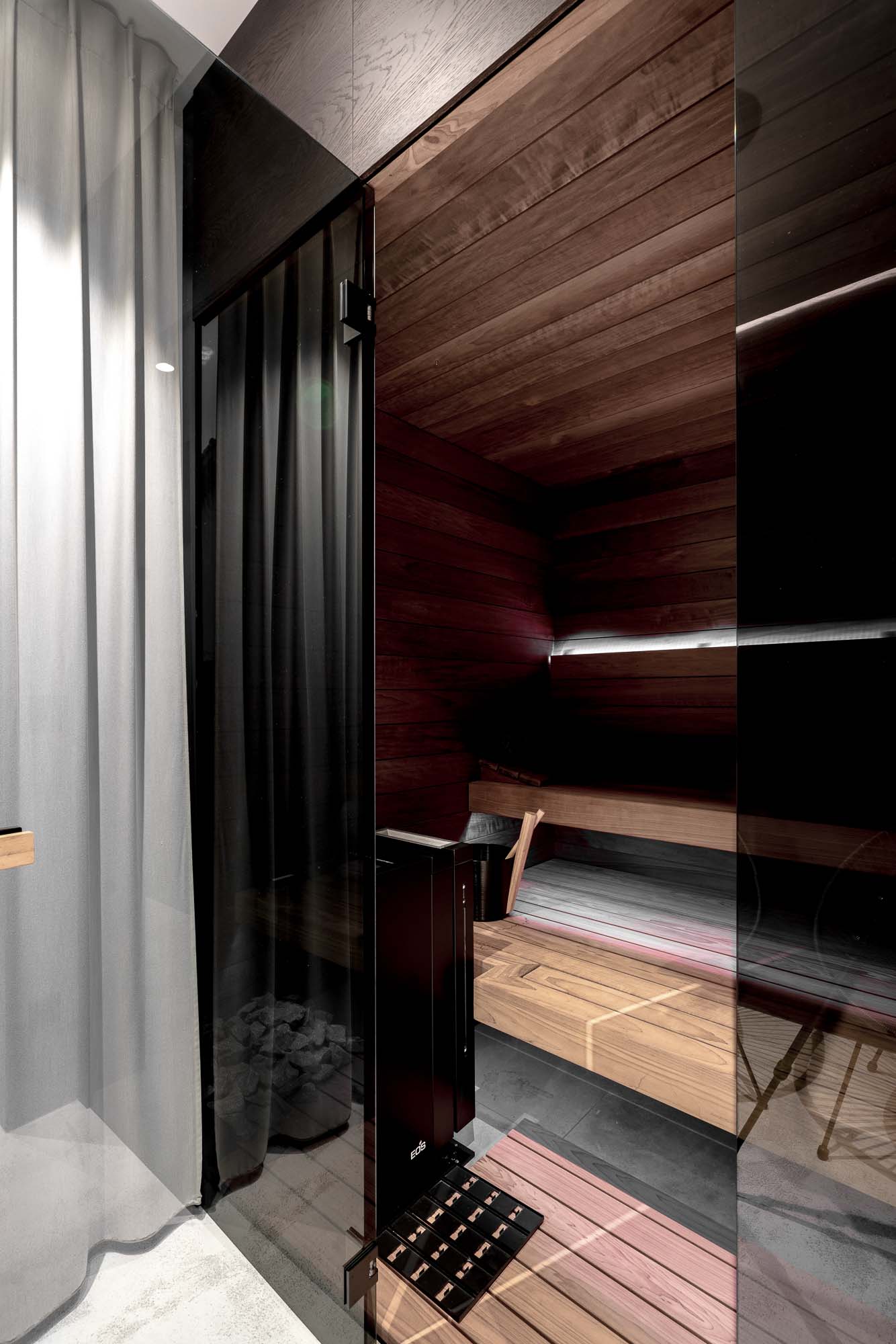
Steel and dark wood
The wellness area with sauna was designed in a significantly darker mood than the rest of the interior. Not for effect, but for atmosphere. Dark materials, lower light intensity, and the combination of raw steel with dark wood create a far more intimate environment.
The steel sink and metal details do not feel overly technical because they are balanced by the warmth of the wood and soft indirect lighting. The entire space feels calm rather than representative.
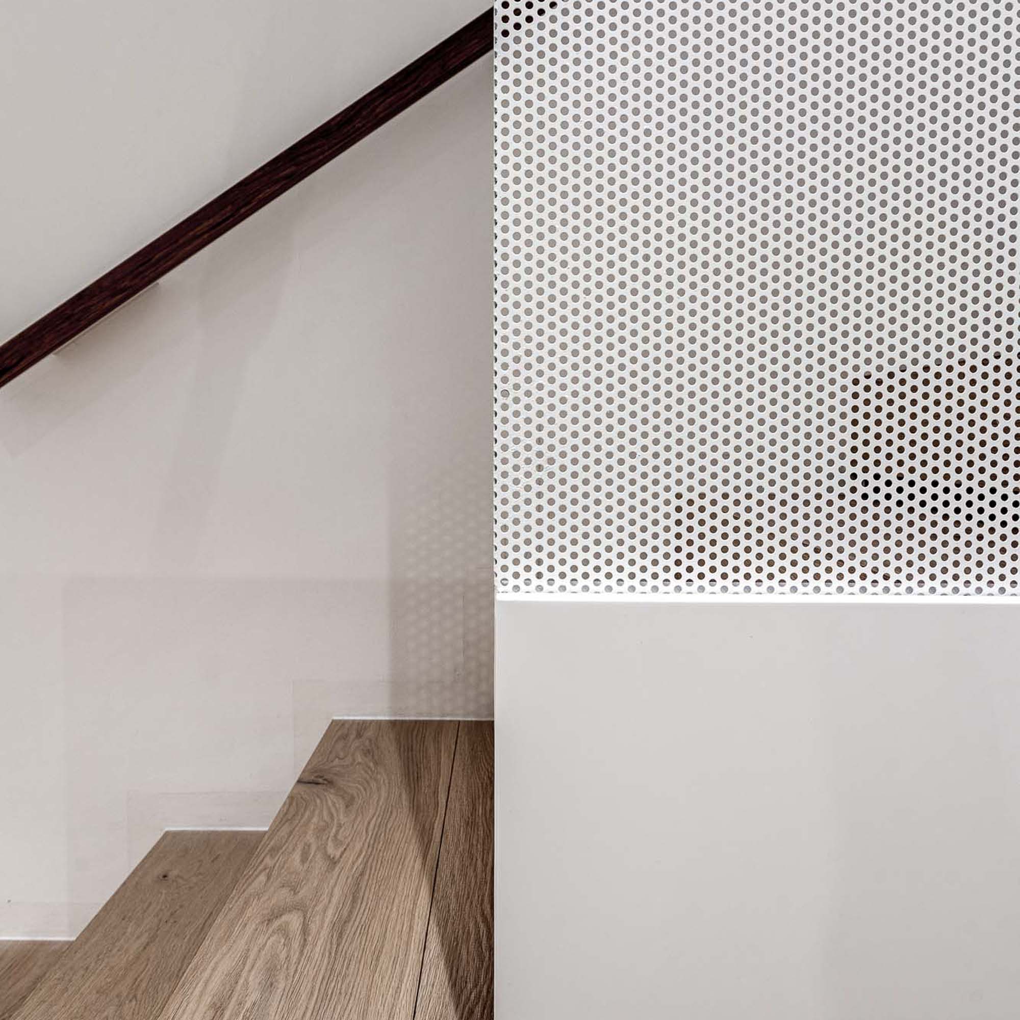
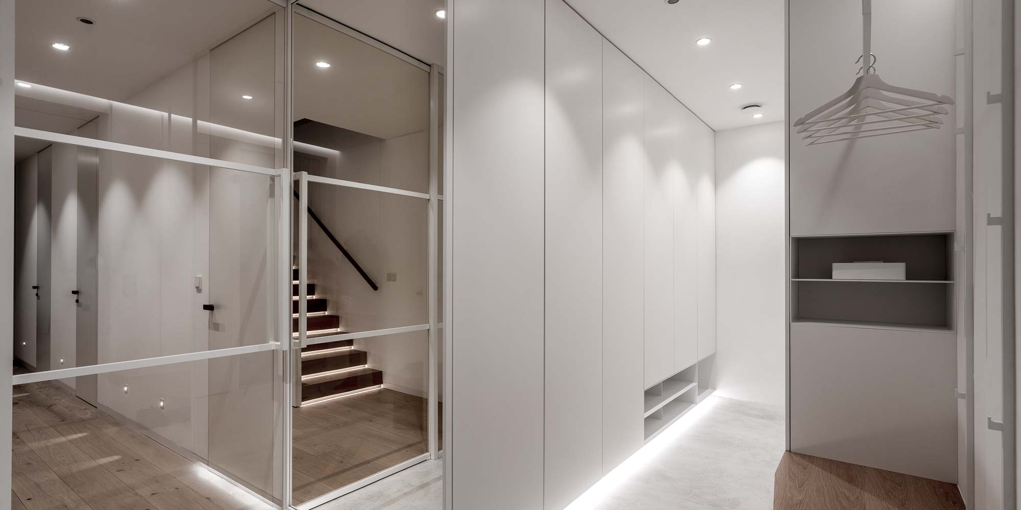
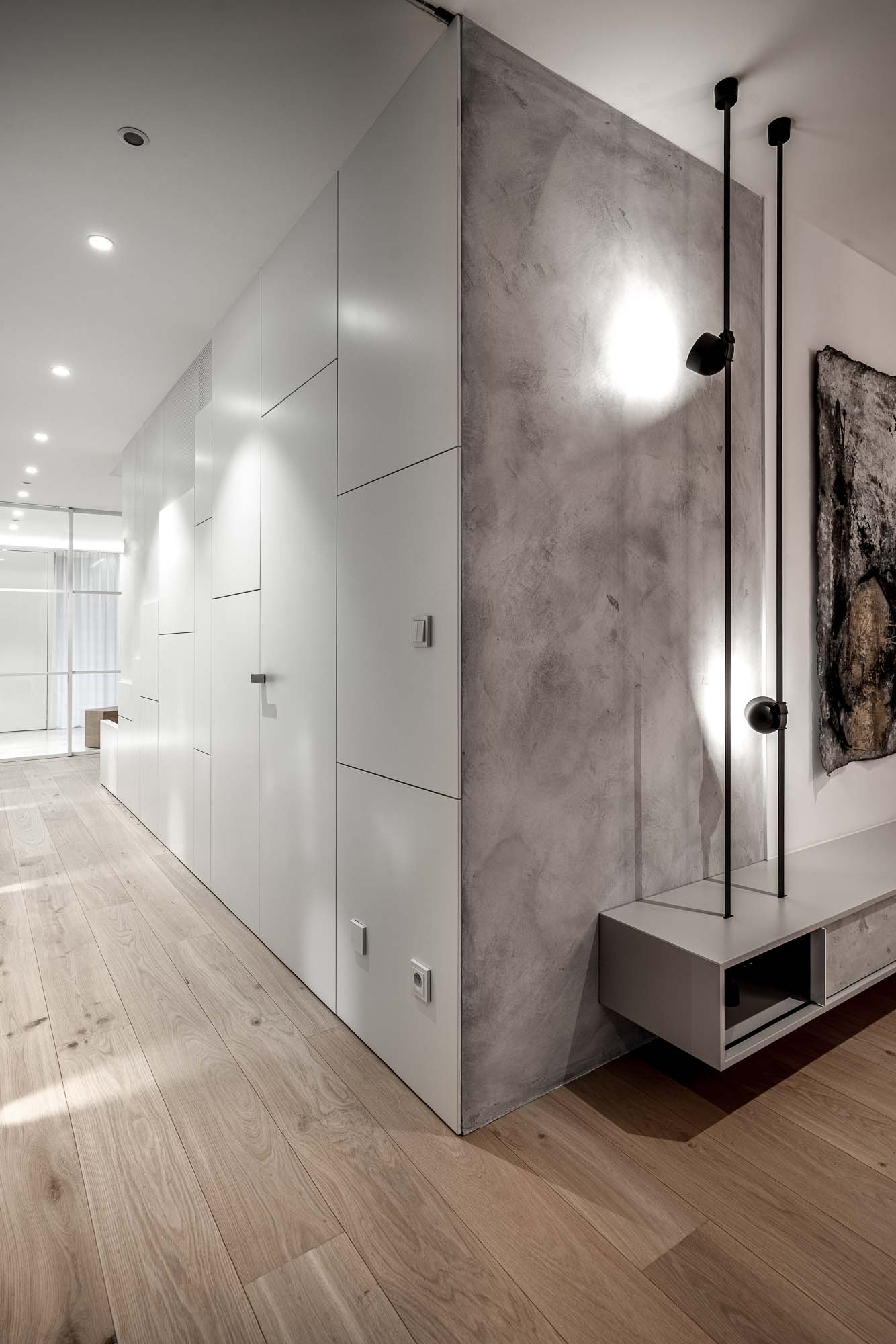
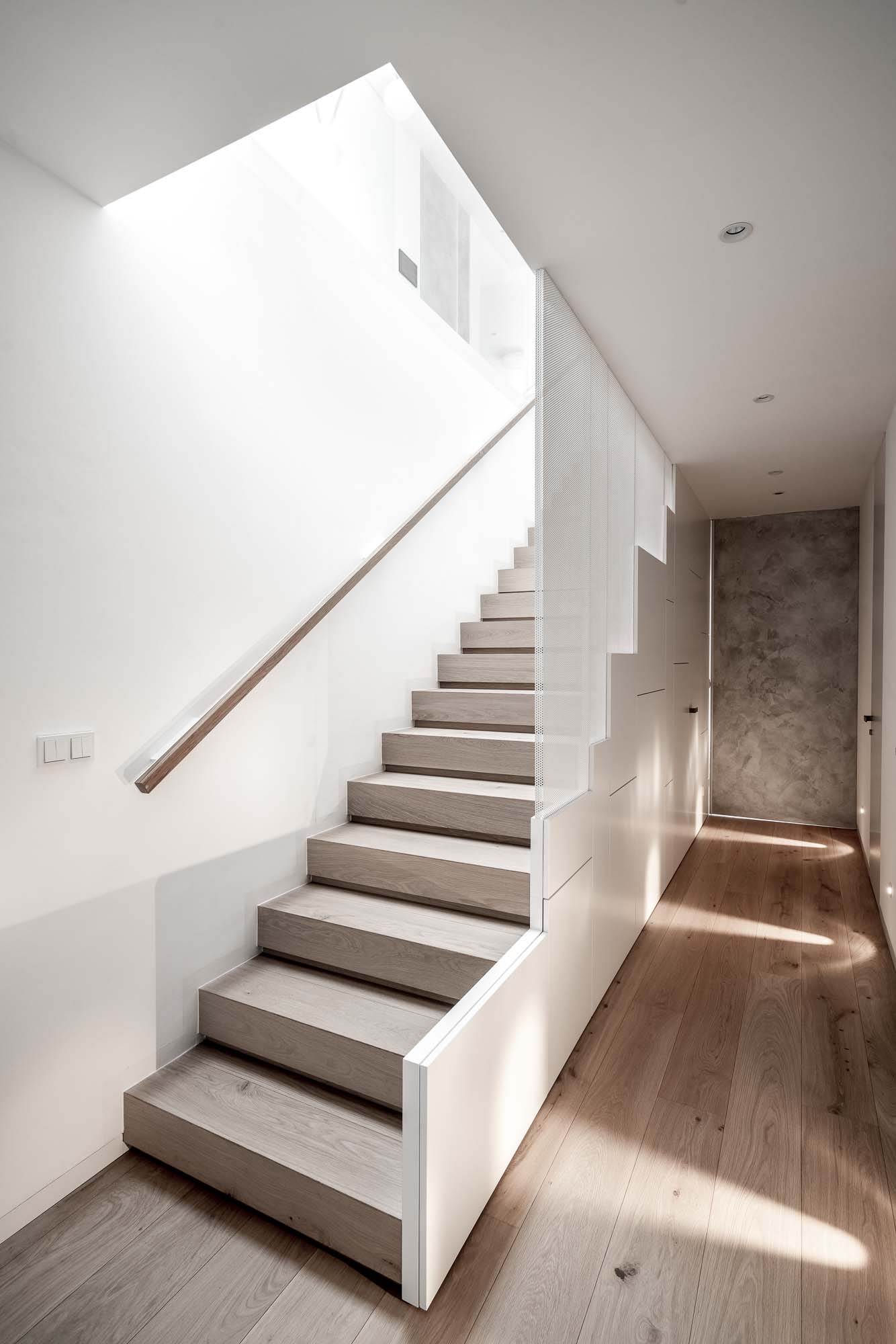
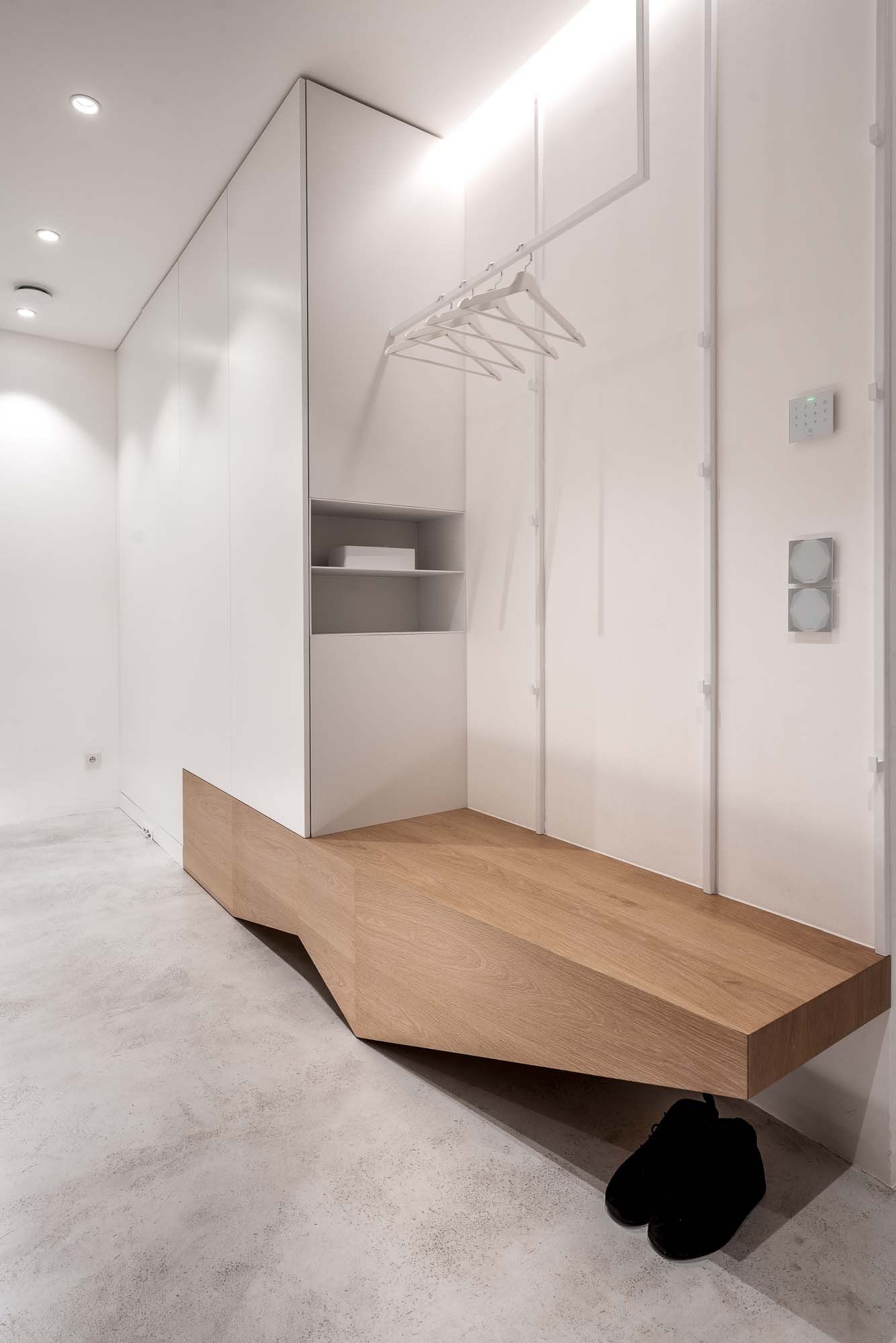
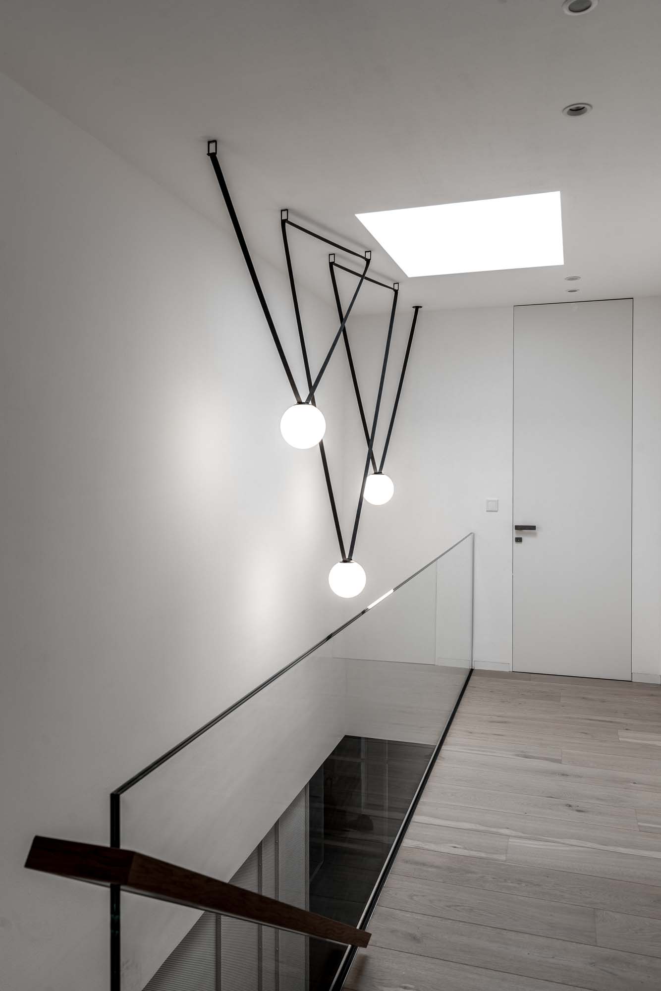
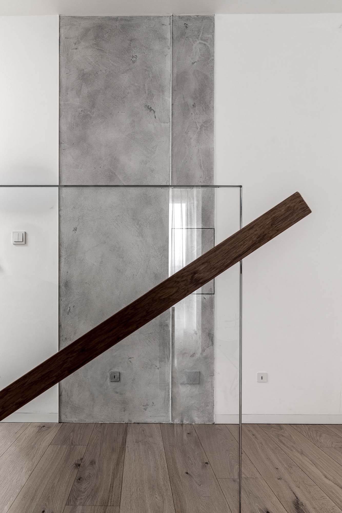
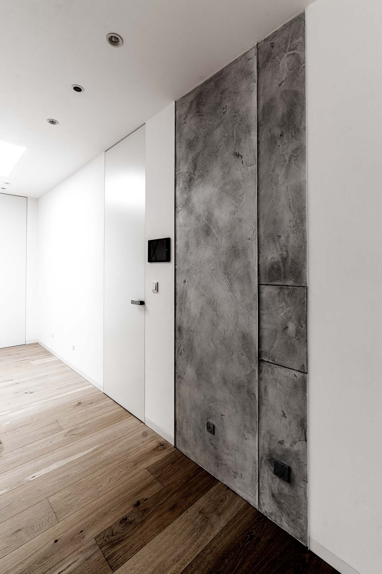
Light in the hallway too
The entrance area was designed to avoid the feeling of a long enclosed corridor. Large mirrored surfaces, glass partitions, and indirect lighting beneath the furniture and along the staircase help visually expand the space.
Built-in storage blends into the walls, allowing the proportions of the entrance to stand out. The staircase itself is simple and almost minimalist, yet thanks to the lighting and detailing it still feels light even within a relatively narrow space.
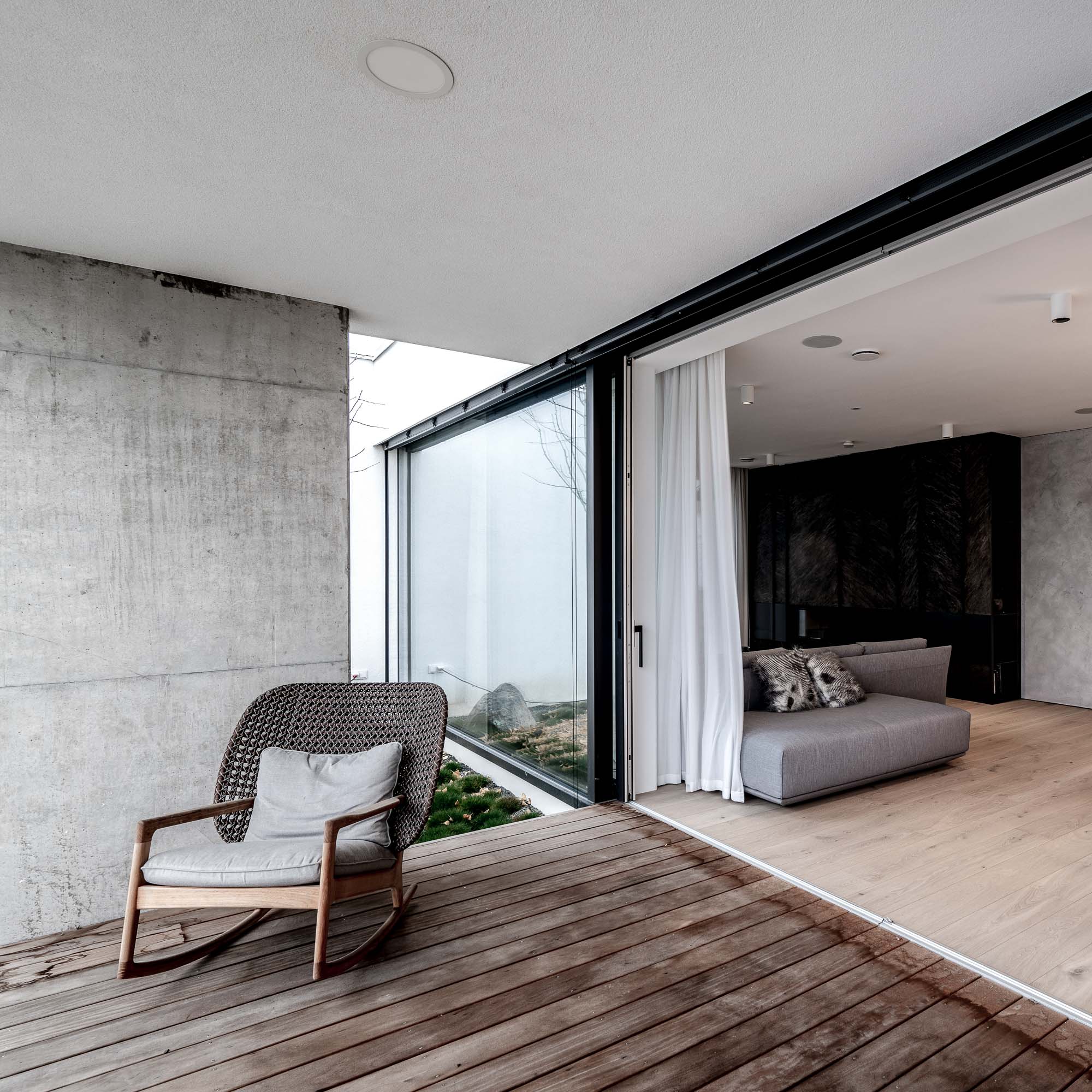
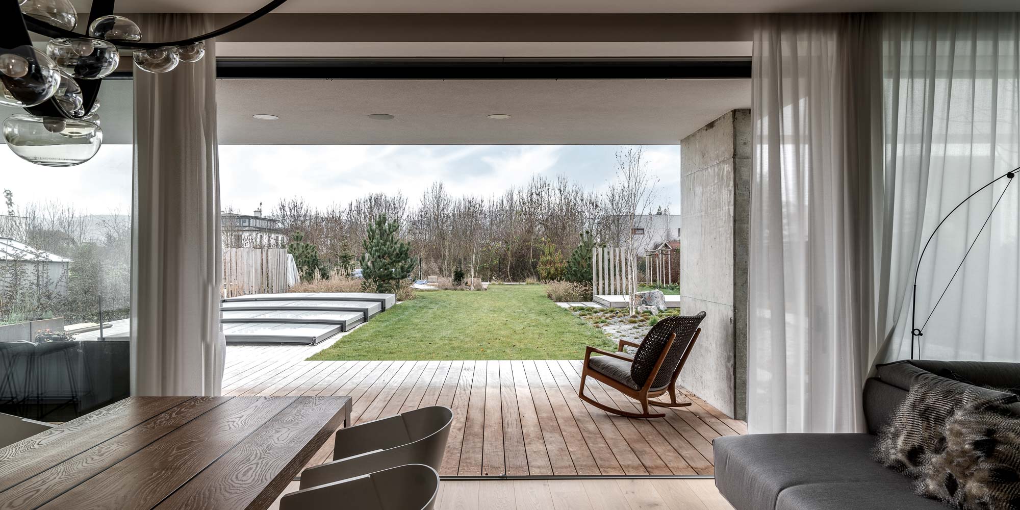
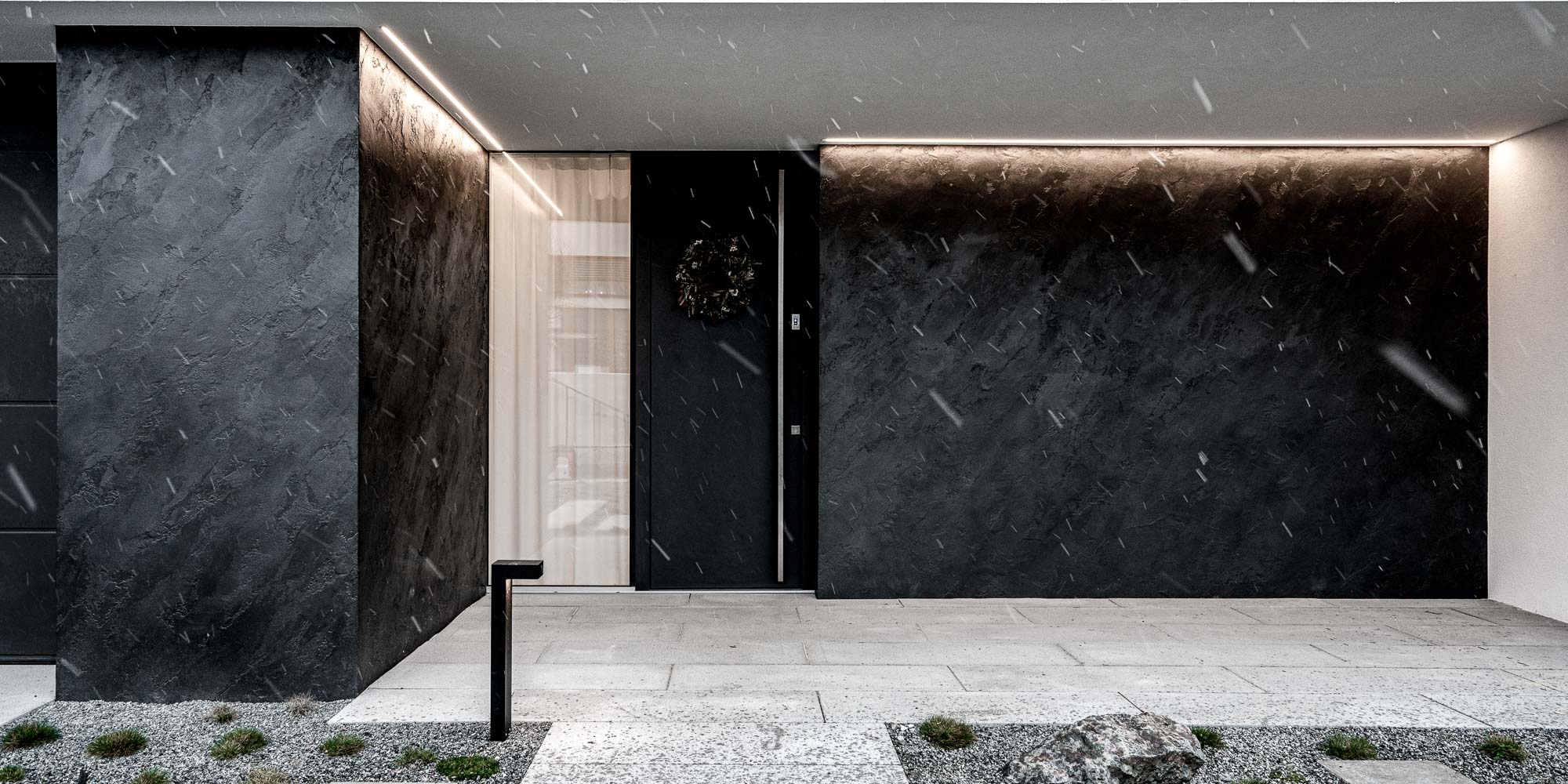
No boundary between the house and the terrace
The exterior naturally continues the interior. The terrace uses the same wood tones as the interior spaces, allowing both areas to merge seamlessly once the large sliding windows are opened.
This is also why we intentionally avoided classic wooden flooring inside the living areas and used plaster flooring instead. We did not want to deal with the visual difference between interior and exterior wood, since exterior wood ages much faster. Thanks to the neutral flooring, the exterior wood can naturally evolve over time without making the interior feel inconsistent after a few years.
The entrance façade also continues the material language of the interior, with parts of the exterior finished in the same plaster used inside the house. The project therefore does not feel like a separate shell with an inserted interior, but rather as one unified whole. The architecture of the house was designed by atelier JKH, with whom we closely coordinated the interior from the beginning so that architecture and interior design would function as one integrated concept.
Why do we love interiors?
Are you curious about how we approach interior design projects like these? Read more about it here in the INTERIORS section.
— Let's meet!
Do you have a similar project you'd like to discuss with us? Fill out this short questionnaire and we'll get back to you!
Petr - 19. 5. 2026