Renovation of the TIVOLI Apartment
What was originally a generous Art Nouveau apartment had been forcibly divided into two units during the previous regime and gradually devastated. The renovation started from scratch — repairing the floors, replacing damaged beams and bringing the apartment back together as a single whole.
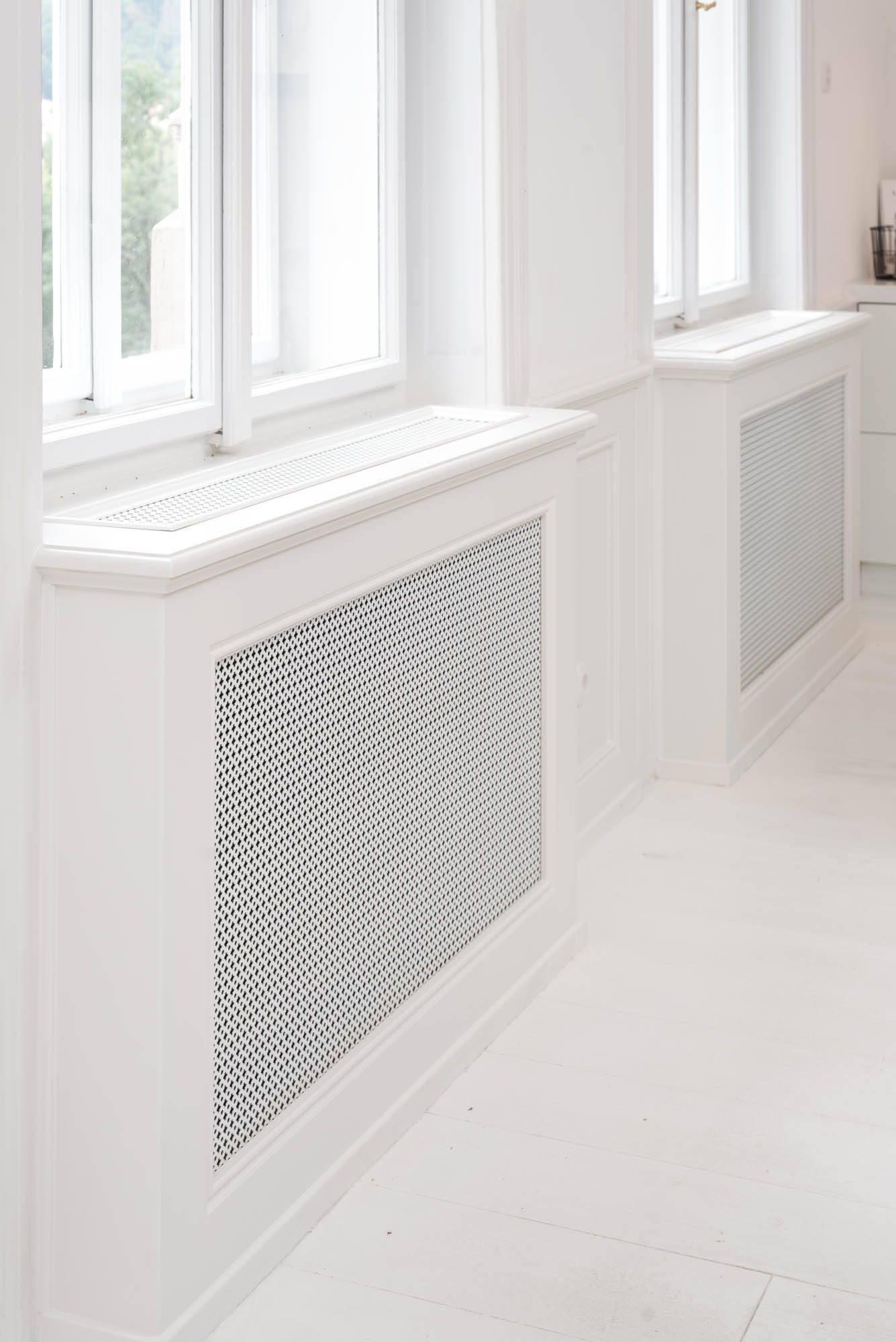
Almost none of the original elements had survived, so we rebuilt them. Cassette panelling, stucco, solid plank floors and radiator covers were paired with contemporary statement pieces, minimalist furniture and distinctive materials.
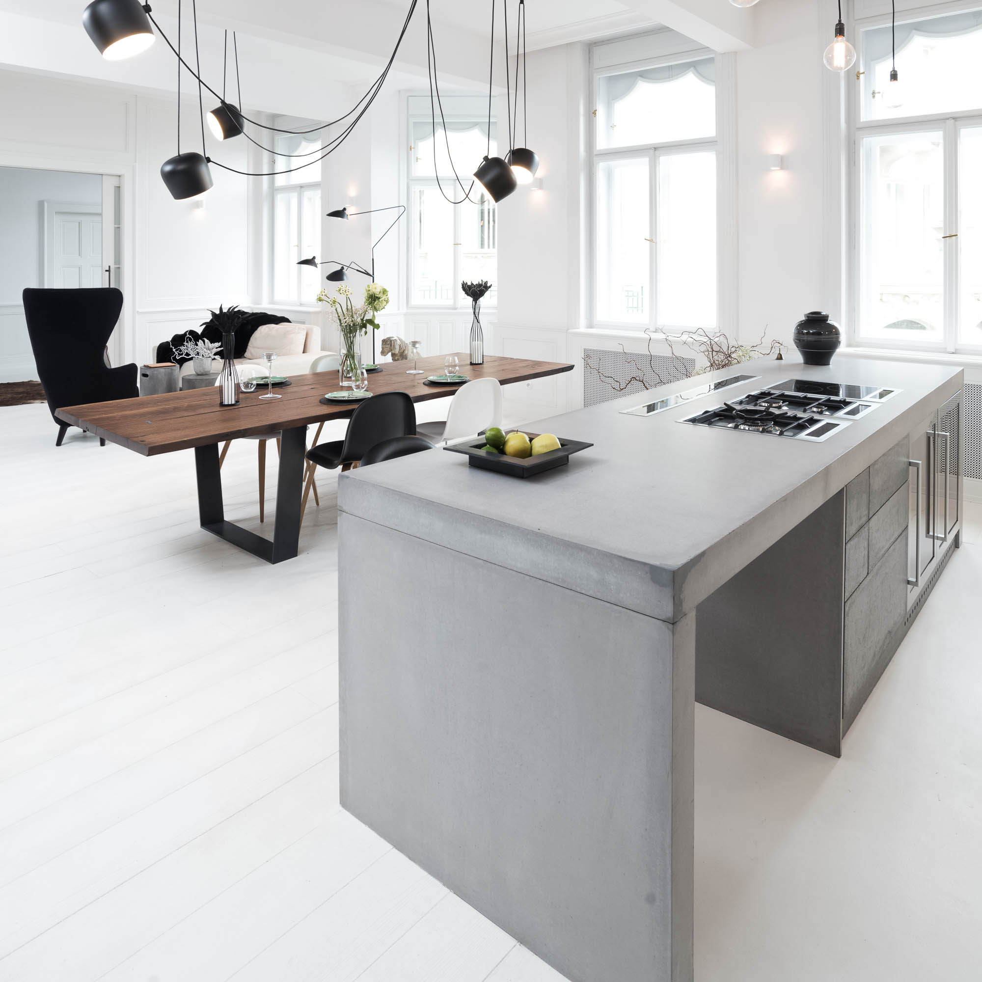
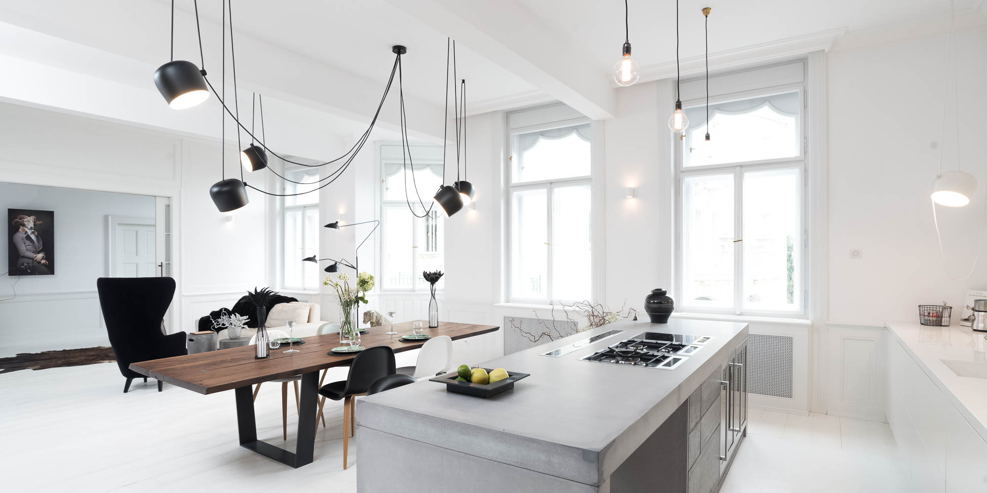
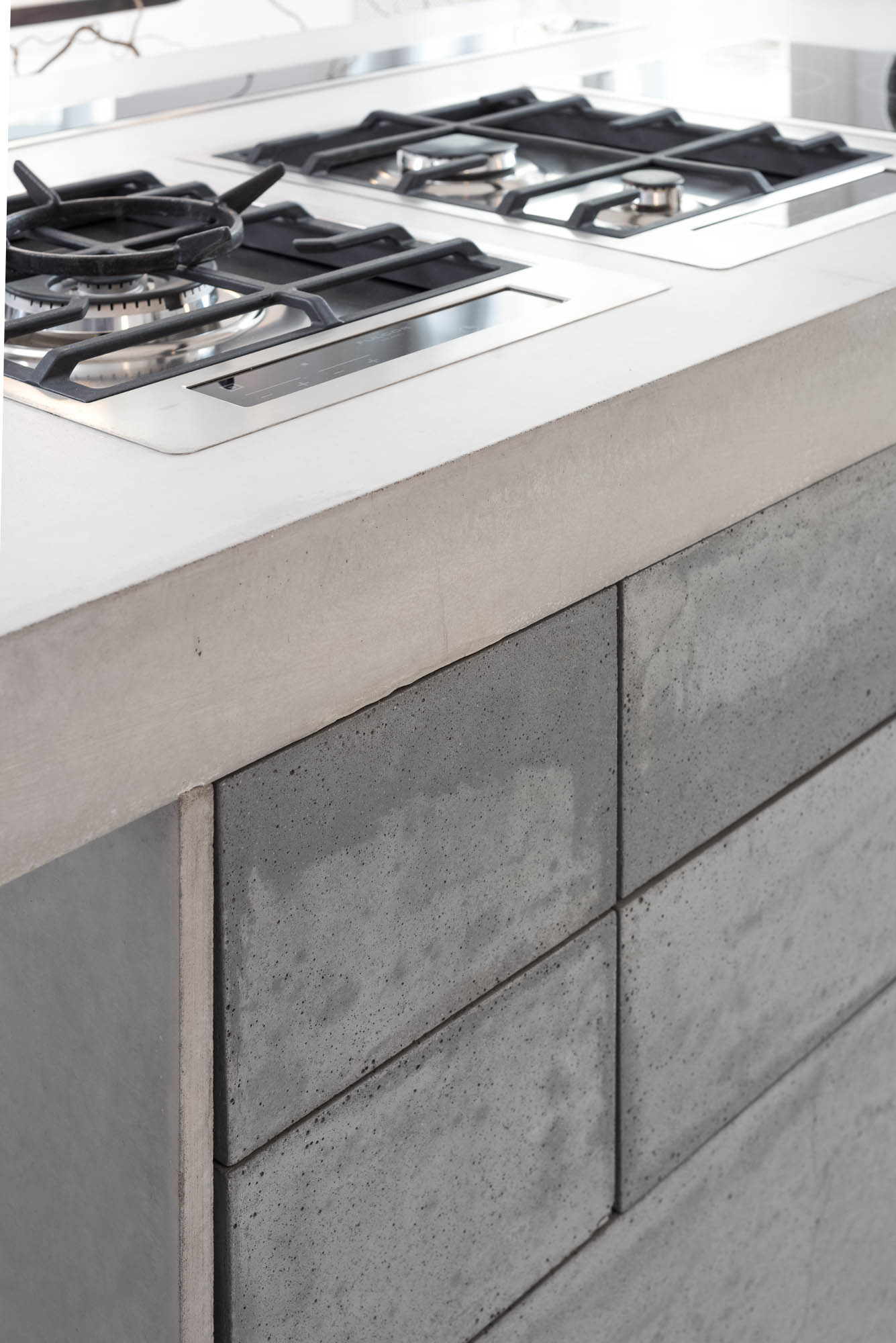
The concrete kitchen as a statement piece
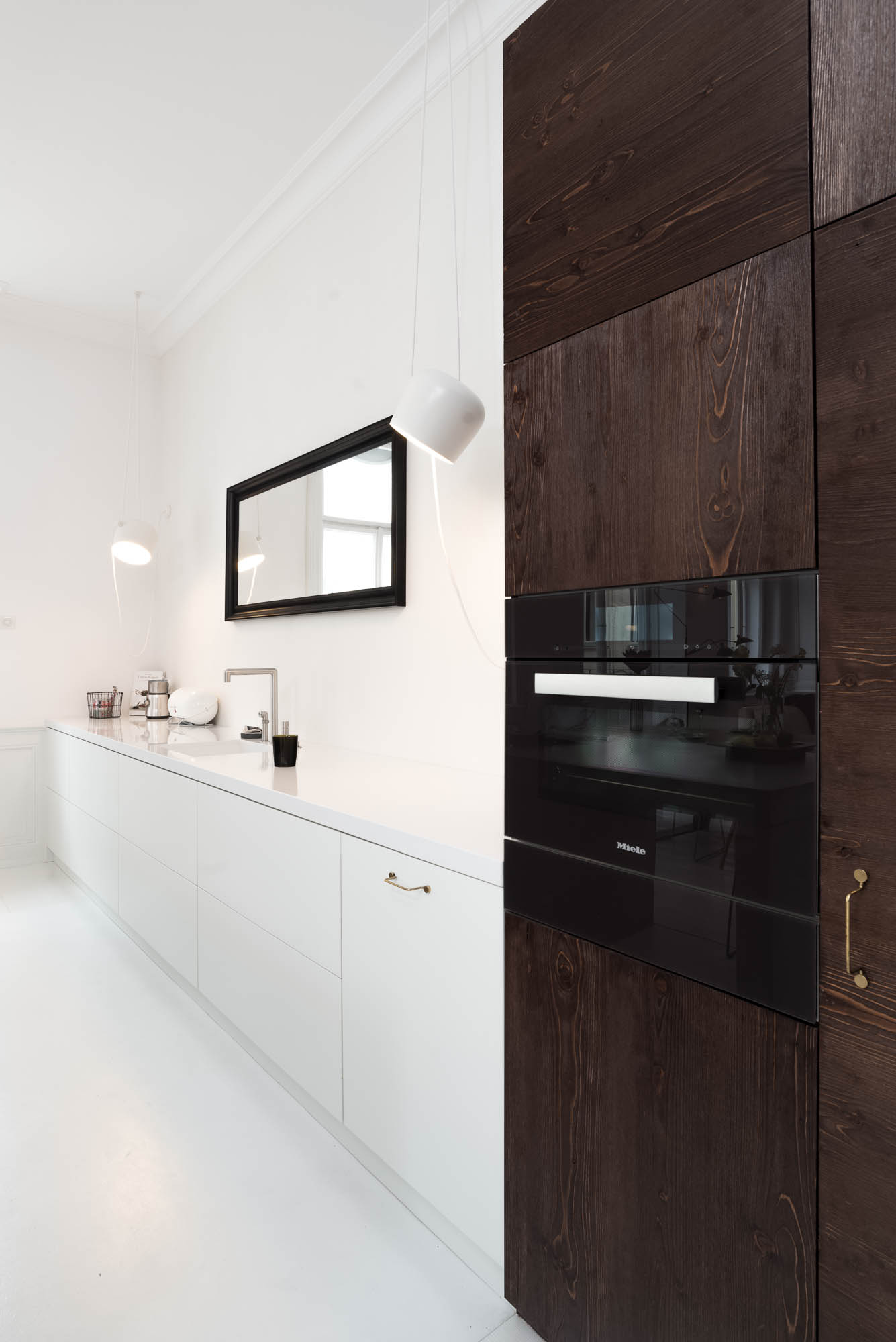
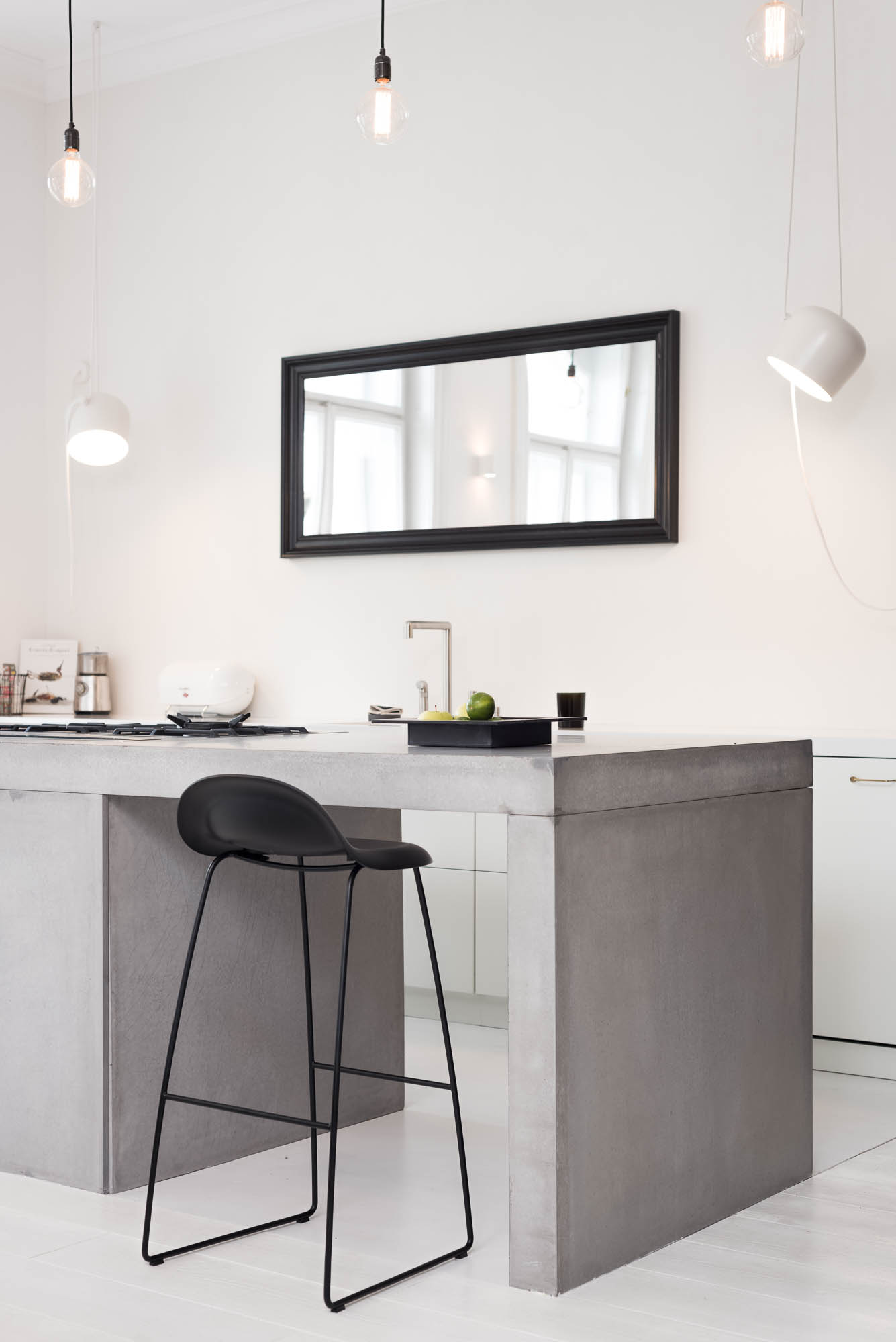
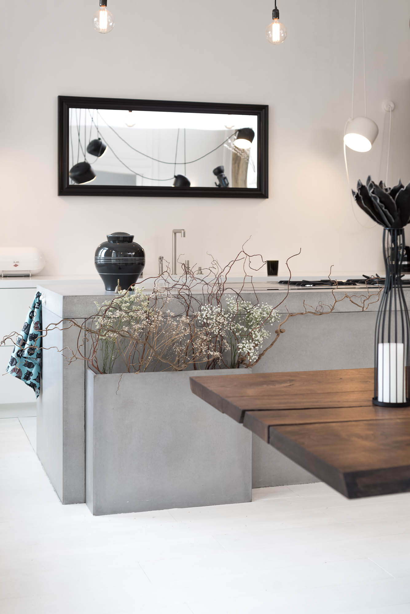
The kitchen is one of the most striking contemporary interventions in an otherwise classical setting. It isn’t just “concrete in appearance” — it is genuinely assembled from cast concrete panels, including the drawer fronts. That’s precisely what stops it from feeling like a decorative effect and makes it read as a heavy, precise piece of architecture placed inside a historic interior.
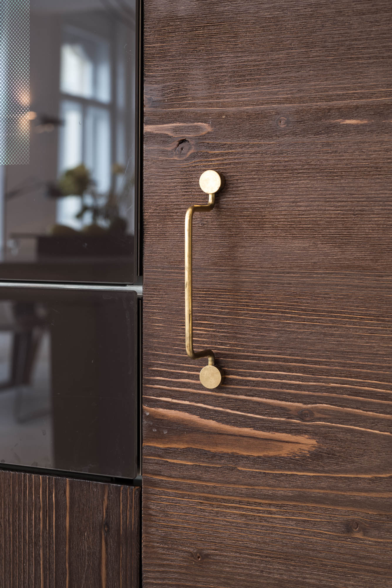
We deliberately left it without upper cabinets so that it wouldn’t behave as yet another wall of things in the open living space. In their place, a mirror above the work surface visually extends the room and keeps the kitchen calm. Alongside the concrete island sits a lower unit with the sink and a tall appliance cabinet whose presence is closer to an old armoire than a conventional kitchen assembly.
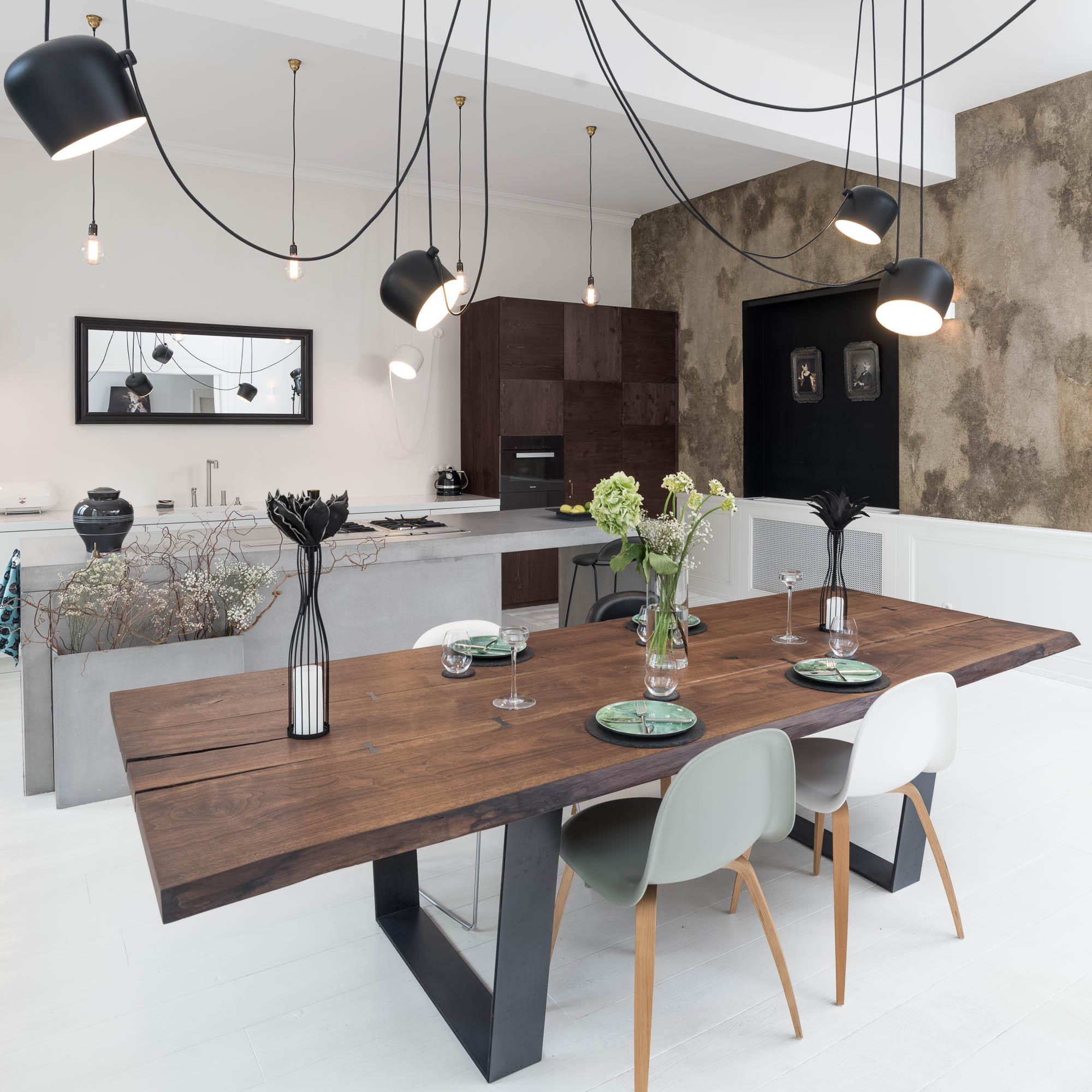
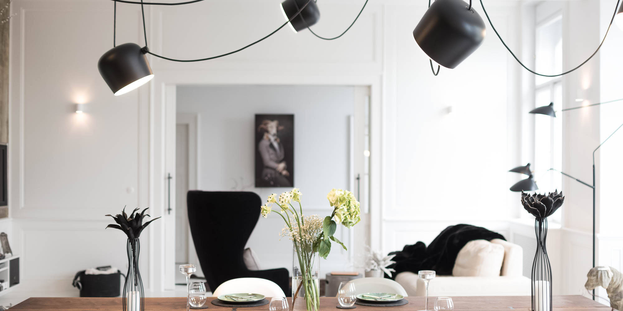
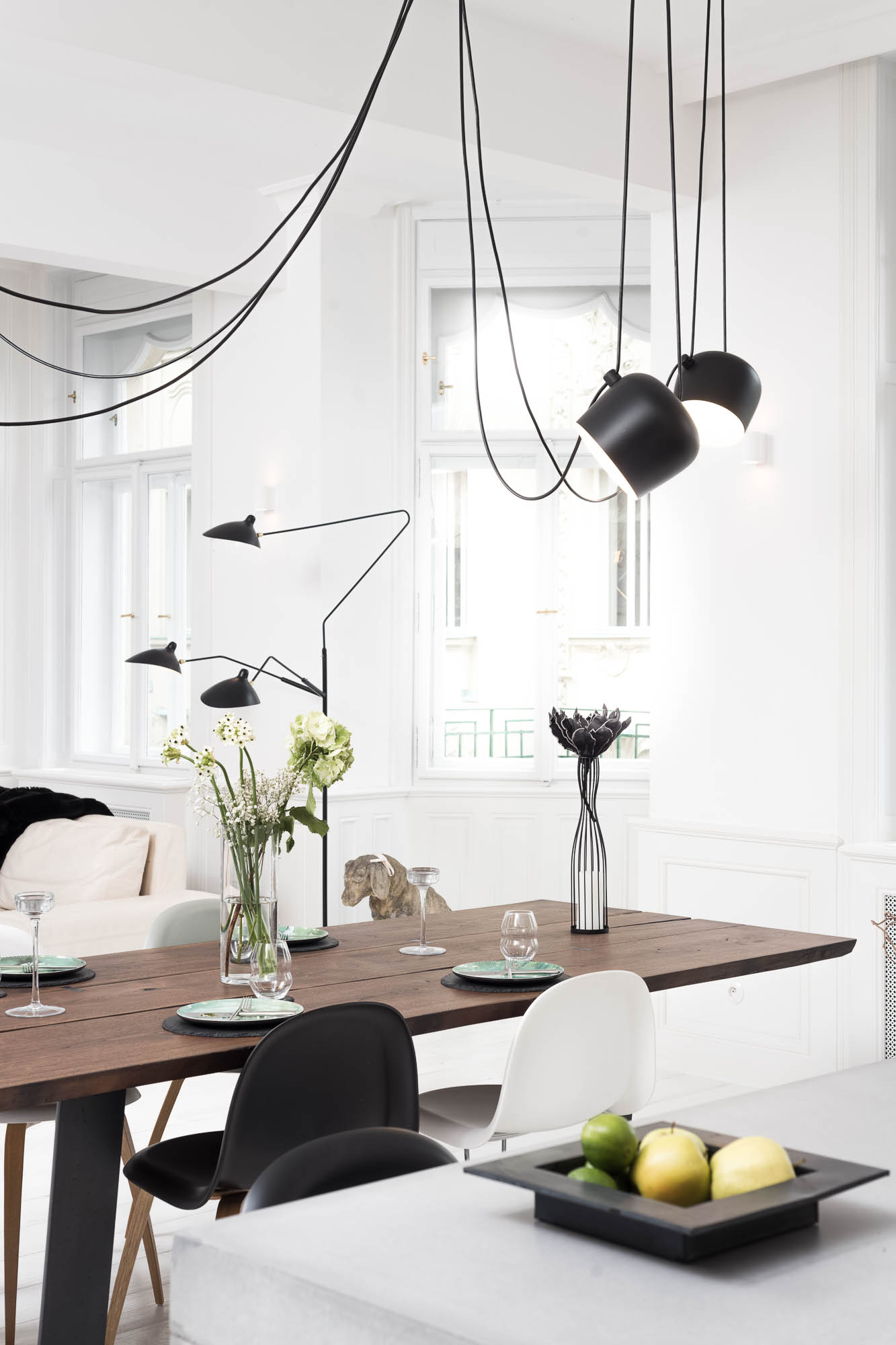
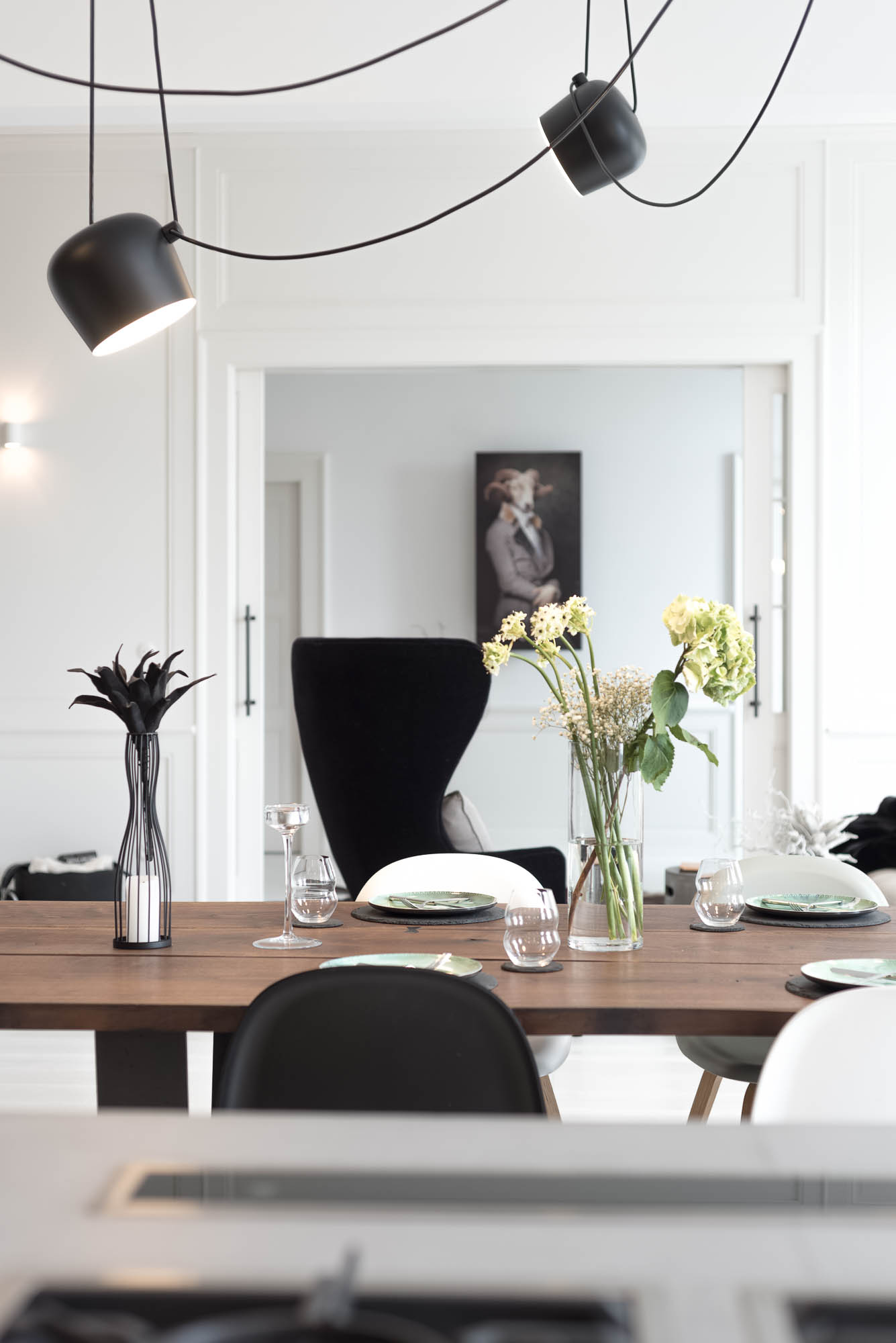
The dining room as the heart of the apartment
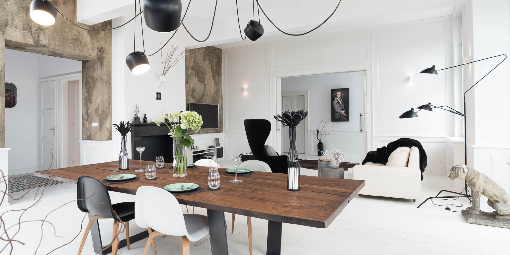
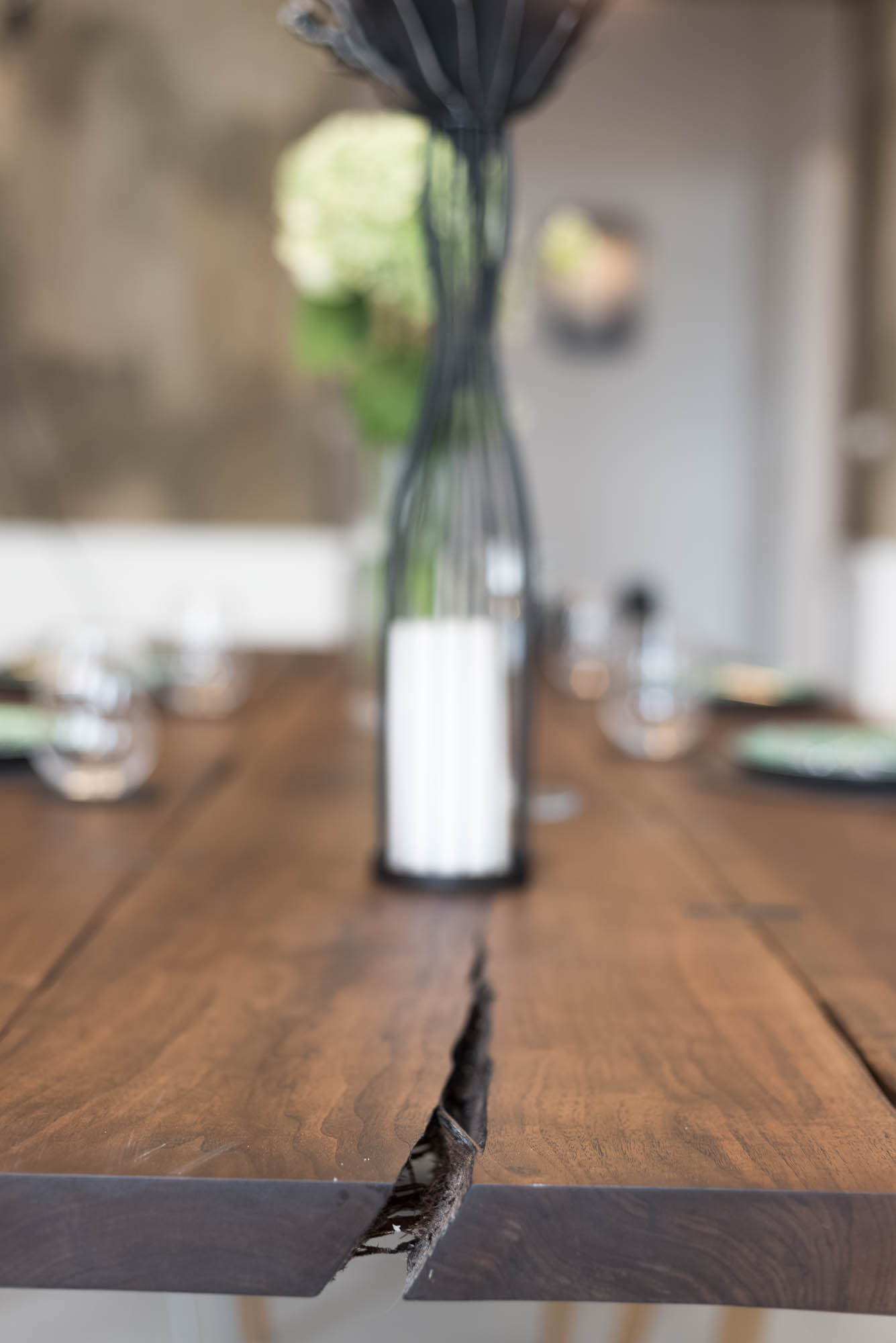
The dining table is exactly the kind of statement piece around which an entire apartment begins to fall into place. It stretches over three metres, is made from solid American walnut, and we let the natural cracks and irregularities speak for themselves. These are held together with steel butterfly joints, so the table doesn’t feel polished — it feels more like a piece of material that has held on to its own strength.
Above it hangs an oversized light fitting that helps give scale to the large space. The dining room is therefore not just a place for a table and chairs, but the genuine centre of the apartment — the element that holds the living space together.
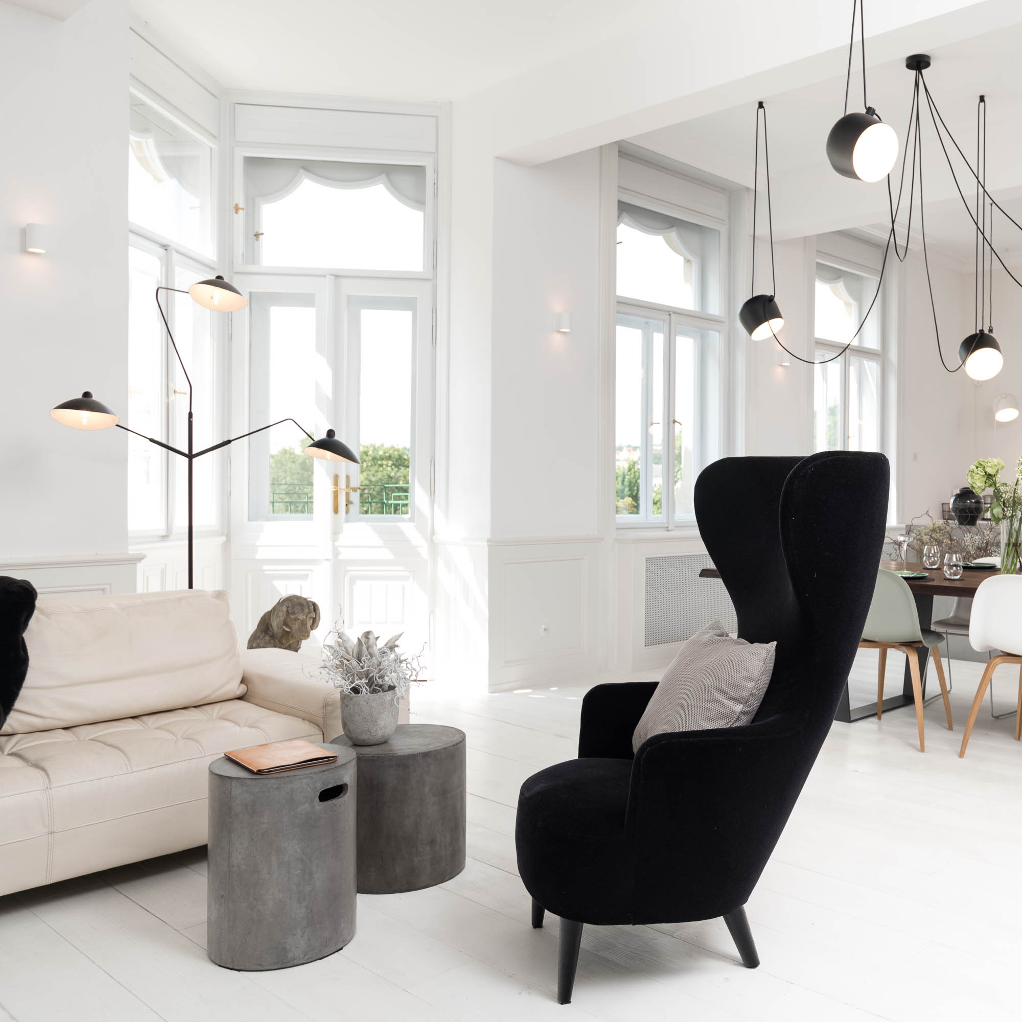
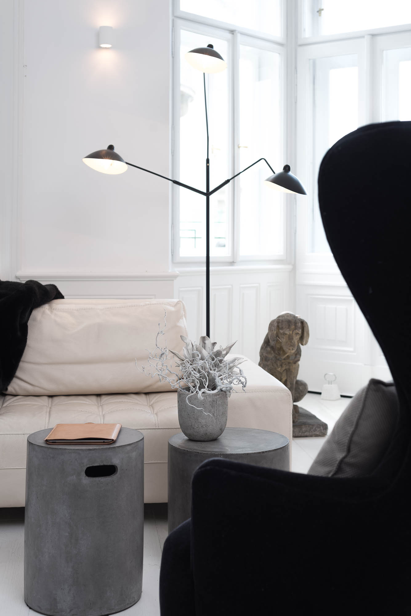
Extending the living room
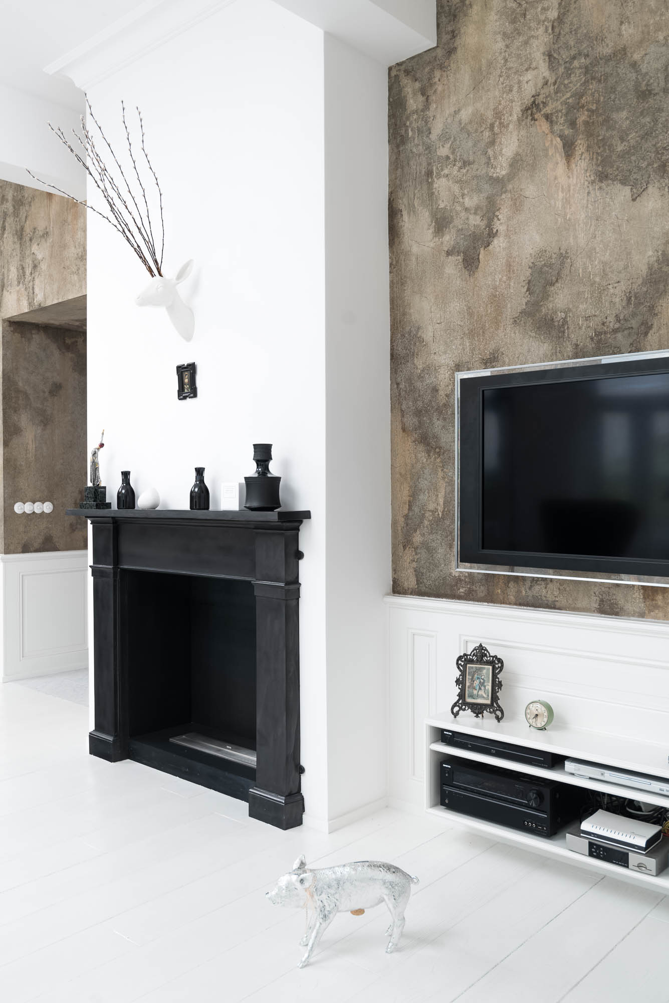
The living space is anchored by a black Victorian fireplace with a bio insert. We had no interest in a romantic decoration or a historicising replica. We were looking for a simple, geometric form that would carry the strength of an original element while holding its own in a contemporary interior. In the end, we sourced the frame from Britain.
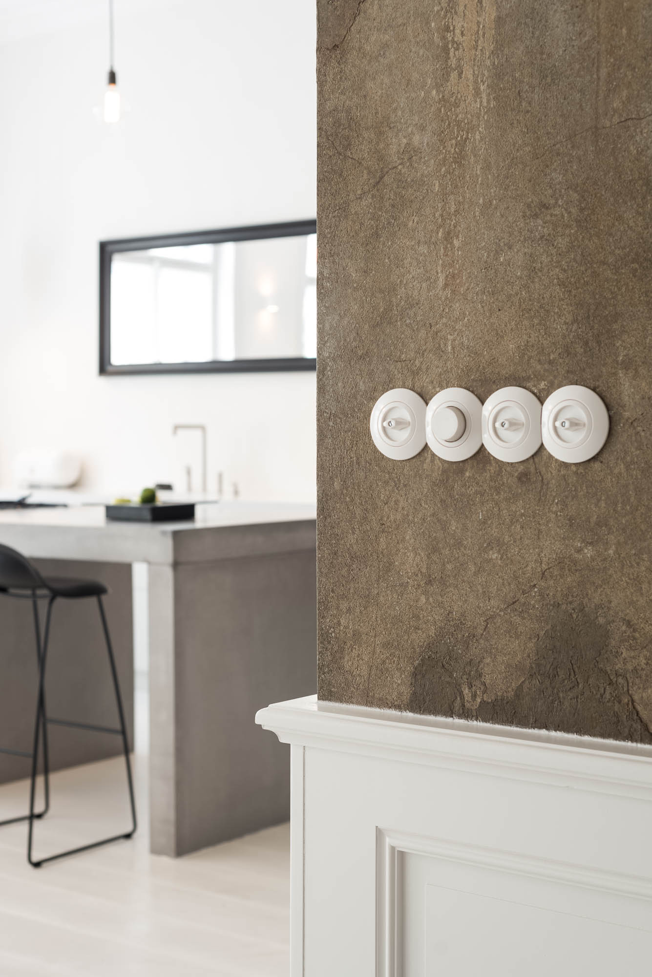
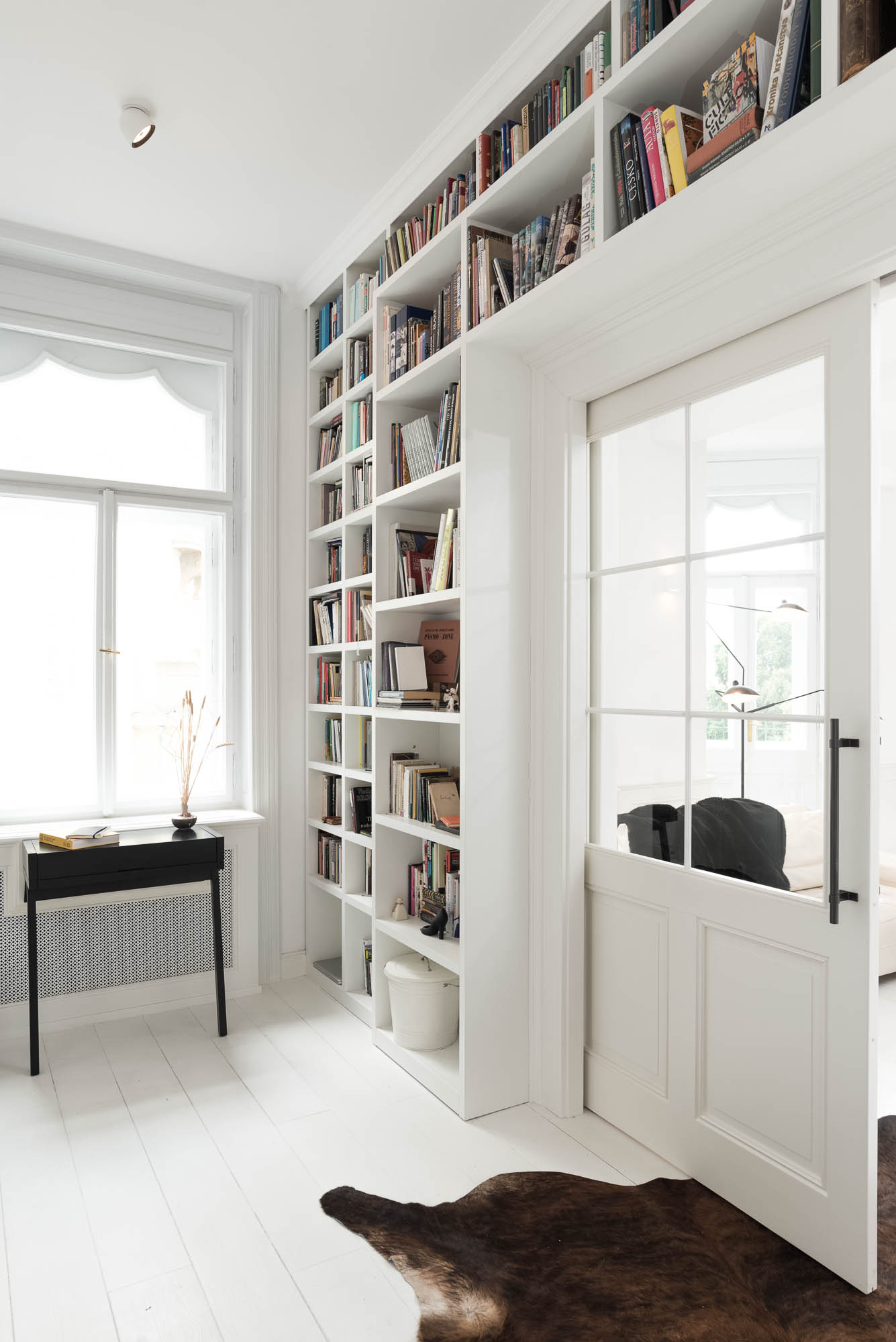
A strong layer of the space is also the distinctive wall painting. Originally we wanted to preserve only the scraped remnants of old paintwork, but new runs of services inside the walls would have destroyed the original composition entirely. So we didn’t abandon the idea — we simply translated it elsewhere. The result is a textured painting inspired by film set backdrops, executed at the time by someone from the Barrandov Studios workshops. The living room connects to a study separated by large sliding pocket doors. Here too we played with the details, and everything from the bookcase to the handles was made to measure.
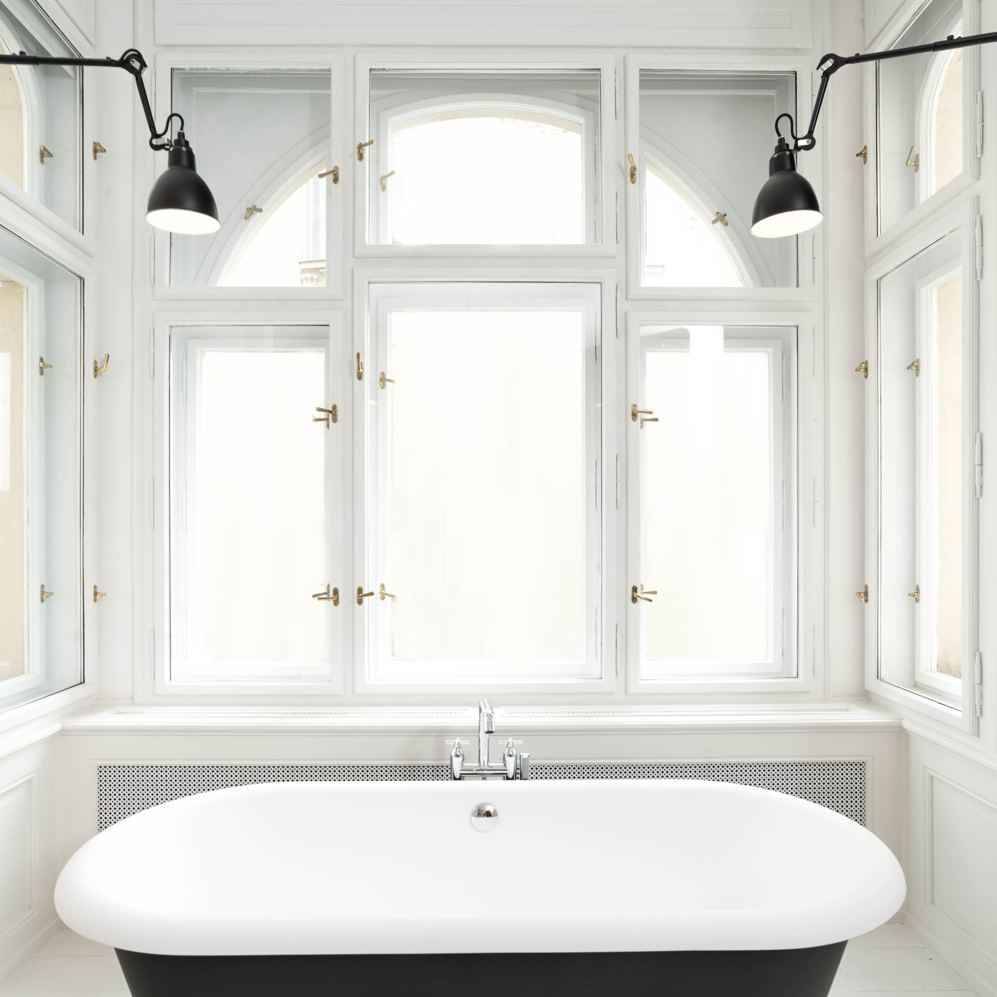
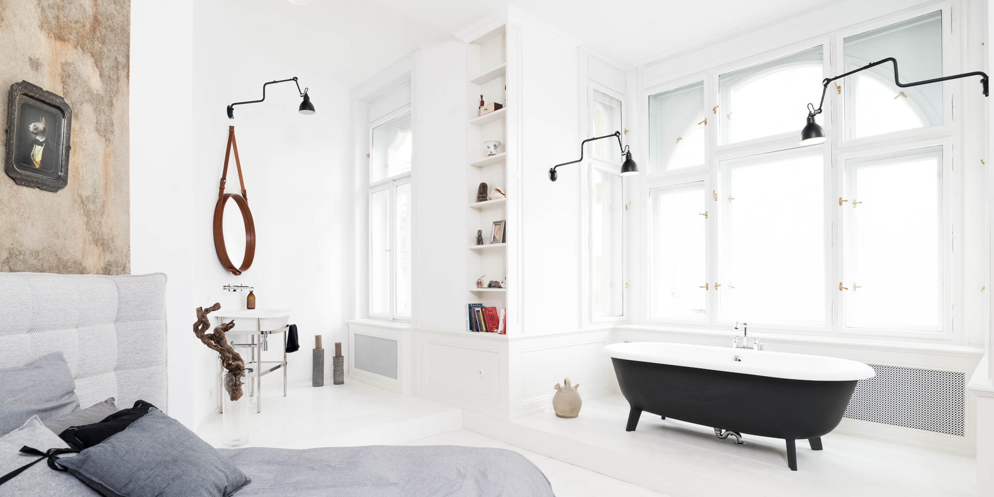
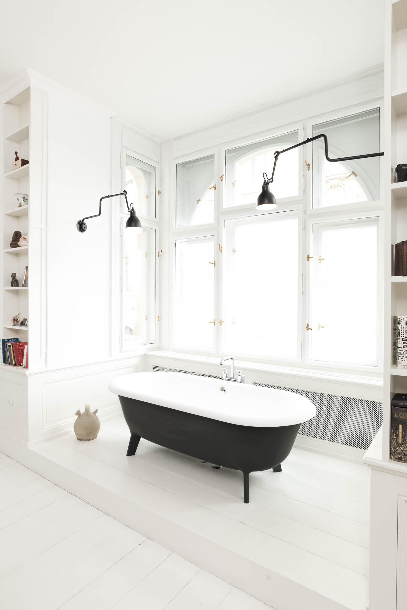
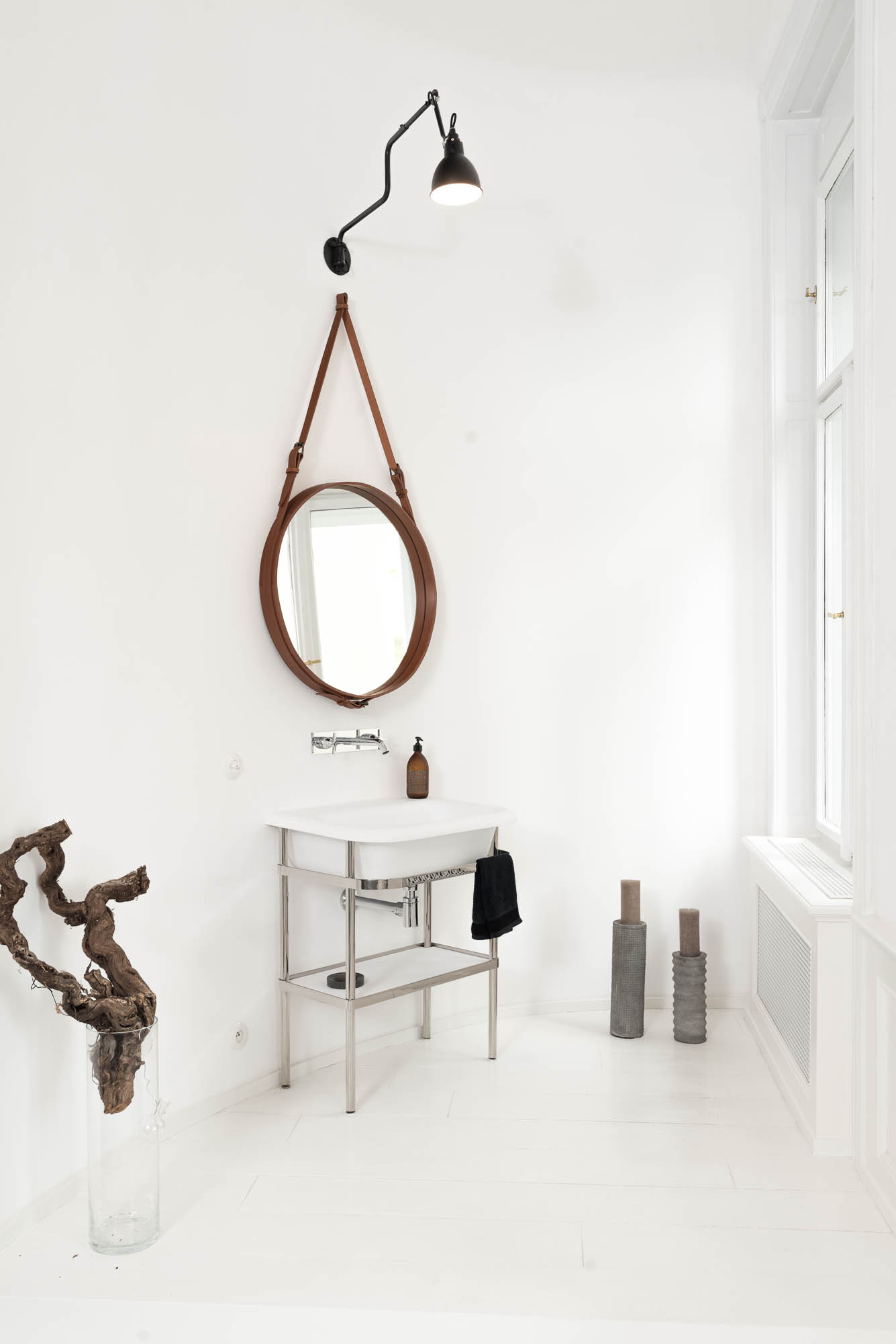
The bedroom with a bath in the view
The bedroom has a particular stillness that comes more from its proportions and atmosphere than from the quantity of its furnishings. It also contains a bath placed in the bay window on a raised platform, so you can look outside while lying in it. That moment alone gives the space something extra — it’s not just a bedroom with a bathroom, but a private corner that makes full use of what an old house has to offer.
The same principle that runs through the whole apartment holds here too: the historic frame stays, but the new interventions are unambiguously of today.
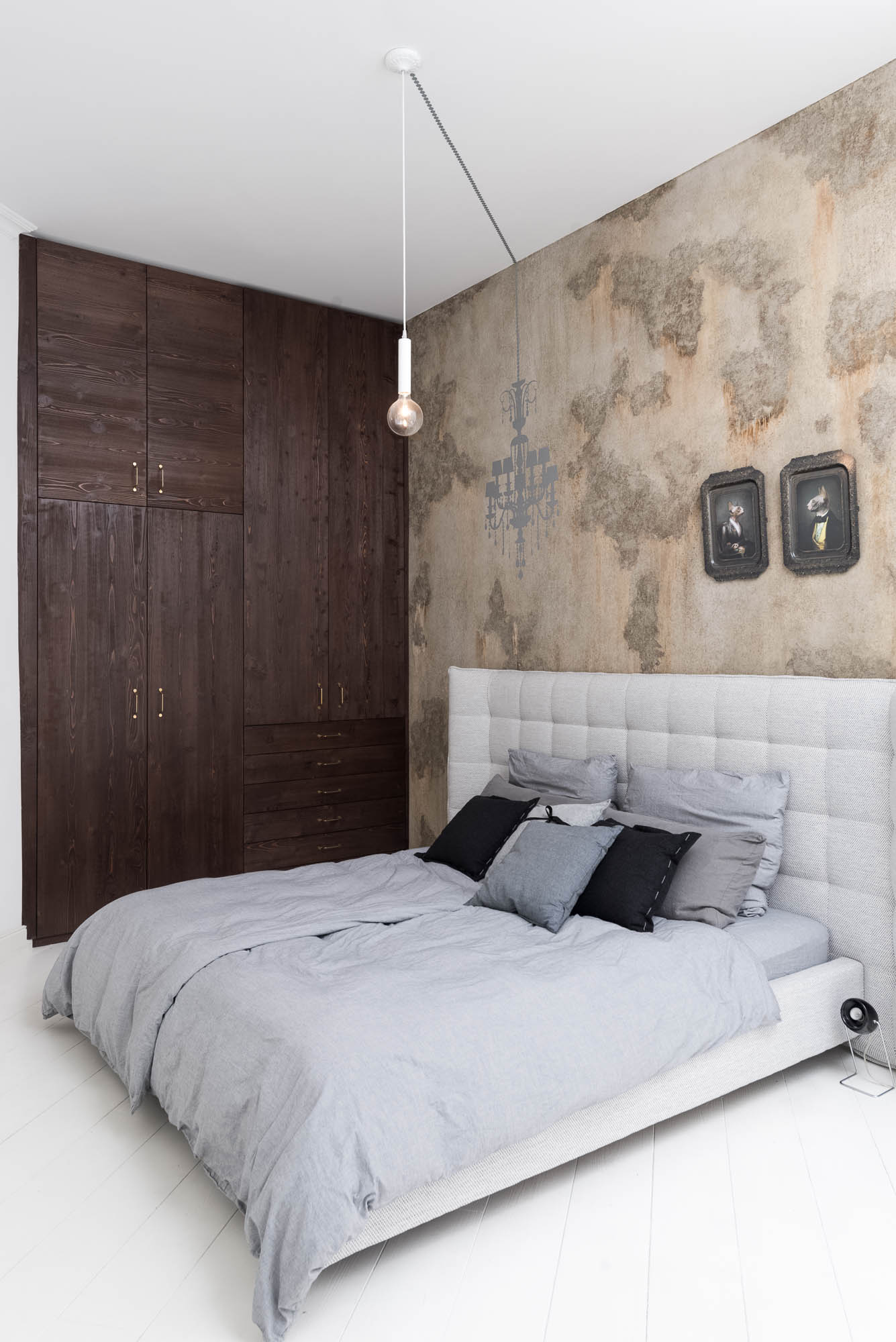
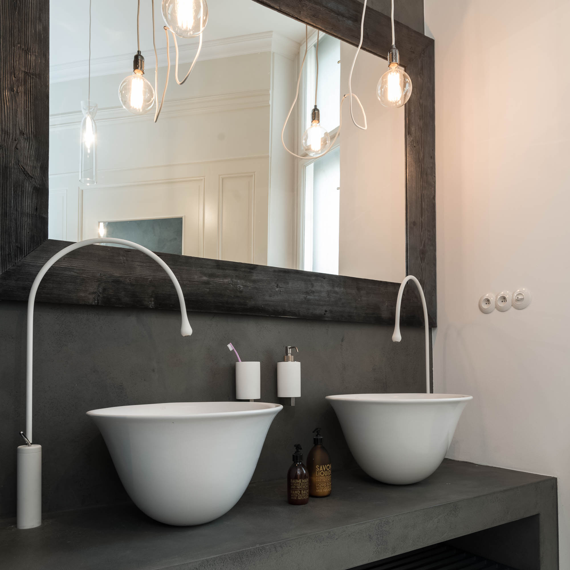
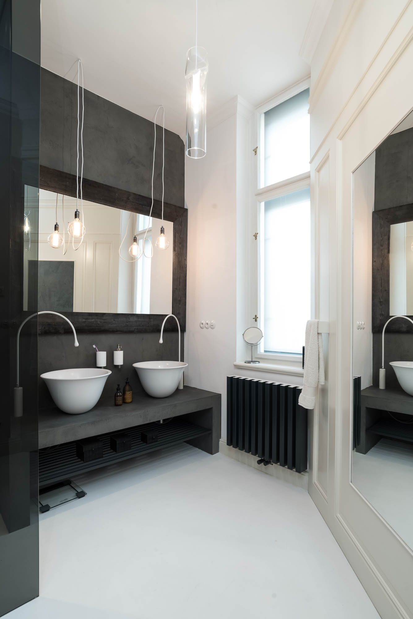
Second bathroom and guest room
The second bathroom takes the opposite approach — more enclosed and considerably darker. It works with render, white basins and white taps, giving it an almost graphic quality. It’s a different register from the rest of the apartment, but it holds to the same discipline in materials and details.
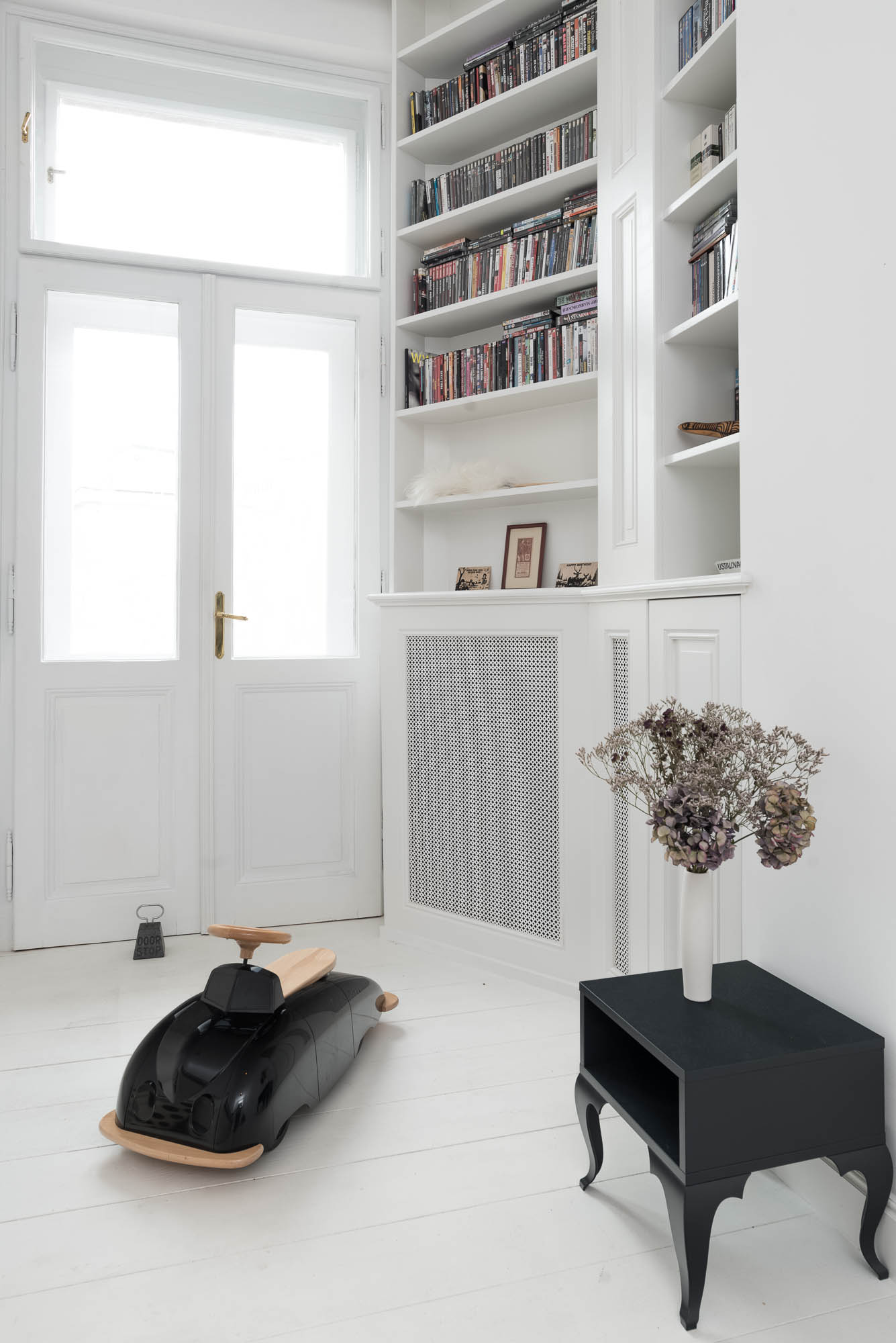
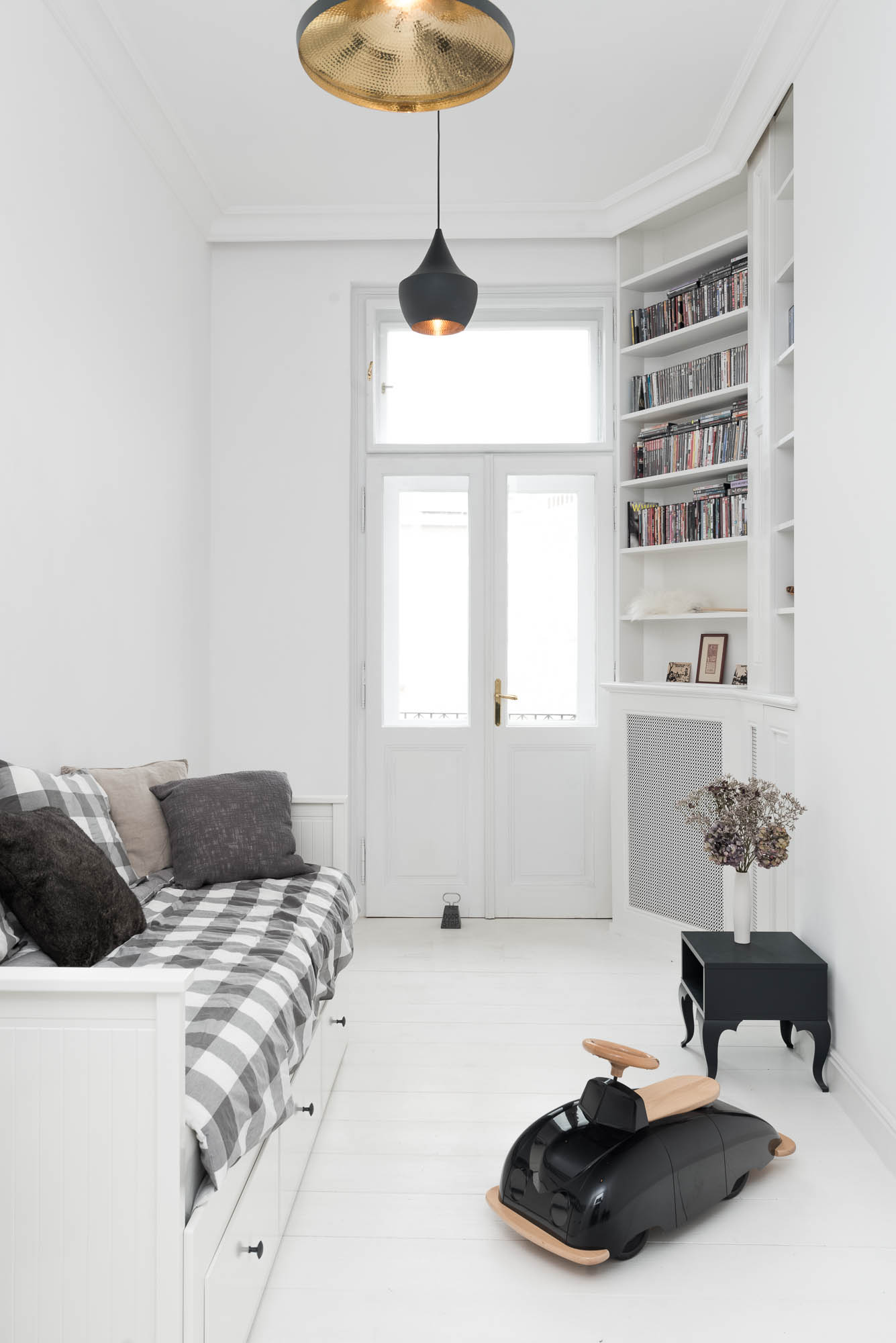
The children’s or guest room is calmer and more restrained, but here too we had no intention of compromising on what makes an interior of this kind complete. The cassette panelling, built-in furniture and concealed radiator keep the whole project coherent even in the parts that aren’t the most visually prominent at first glance.
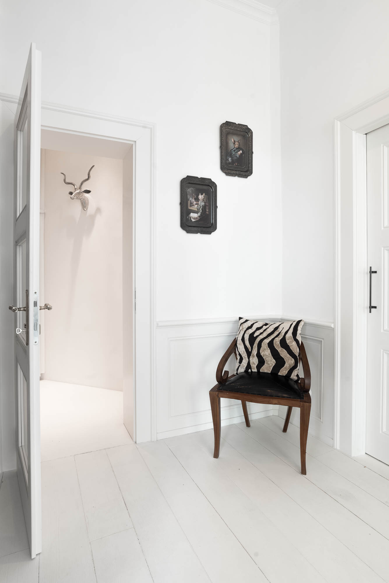
The entrance hall as a first impression
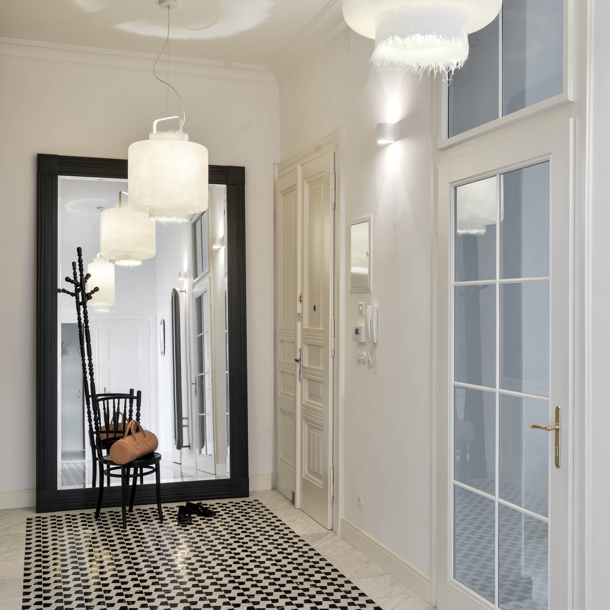
The hallway is the first place where it becomes clear that this renovation didn’t take the route of replica, but of a precise new layer. The floor is a new stone mosaic in three colours of marble with detailed borders — it evokes the original floors of the building without being a literal copy.
Into this we introduced contrasting fibreglass light fittings suspended from the ceiling. It’s exactly this collision between a retro principle and a contemporary detail that we enjoy most in renovations.
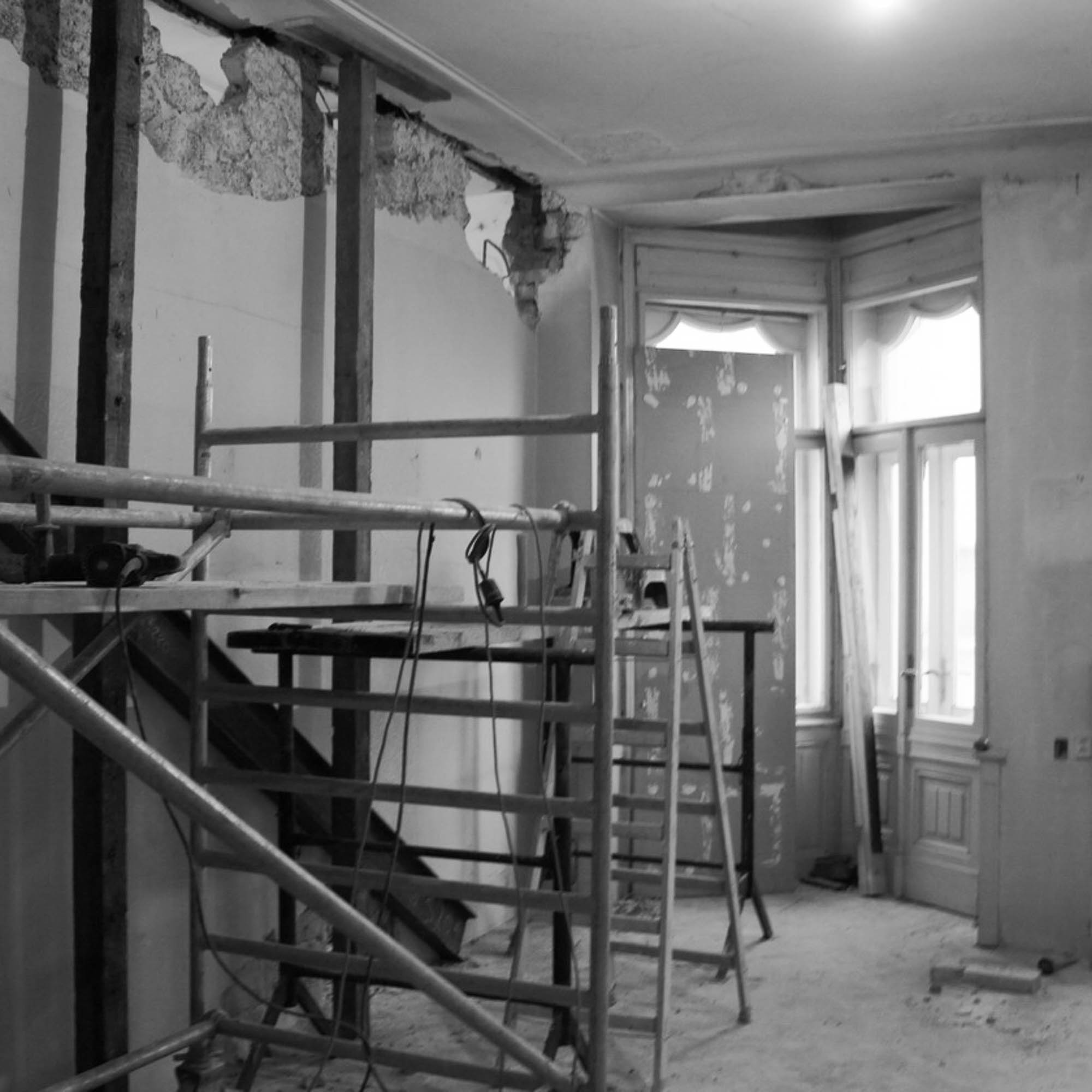
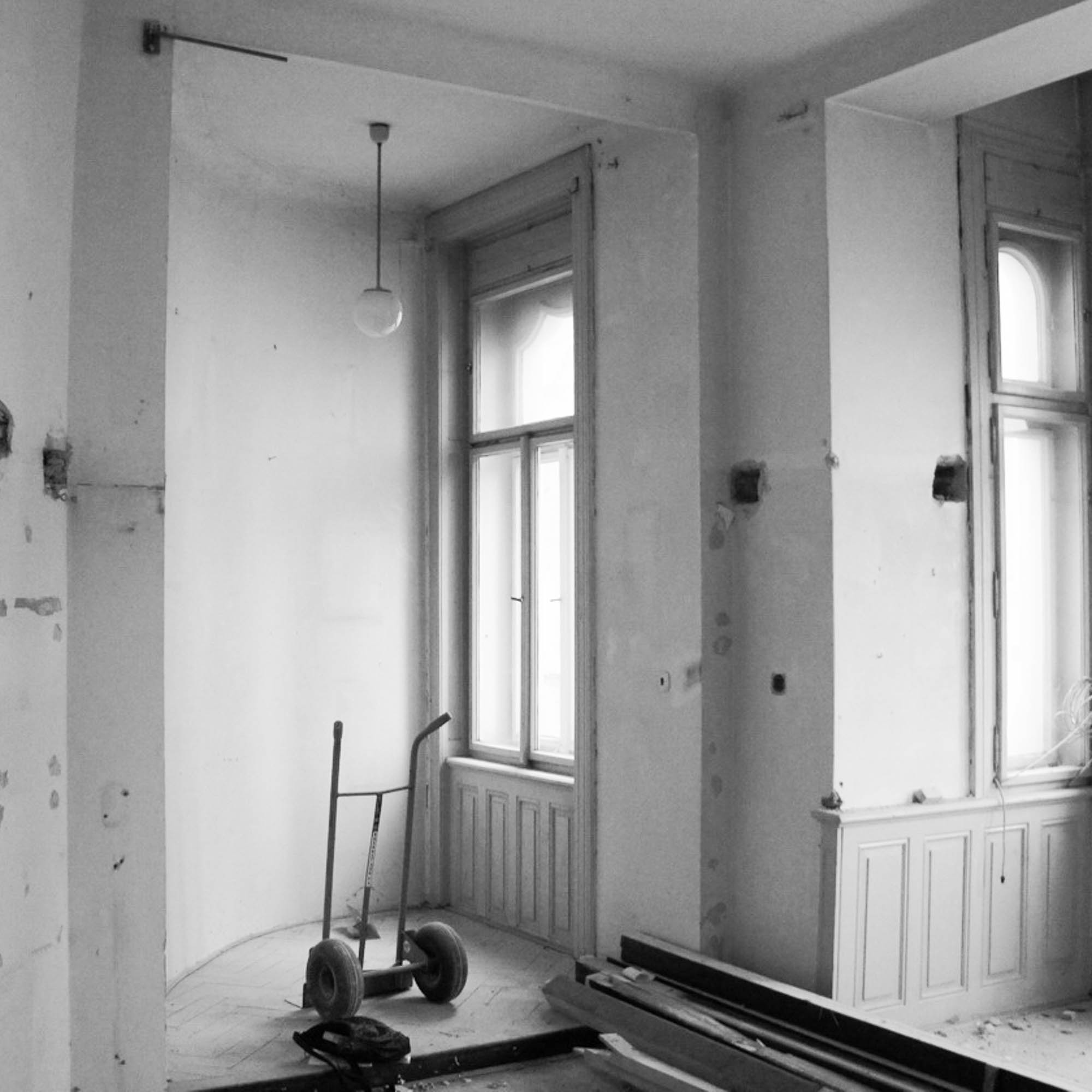
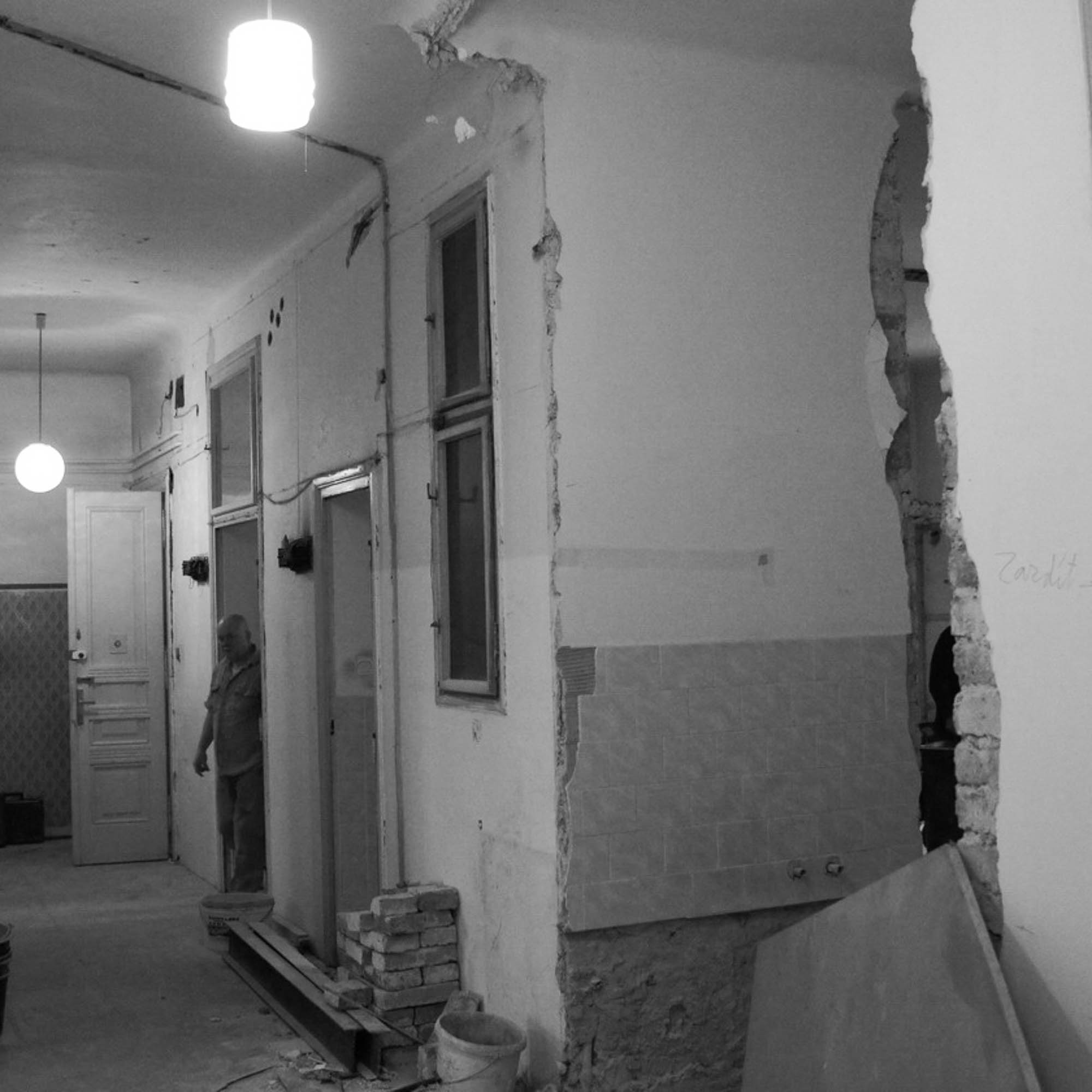
A desperate original condition
The original condition was on the edge. A divided apartment, inserted mezzanines, damaged floors, missing details. And yet there was still something in it worth saving.
These are exactly the projects that interest us most. Not because we turn them into something new. But because we find again what was already there long ago.
Why we love renovations
Curious about how we approach interior design projects like these? Read more about it here in the section RENOVATIONS—it’s our favorite area of expertise.
— Let's meet!
Do you have a similar project you’d like to discuss with us? Fill out this short questionnaire, tell us a little about your plans, and we’ll get back to you soon.
by Radka - 20. 4. 2026