GRAUDENZ apartments
How a low-budget renovated townhouse just steps from the colonnade turned into apartments where guests truly want to stay. No demolition, a restrained budget, and clients who trusted the process. The result? Guests love it — and honestly, so do we.
Without tearing anything down.
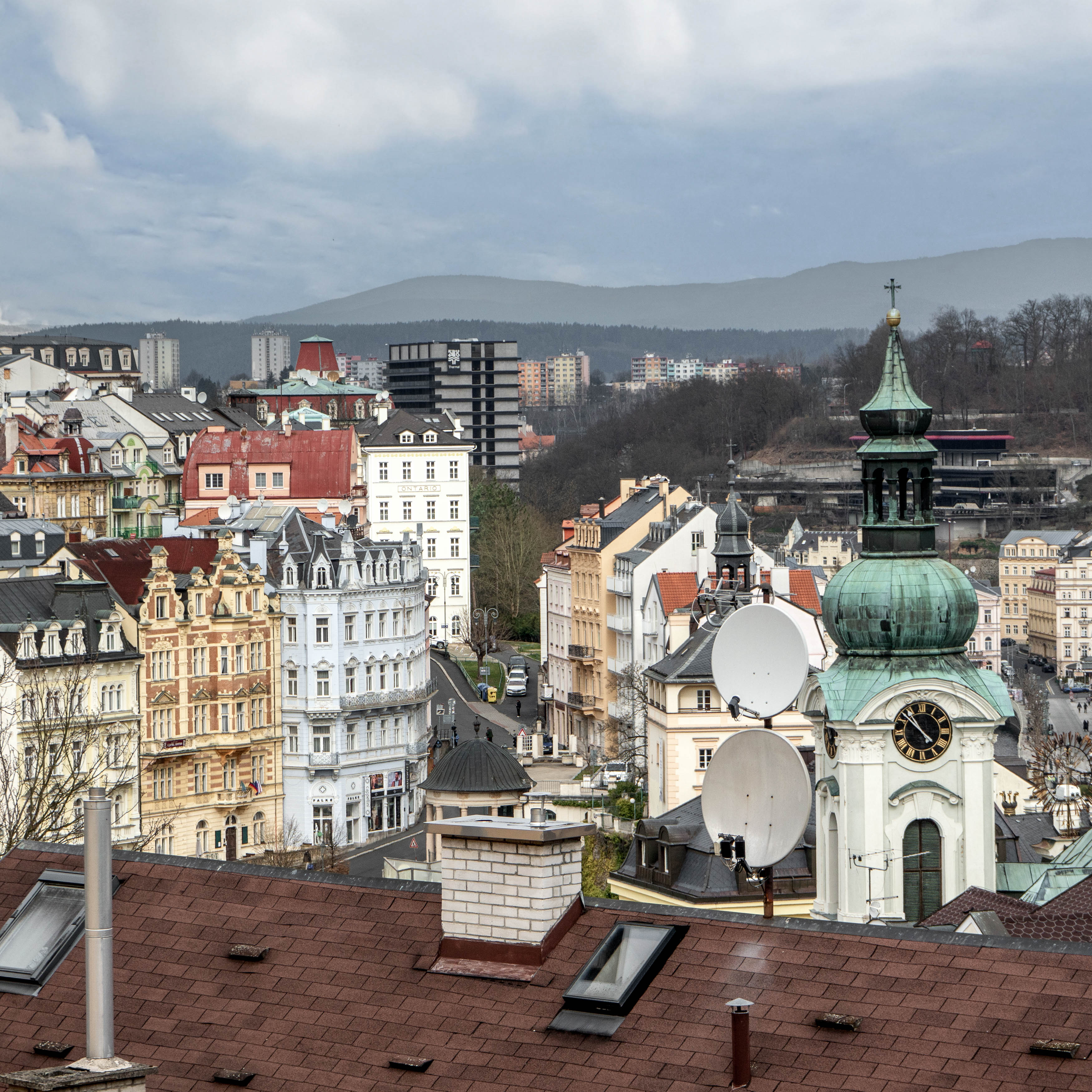
Every year during the Karlovy Vary International Film Festival, we spend a few days in town — and every year we ask ourselves the same question: Why isn’t there a hotel that isn’t wrapped in gold, stucco, heavy curtains and unnecessary grandeur? Something fresh, light, comfortable. So when the travel agency Vary Jinak reached out and asked us to furnish an entire townhouse meant for short-term rentals, we immediately saw an opportunity.
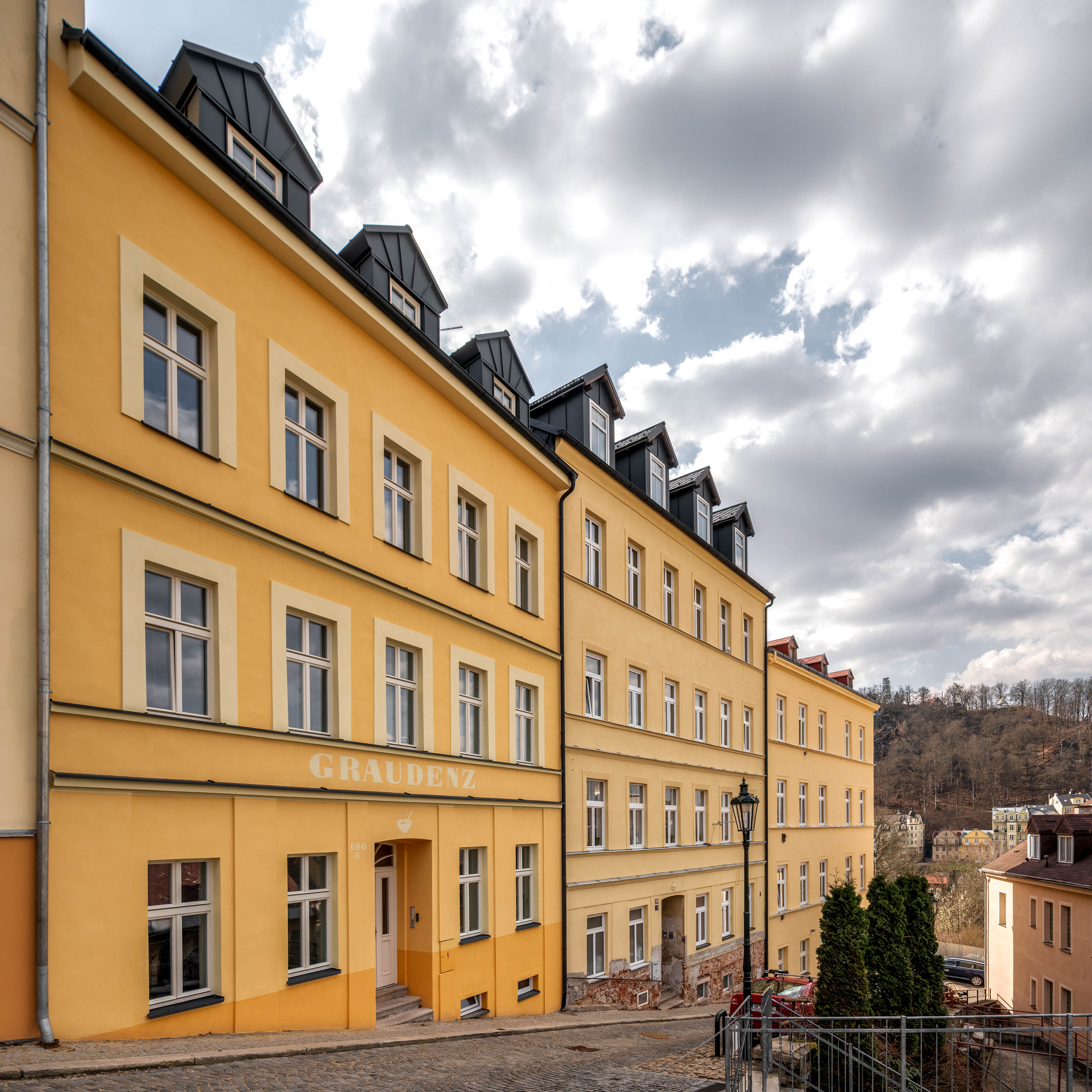
The building had been renovated, but only in the most literal sense. Low-cost materials, surfaces that didn’t hold up visually, and an atmosphere that simply didn’t match the prime location a few steps from the colonnade. The brief was clear: upgrade, warm up and elevate — without any structural interventions, and with full respect for the budget.
So we jumped in and used a slightly different kind of creativity than we usually do.

A building with potential
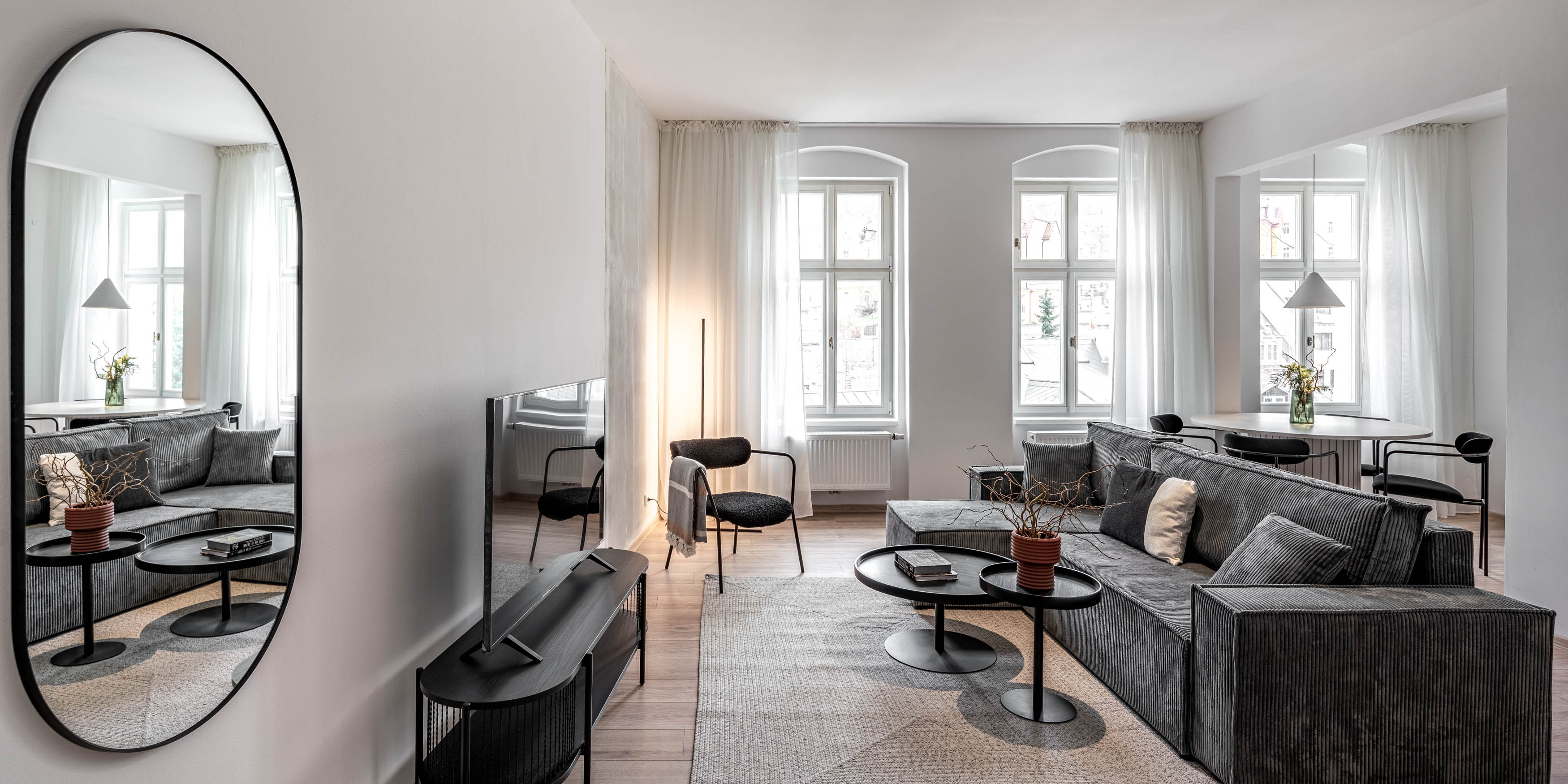
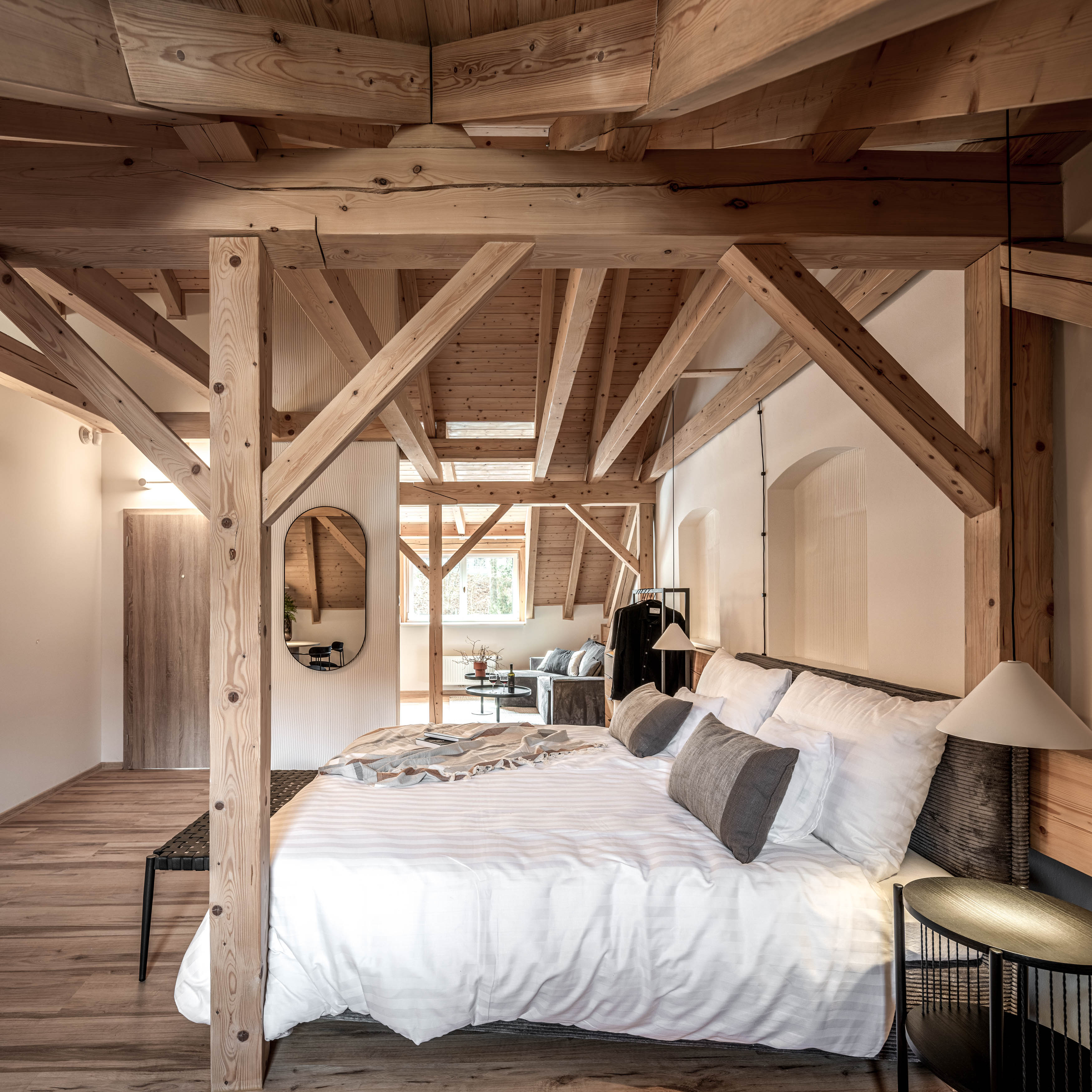
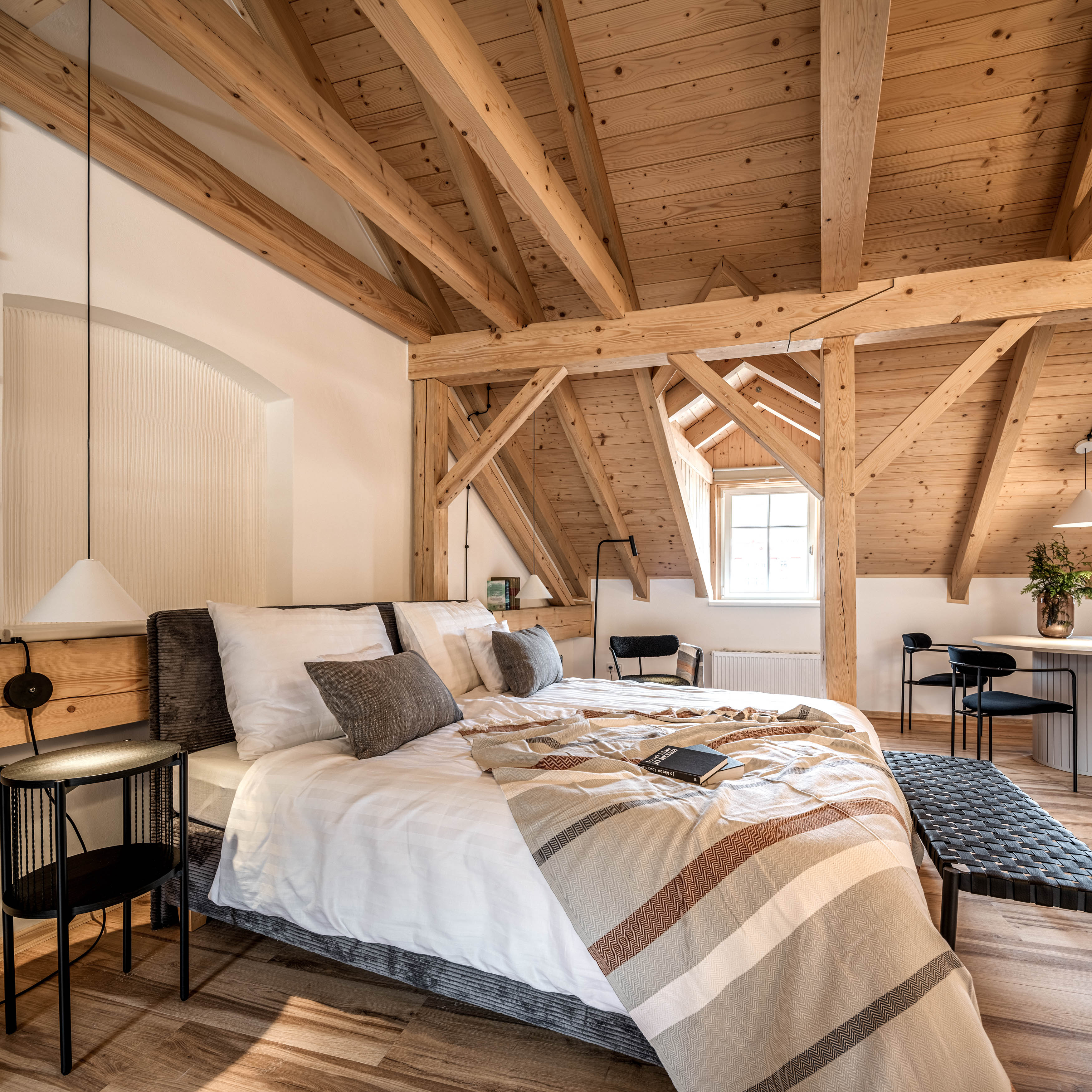
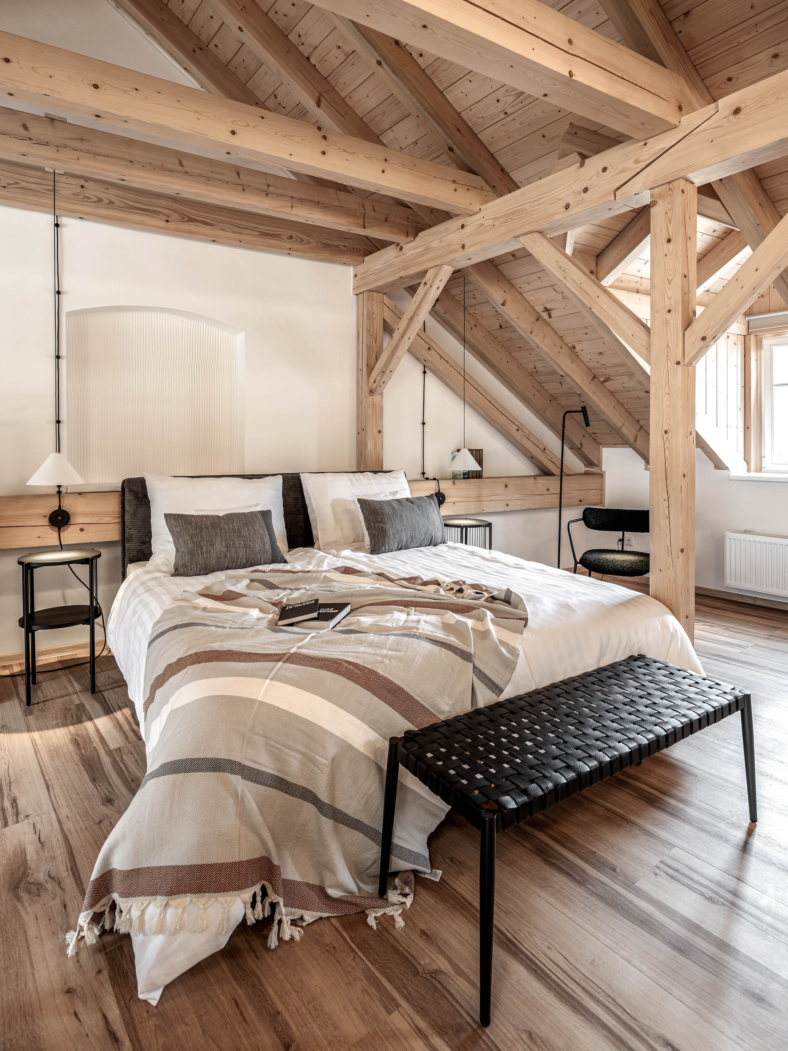
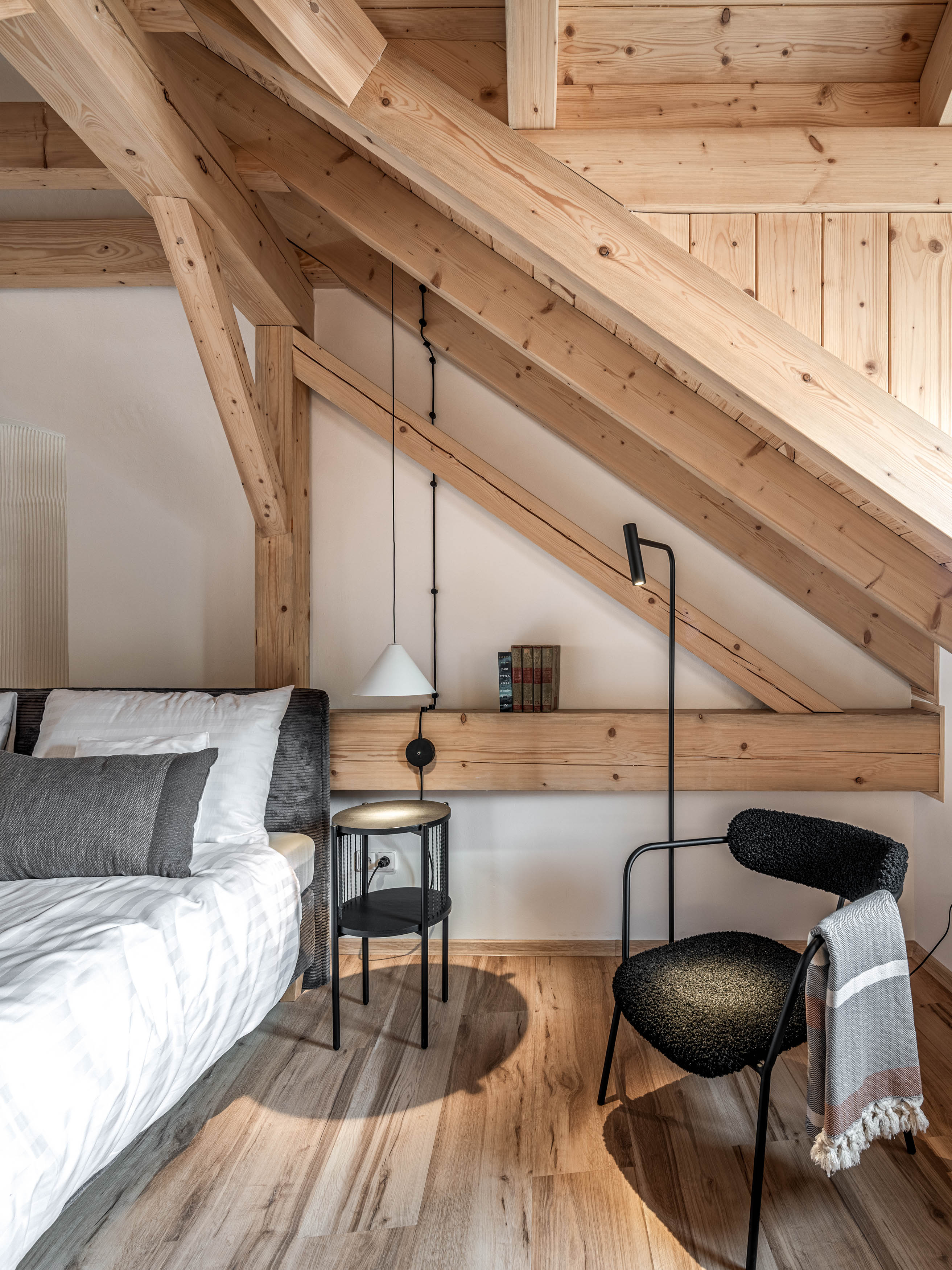
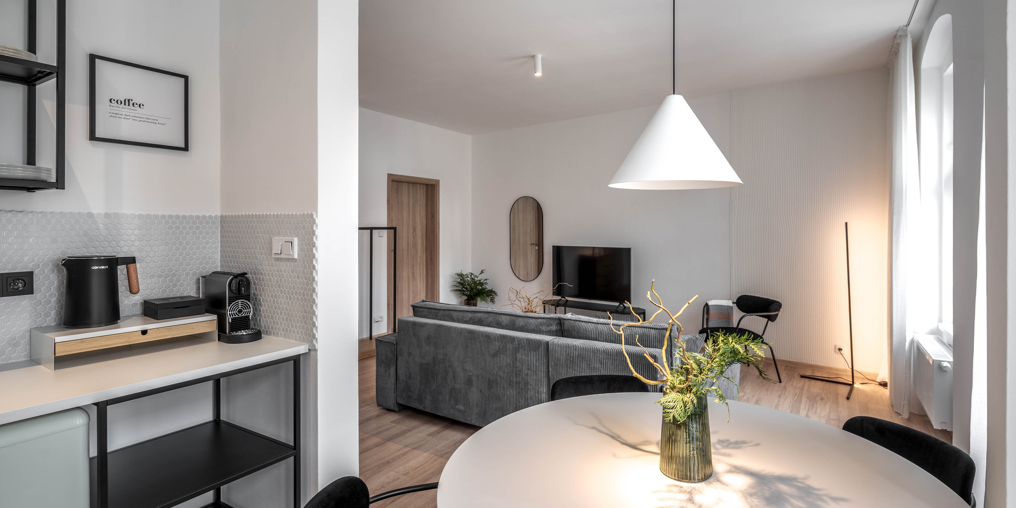
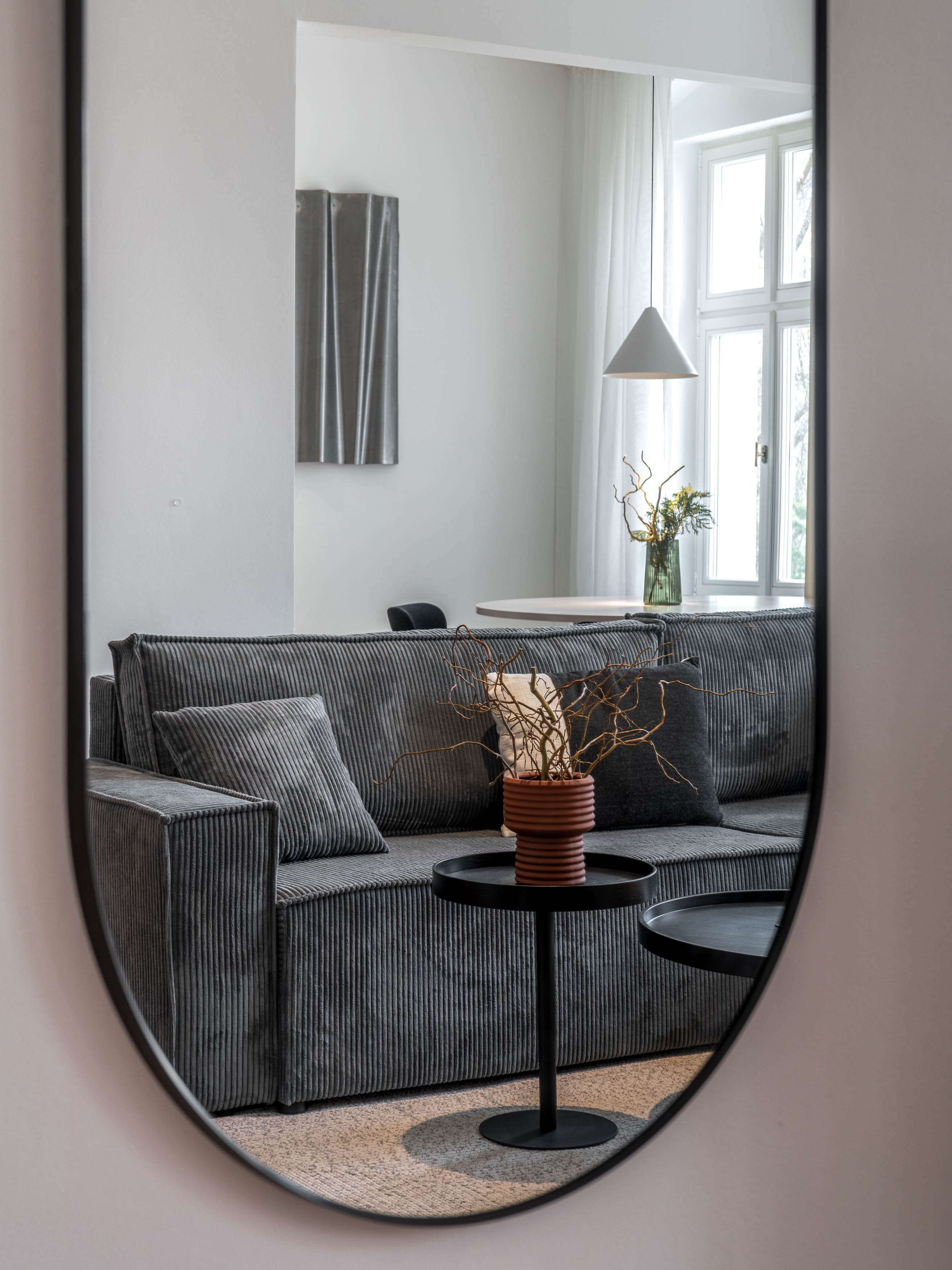
The townhouse on Vyšehradská Street has three floors, two apartments per floor — one larger, one smaller. A promising base. The issue was the extremely low-budget renovation, which left the interiors flat and expressionless. Our goal wasn’t to fake luxury; it was to remove the “cheap” feel and create interiors that are pleasant, visually clean, and functional — the kind of place where guests feel good even during a short stay.
Since we normally work with completely different budgets, this became a lovely challenge: finding accessible pieces that don’t look accessible.


How to build atmosphere without building anything new
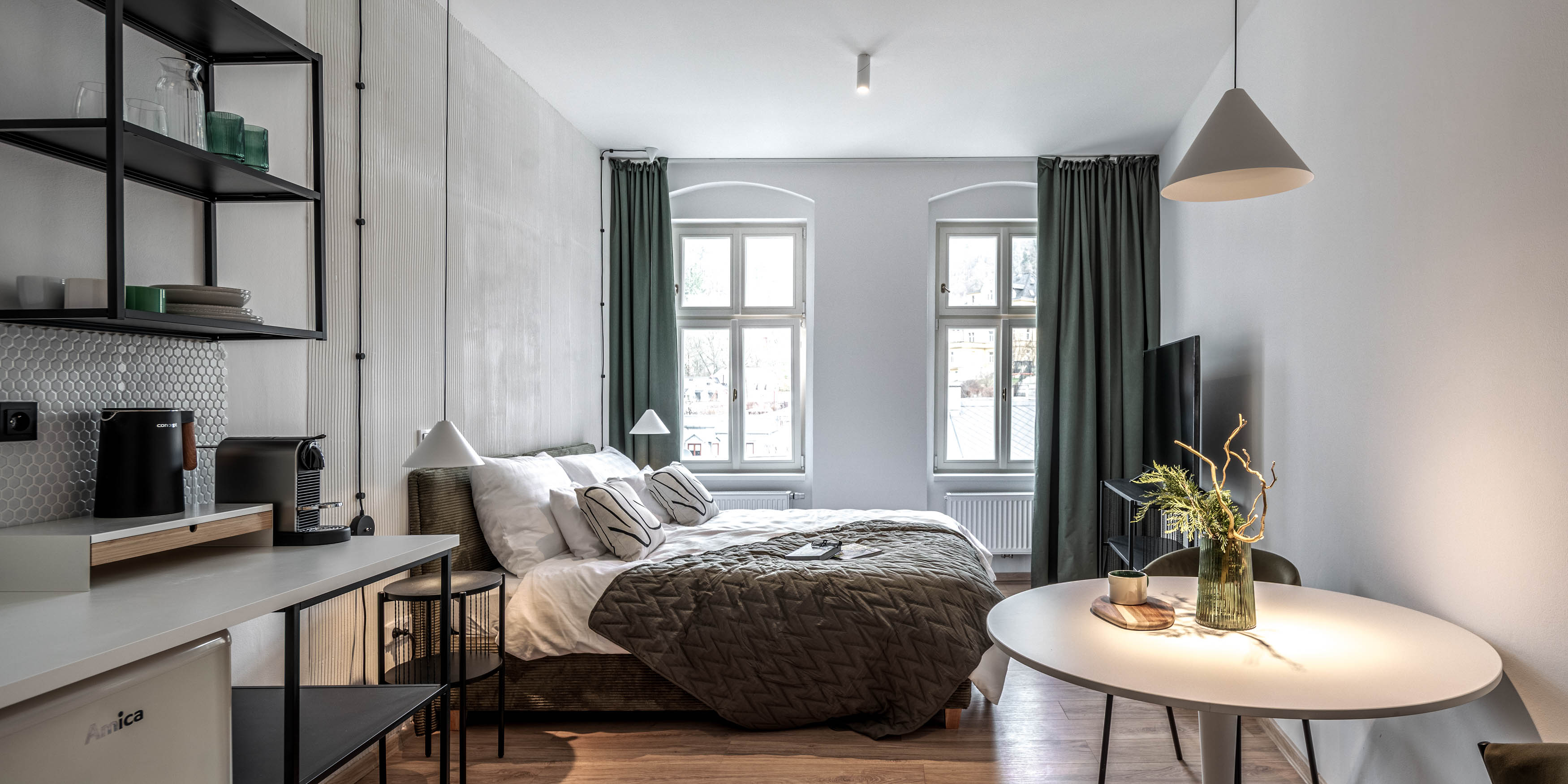
The clients were fantastic from the start — practical, open-minded, and clear about how they wanted guests to feel. We designed the apartments for short stays, not long-term living. The small kitchenettes are meant for coffee, a croissant, and a bottle of wine — nothing more. Any real cooking was intentionally moved elsewhere.
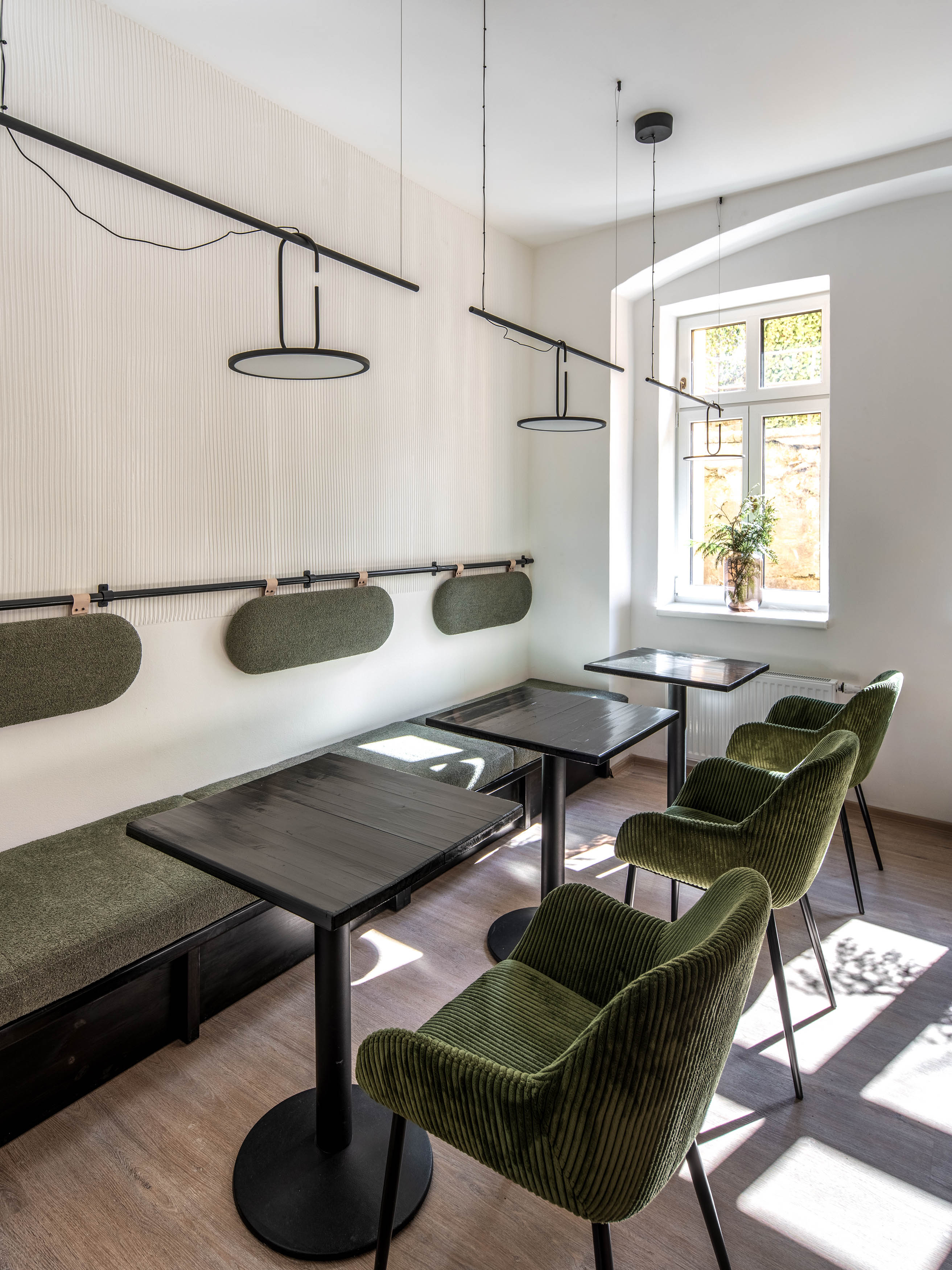
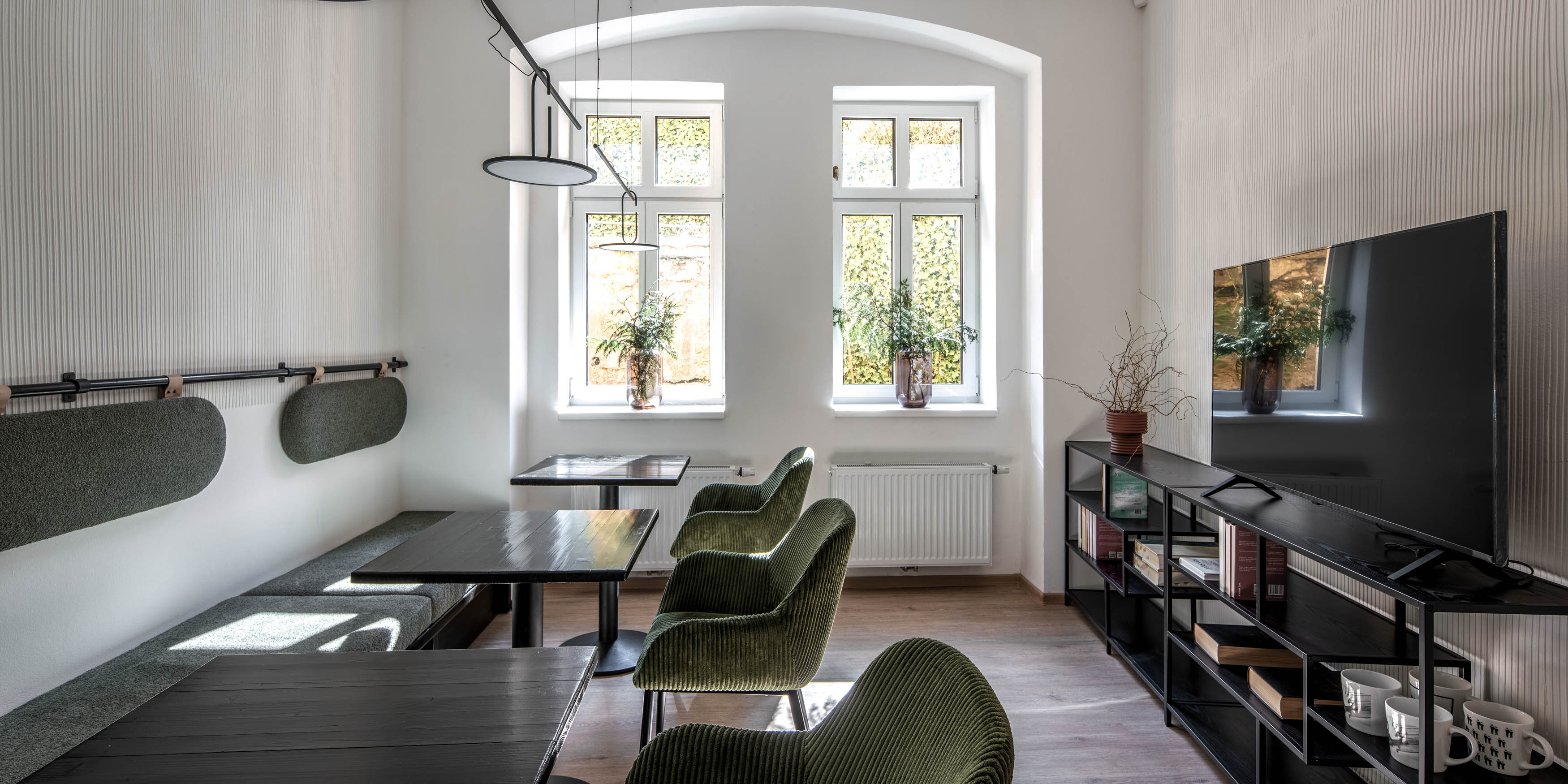
The shared kitchen as the heart of the house
On the ground floor, we created a large communal kitchen where guests can cook anything from eggs to a proper broth.
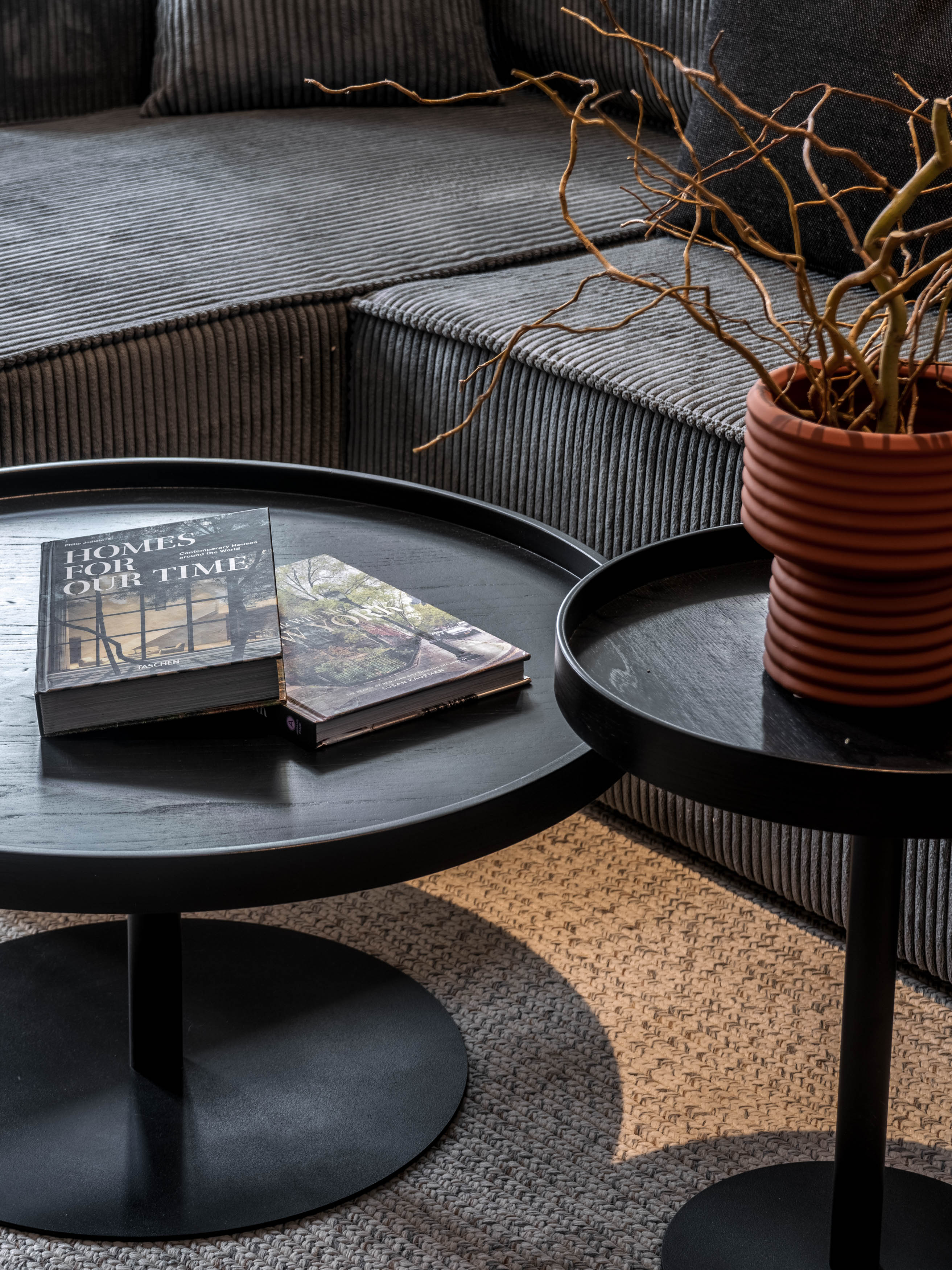
The adjacent dining area can be easily reconfigured: a few small seating setups can transform into one long shared table within minutes. Helping this flexibility are supportive back cushions, movable elements and lighting mounted on horizontal bars, allowing the atmosphere to shift effortlessly from morning brightness to cozy evening glow.

An entrance that quietly announces effort and intention
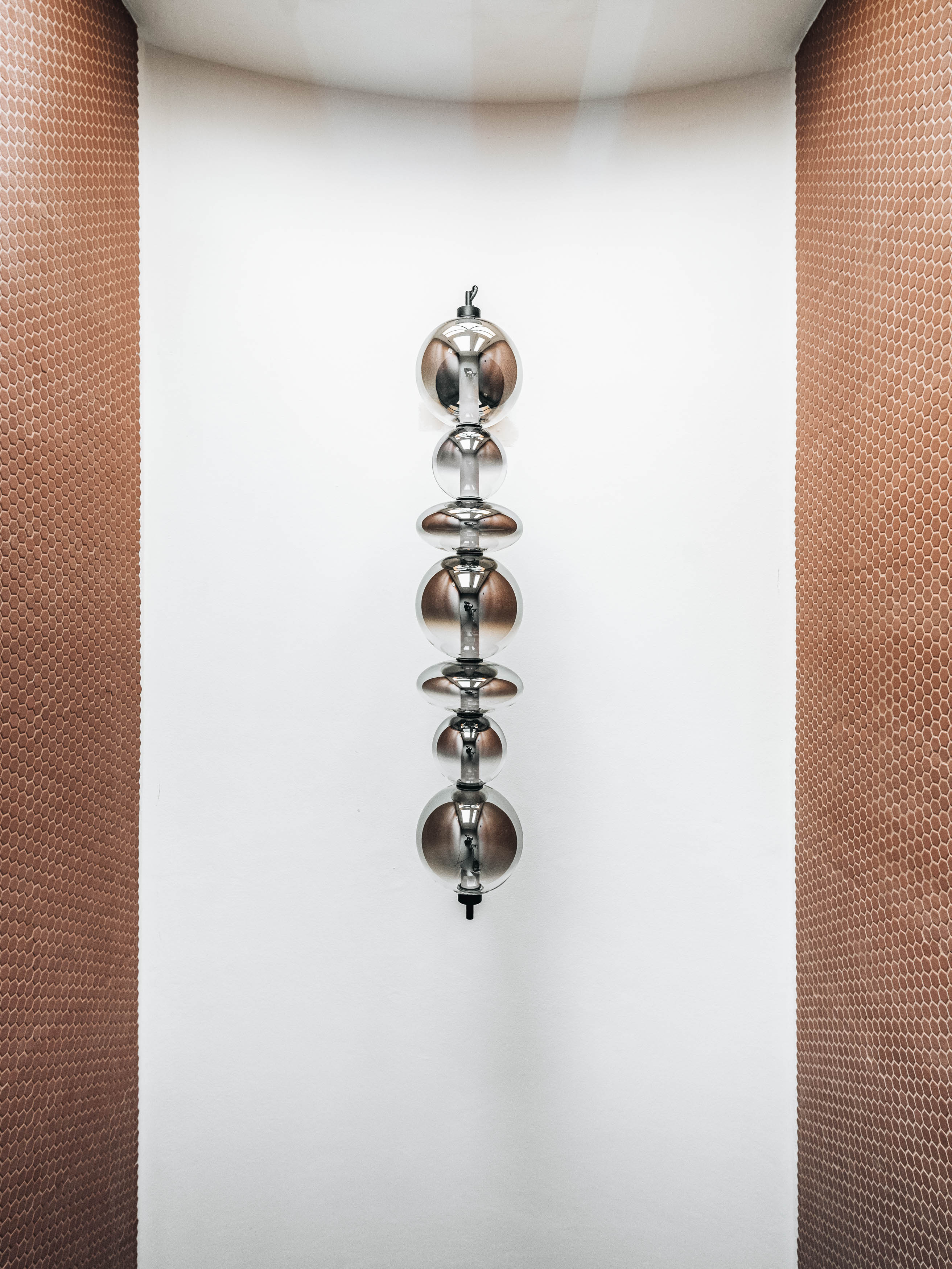
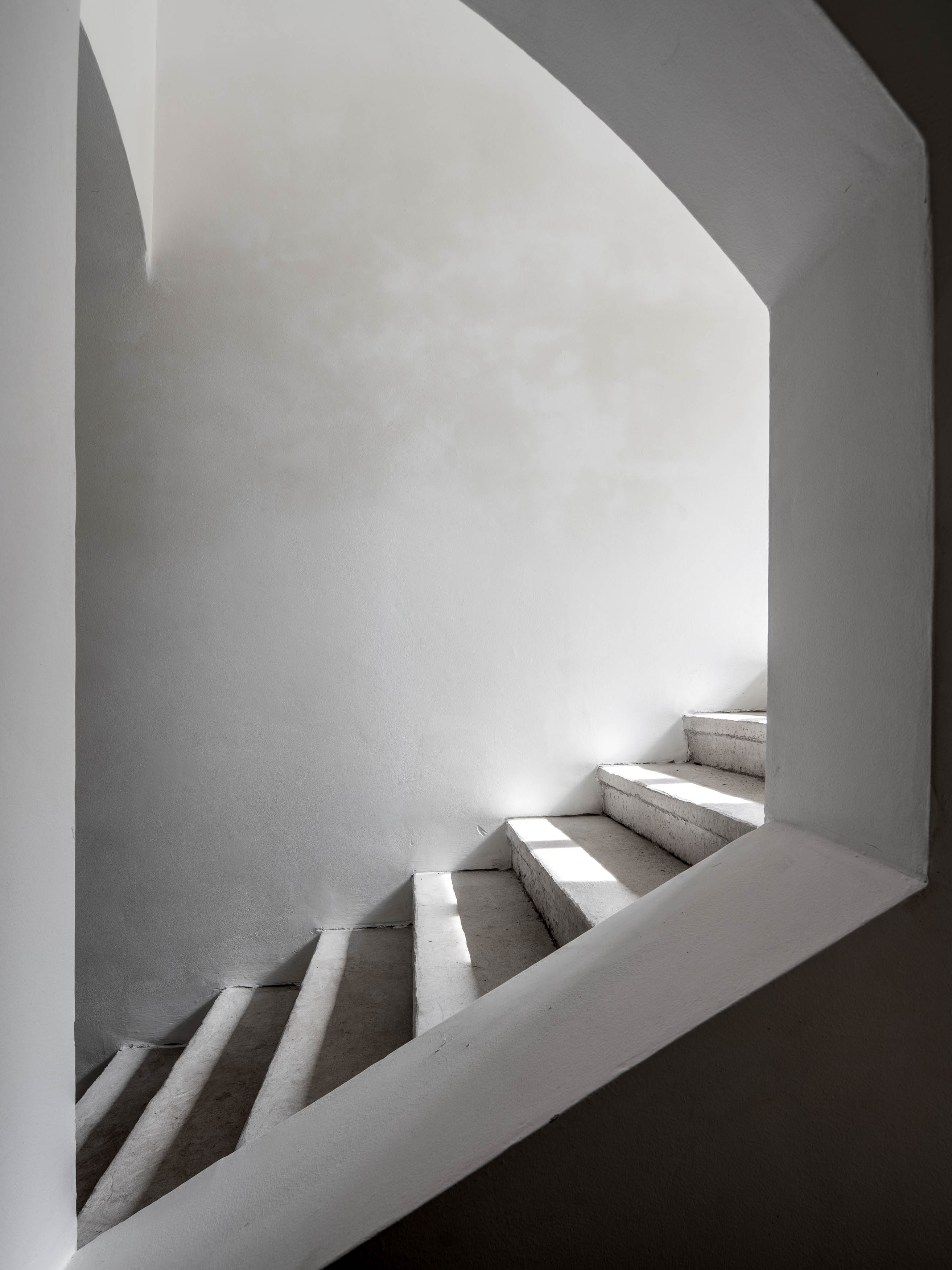
We clad the entire entrance — floor to ceiling — in a soft, earthy round mosaic tile. The space is anchored by a smoked-glass light fixture, giving the entryway the presence it previously lacked. As for the original hallways, they were the most beautiful part of the house — so we restored them. Sanding the stone staircase was a demanding process, but the result is absolutely worth it. It gives the building a dignity it was missing.

Small gestures that make a big difference
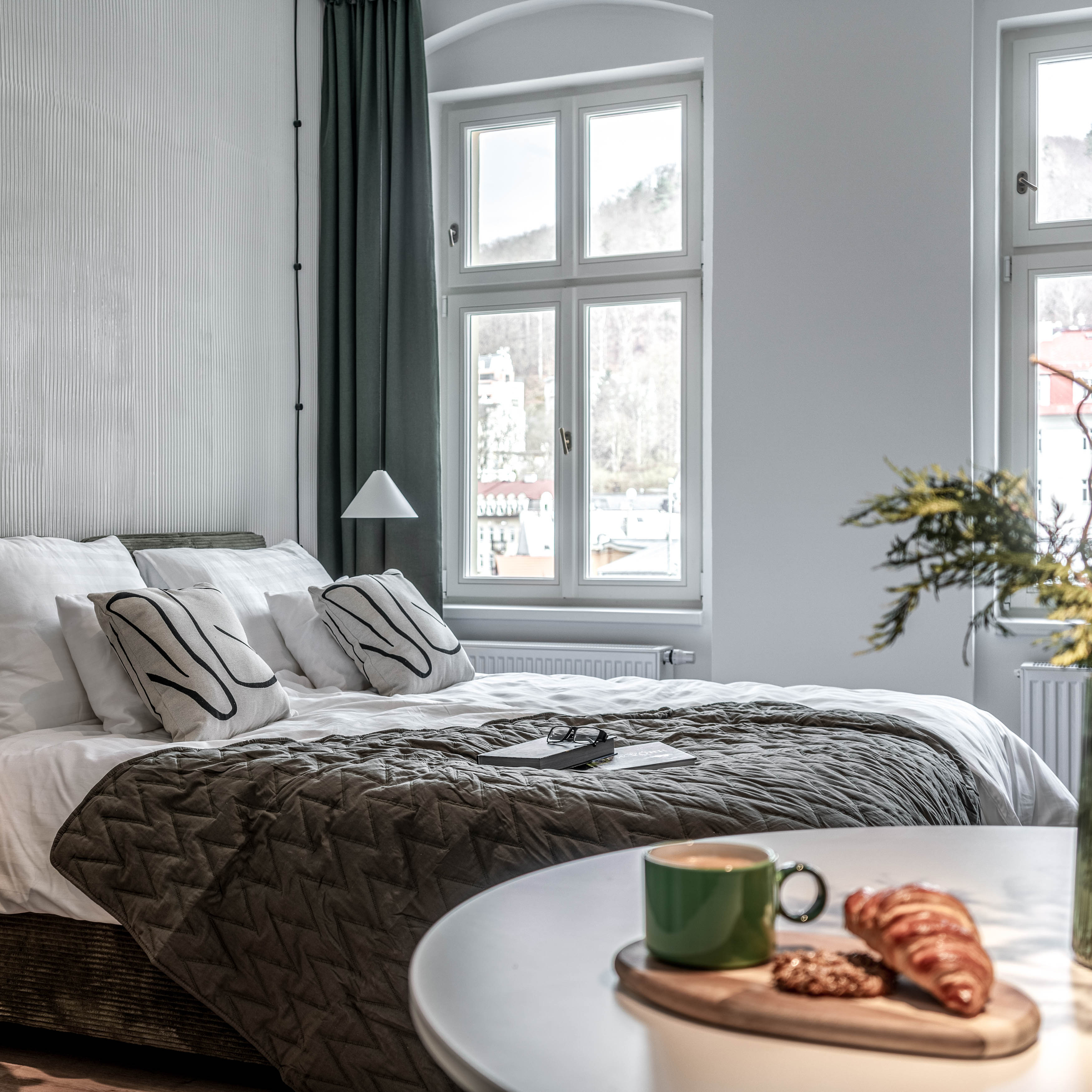
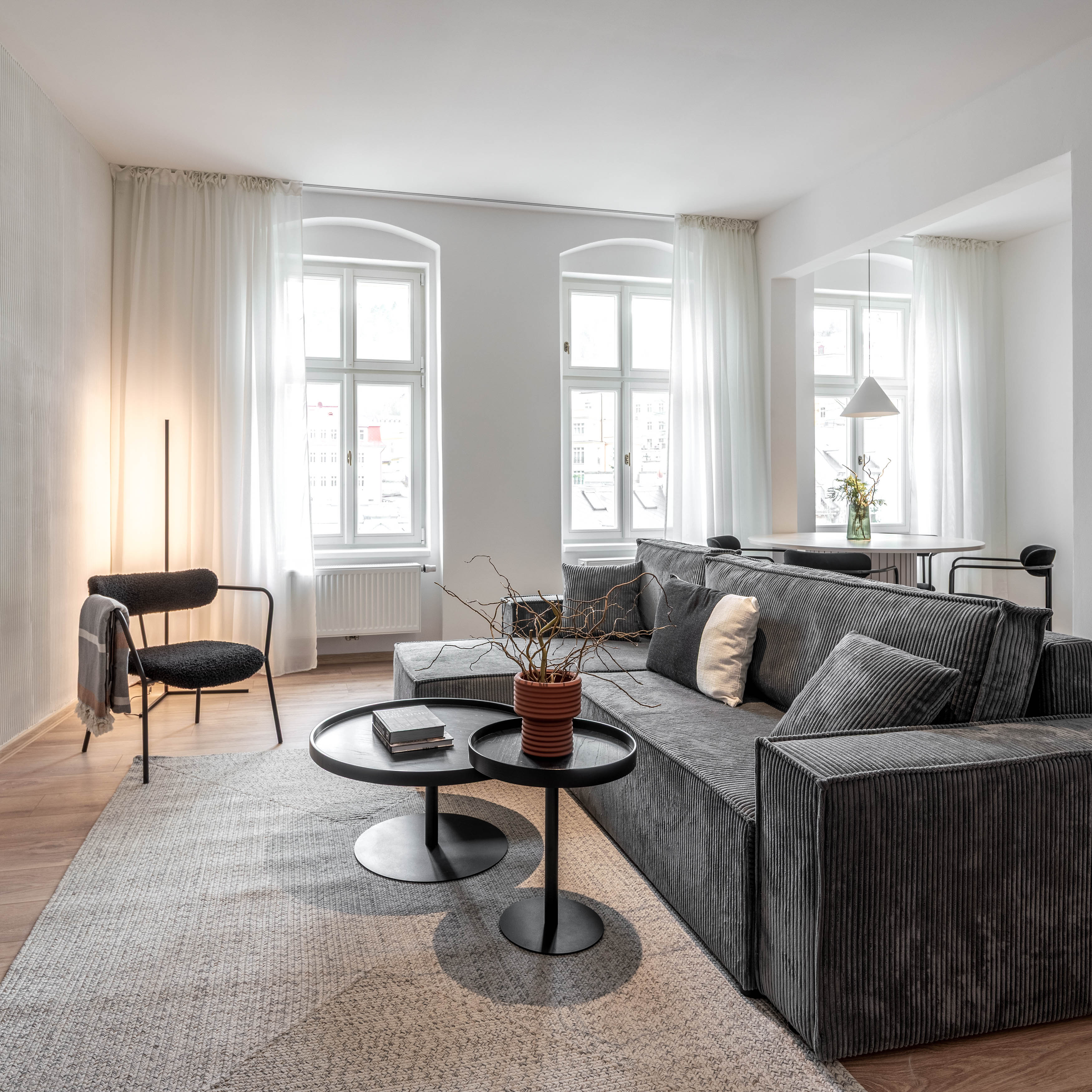
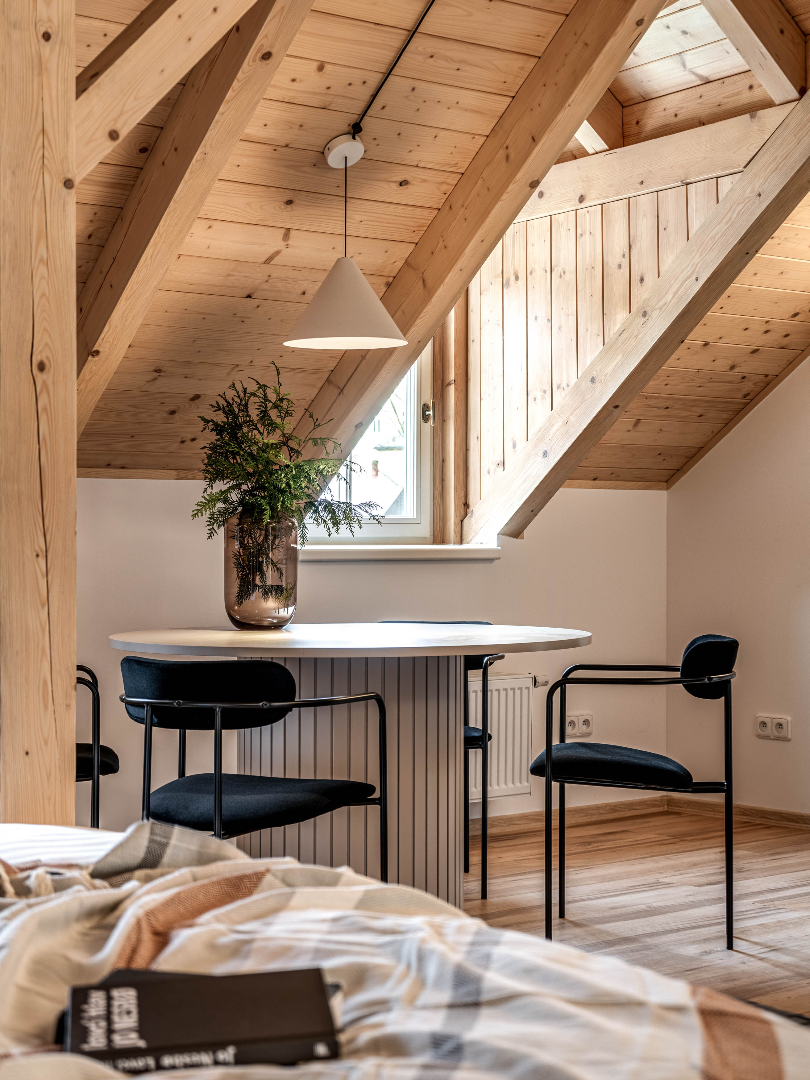
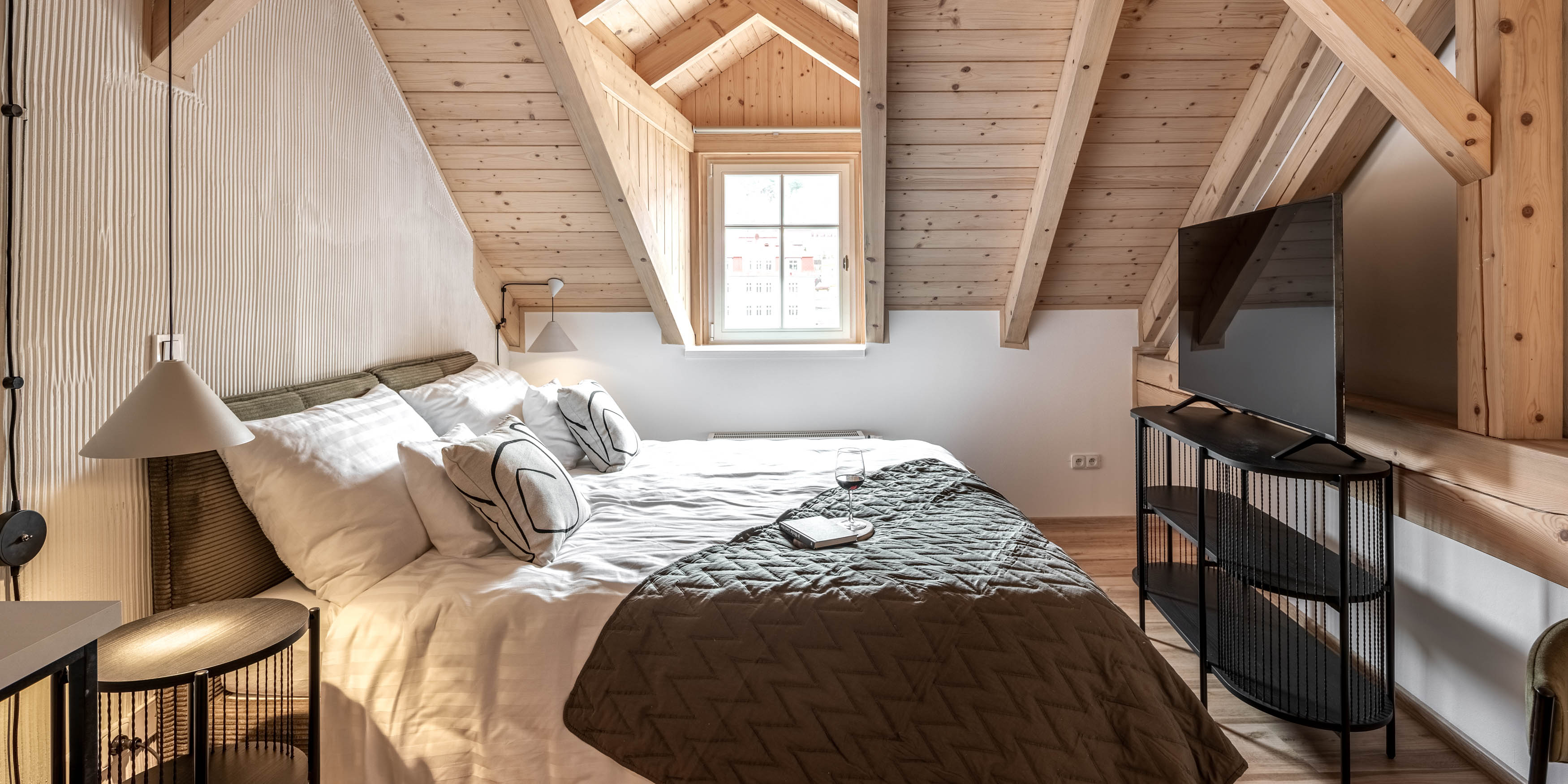
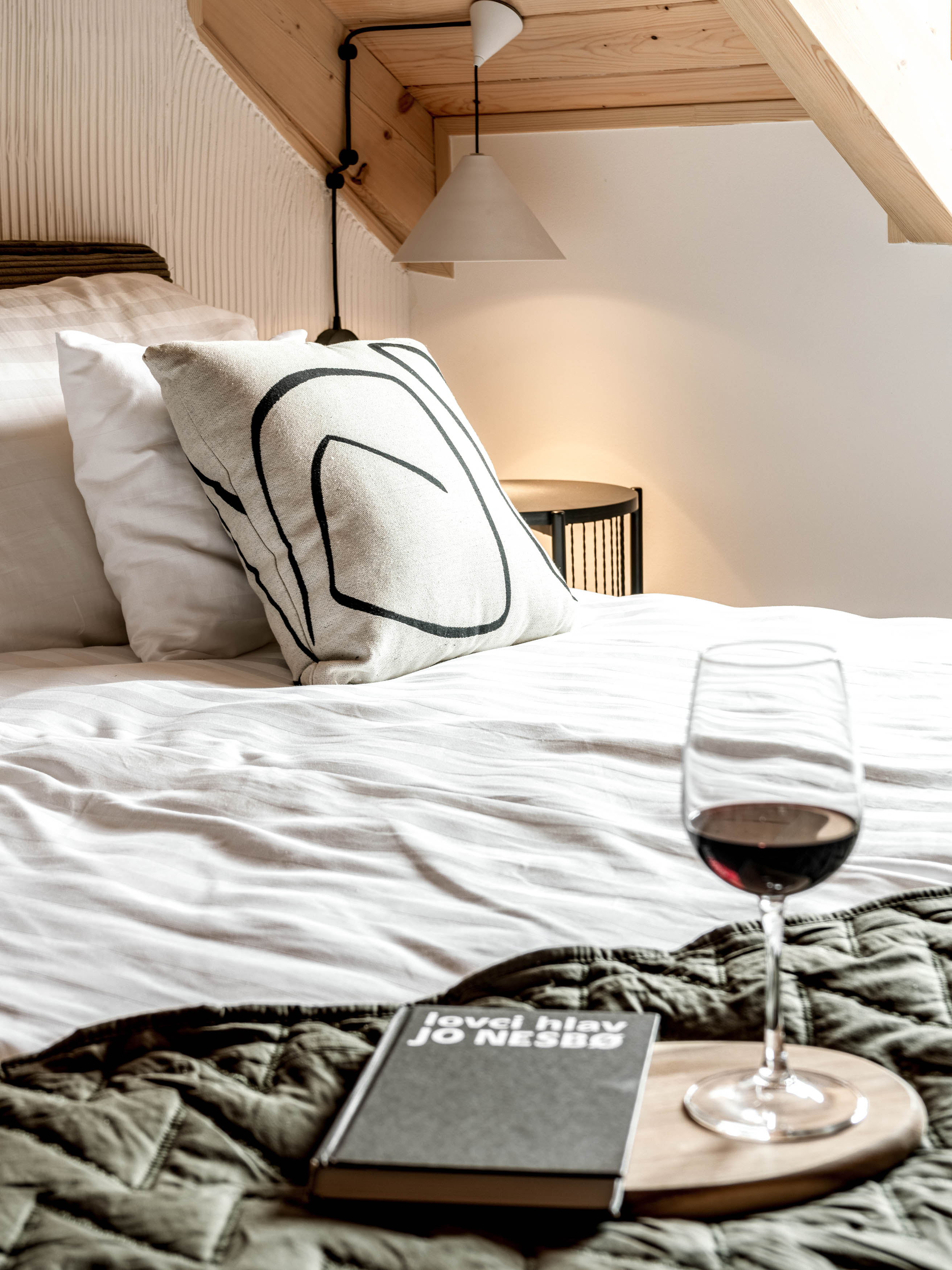
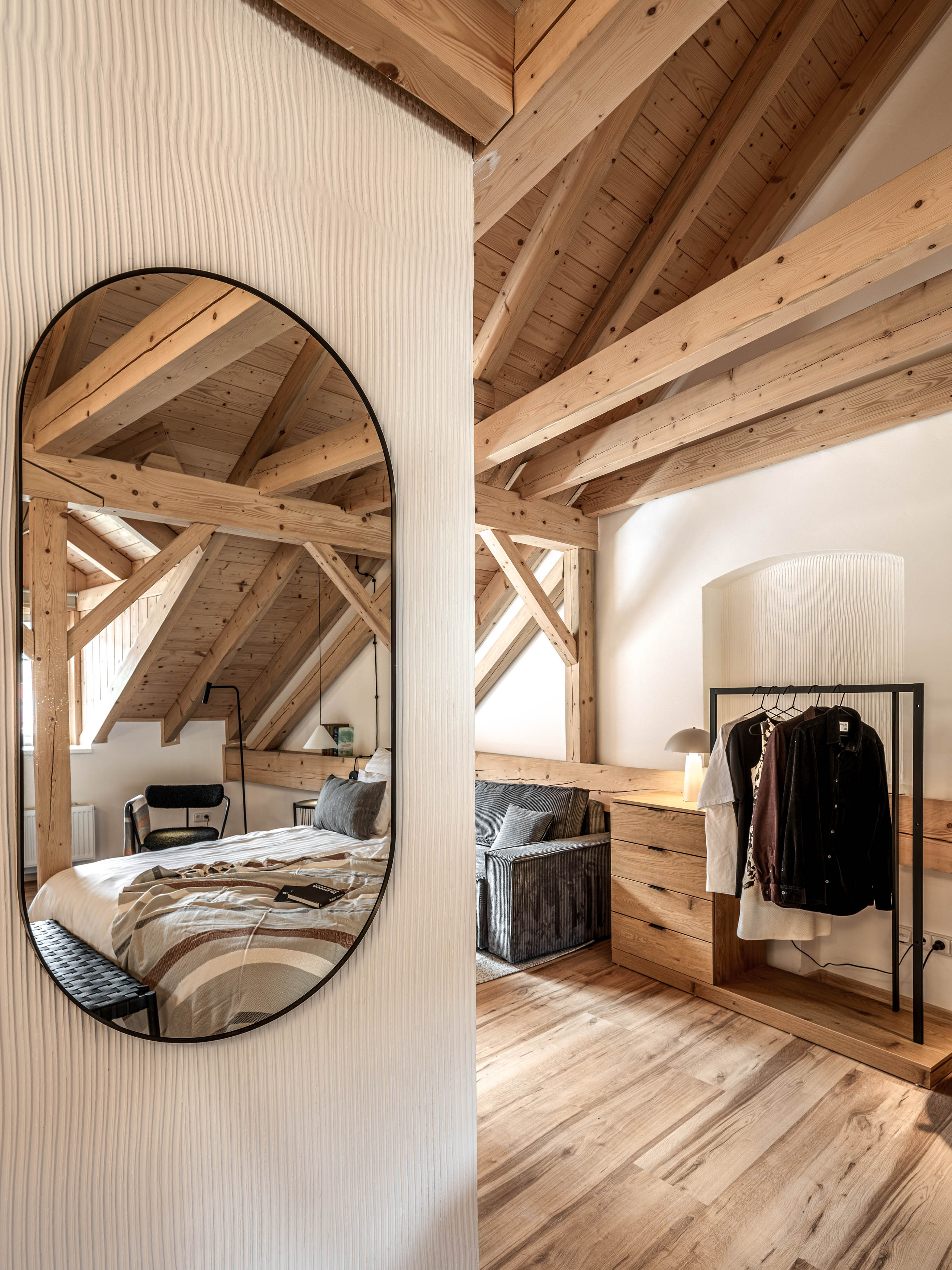
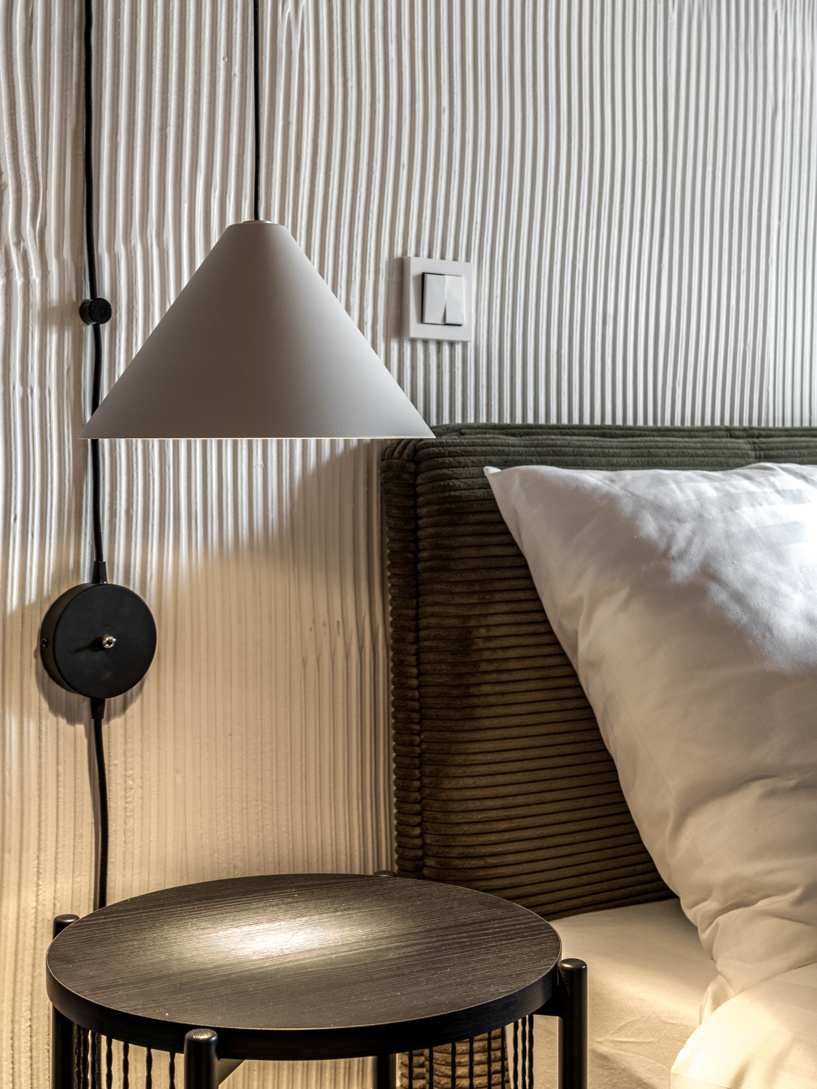
In the bedrooms and living rooms, we used a solution that is simple to execute, budget-friendly, yet visually incredibly impactful: we applied a fine ribbed texture using adhesive, then painted everything back in white. The texture immediately made the spaces feel more “lived-in,” less sterile, and in the evening, paired with lighting, it plays beautifully with shadows.It’s a subtle gesture with an unexpectedly strong effect. This is also where the subtle design leitmotif emerged: stripes. The ribbed wall texture resonated perfectly with other materials: corduroy beds and sofas, ribbed glass, structured vases and accessories. Together, they create a quiet rhythm that runs through the whole house, unifying the interiors without drawing attention to itself. We dressed the windows in airy curtains that soften the rooms and add gentle movement. And in summer? Open windows, a curtain fluttering in the breeze, and beyond it the panorama of Karlovy Vary. One of those tiny moments that give a place its soul.
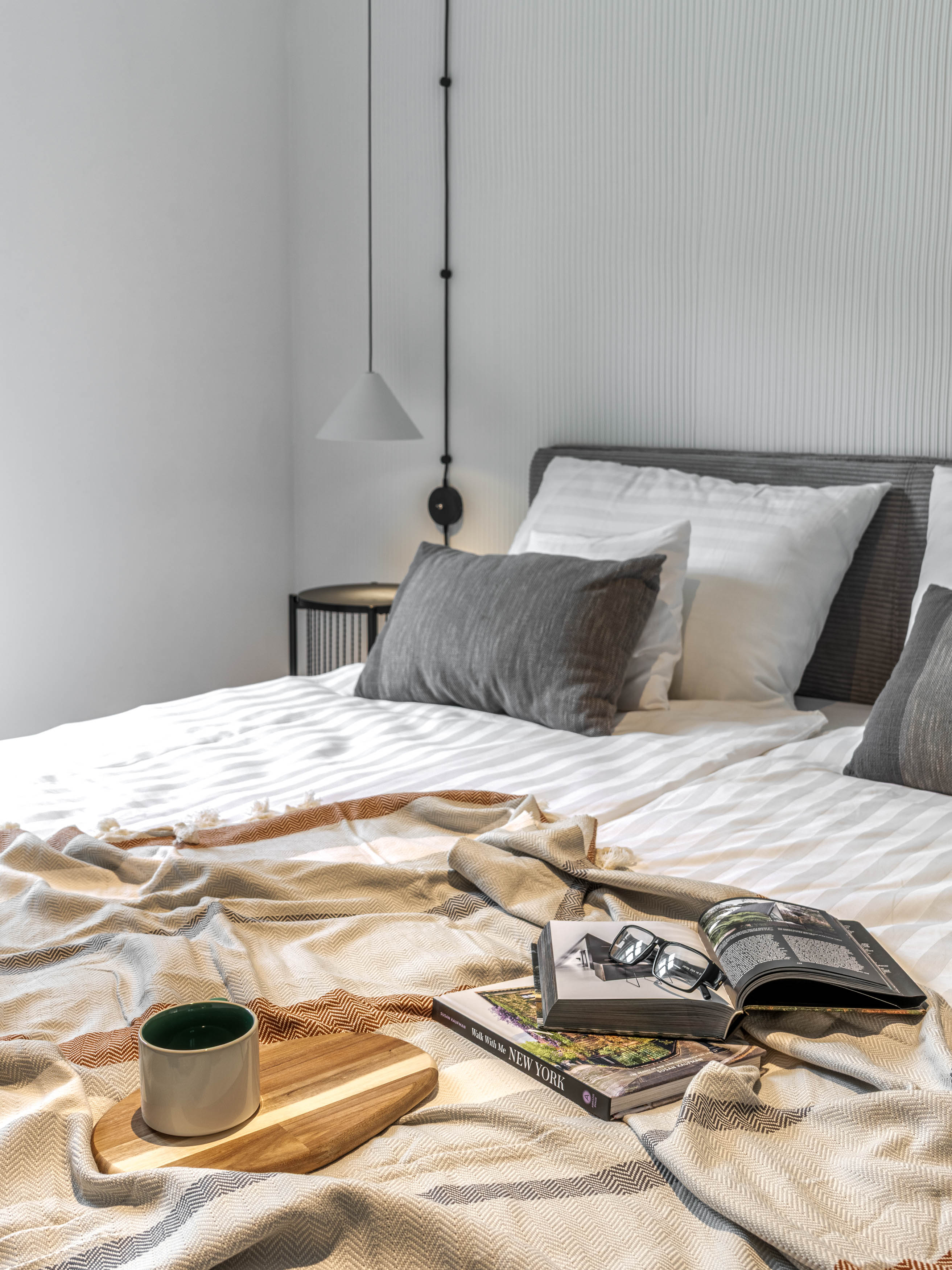
Worthy beds and thoughtful low-budget choices
Beds were one of the key points of attention. We tested several options — and even sent one entire delivery back, because comfort is non-negotiable. We looked for pieces that were comfortable, easy to maintain, and priced sensibly.
A similar hunt followed with the sofa beds. Finding something that doesn’t look cheap, despite being affordable, is an entirely different design discipline.
And now, a little unapologetically: it worked
This project is a wonderful demonstration that a low budget doesn’t limit creativity.
It simply asks for a different mindset — clever solutions, thoughtful combinations, and the courage to rely on texture, light and a unifying rhythm. The clients were amazing. They trusted us completely, didn’t insist on unnecessary décor, and allowed us to strengthen the spaces instead of decorating them. And the result? Guests are leaving one glowing review after another, the apartments are functioning exactly as intended, and the house now lives a very pleasant life. So yes, we’ll say it: It really did work. And you can enjoy Karlovy Vary in a different way — and book the apartments directly on GRAUDENZ web. site
Are you interested in how we approach similar interior projects? Read more about it here in the INTERIORS section.
— Let's meet!
od Radky - 9. 12. 2025